I don't either. It's two J's next to one another. Then again Nike is just a tick and adidas is just 3 parallels.I really don't see what's clever about it?
Each to their own I guess.
Juventus unveil bold new club crest at ceremony in Turin
- Thread starter KiD MoYeS
- Start date
You are using an out of date browser. It may not display this or other websites correctly.
You should upgrade or use an alternative browser.
You should upgrade or use an alternative browser.
It's quite close to an old Fulham badge!It's almost as drastic as Fulham's badge change a few years back.

http://www.friendsoffulham.com/the_badge.php
Member 39557
Guest
Ahh, didn't know that. I just remember the previous 2, which looked more like a coat of arms with swords etc.
Camilo
Full Member
- Joined
- Jan 27, 2014
- Messages
- 3,181
I think it looks pretty sharp actually.. The whole "badge/crest" thing is undoubtedly a bit odd when viewed with a bit perspective, so I can see something like this (which would actually look alright on a piece of clothing that isn't a football shirt) taking off.
Still, quite liked their old one - it was already plenty better than most.
Still, quite liked their old one - it was already plenty better than most.
decorativeed
Full Member
Sickening.
That old Juve badge meant so much. So many Wednesday nights in the mid 90s were spent trying to overcome that badge.
The players they had. Ferrara, Di Livio, Del Piero, Conte, Pessotto, Deschamps, Davids, Zidane. What a team. What a struggle to overcome them. Then finally doing it in 99.
The old lady of Italian football has juncked her traditions for this photoshop looking garbage. Awful.
Must be your memory playing tricks on you, as Juve never even wore a badge on their shirts back then.
decorativeed
Full Member
Found it...
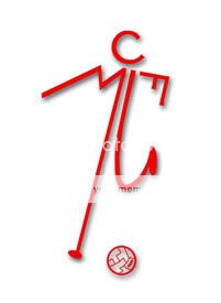
The MUFC stick man was used by the club since the sixties and possibly earlier. I think by the 90s they had started to phase it out entirely. Shame as I quite like it, although not as a club badge.
One Night Only
Prison Bitch #24604

Regulus Arcturus Black
Full Member
The MUFC stick man was used by the club since the sixties and possibly earlier. I think by the 90s they had started to phase it out entirely. Shame as I quite like it, although not as a club badge.
Seriously? I thought it was just an early 90's thing, I remember an amazing stick-man tracky I got for Christmas around 91-92, love it!
Although looking at is now, I think @SteveJ is right, looks more like a toilet sign.
decorativeed
Full Member
Seriously? I thought it was just an early 90's thing, I remember an amazing stick-man tracky I got for Christmas around 91-92, love it!
Although looking at is now, I think @SteveJ is right, looks more like a toilet sign.
Yeah, there is footage of the Old Trafford boardroom in the mid sixties and the stick man is used on the frosted glass doors. It was on official documents too.
Me either, I just looked up what you were on aboutAhh, didn't know that. I just remember the previous 2, which looked more like a coat of arms with swords etc.
decorativeed
Full Member
Looks terrible. Their old crest was brilliant, as was Citys. God, I hope we don't go down this route.
City's was an abomination, it's just that it was the one you were used to. I grew up with City having a circular badge very similar to their new one, so it's easy to accept.
I also think a lot of the crests designed in the 2000s have stated to look a bit dated already, as they show up what people thought was great about their at-the-time cutting edge design software rather than what is good, sturdy design. It was all about gradients and shading and tapering lines. I actually admire what they have done here with the new Juve logo.
I wonder how many clubs in the world have not modified their crests in the last 20 years? It is exactly 20 years since we registered our current crest, which I think needs a subtle update.
decorativeed
Full Member
The juxtaposition of being called "The Old Lady" and having a trendy logo like this is hilarious. Like a regal old lady donning a shellsuit.
I'd say it is no greater juxtaposition than having a name that translates as 'Youth' while being nicknamed 'the Old Lady', really.
DanBorja
New Member
- Joined
- Jun 10, 2011
- Messages
- 366
Looks good imo, previous crest was legendary tho, so I get why people are complaining.


youngrell
Full Member
It's more than that.I don't either. It's two J's next to one another. Then again Nike is just a tick and adidas is just 3 parallels.
The Js form the shape of a more traditional crest, it incorporates black and white stripes and as someone else pointed out it could also reflect an abstract version of the horse or whatever from their old badge. There are plenty of subtle creative pieces to the logo. Plenty of thought went into it, even if it does look simple at first glance.
Summit
"do the dead, spread your seed and get out"
- Joined
- Nov 10, 2011
- Messages
- 51,052
It's very 'social media age'
If that's what they want to achieve then well done
But it doesn't convey any of their tradition or history
If that's what they want to achieve then well done
But it doesn't convey any of their tradition or history
still ten times better than the new premier league logo or Chevrolet logo, the trend is still to simplify and flatten but perhaps the changes could be more sensitive, there's no link to the past, it's completely new thing, might not work well as a crest especialy on the stripes.. let's see the applications
stevoc
Full Member
- Joined
- Jun 11, 2011
- Messages
- 23,508
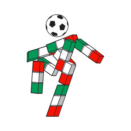
I think they've actually missed a trick here. They could have made it a little football man like the Italia 90 logo.

horsechoker
The Caf's Ezza.
still ten times better than the new premier league logo or Chevrolet logo, the trend is still to simplify and flatten but perhaps the changes could be more sensitive, there's no link to the past, it's completely new thing, might not work well as a crest especialy on the stripes.. let's see the applications
What's wrong with the Chevy logo?
Zen
Full Member
- Joined
- Aug 11, 2008
- Messages
- 15,420
jj abrams?
Get In Scholesy
Full Member
Agnelli: 'this is a symbol of the Juventus way of living'

It took a year to create, no wonder Pogba left.
There was a ceremony for this?!?
Just removed the United bit. Everyone knows us as Manchester anyway and then it's all pretty.
Van Piorsing
Lost his light sabre
Minimalistic in a bad way. I get it, it supposed to be simple, direct and all the modern jazz but this is just Facebook logo level of laziness.
MartialsBeard
New Member
- Joined
- May 4, 2016
- Messages
- 591
I guess im the only one that likes it and thinks we should have a surgical re branding also, nothing identical to this but something more updated, our badge despit emy love for it is an eyesore and looks very "late 1990s".
What's wrong with the Chevy logo?
Are you serious
goin4glory
New Member
That's seriously awful. If I was a Juve fan I'd be furious.
simply because it's ugly??What's wrong with the Chevy logo?
podurban2
Full Member
- Joined
- Nov 30, 2010
- Messages
- 5,844
The Inter one actually looks pretty sleek.
#07
makes new threads with tweets in the OP
- Joined
- Oct 25, 2010
- Messages
- 24,124
Must be your memory playing tricks on you, as Juve never even wore a badge on their shirts back then.
It wasn't on the shirts. They just had the Italian flag, right? But it was on everything else though.
Why are there two Js?
Red Pavan
shittest username ever manutddabest791

JustFootballFan
Thinks Balotelli & Pogba look the same
- Joined
- Jan 16, 2013
- Messages
- 4,245
- Supports
- Liverpool
Maybe the child workers in Bangladesh complained that the old logo was too complicated.
Ramshock
CAF Pilib De Brún Translator
Why are there two Js?
the fella had a stutter
Reds-of-Ulster
Full Member
'juventus way of living'? Wtf is that?
Don't mind the logo (though u prefer the old one) but I dislike stuff like that.
Juventus mean Youth, so I guess it is meant to mean "Youthful way of Living"
Or some sort of marketing cliche like that.
stevoc
Full Member
- Joined
- Jun 11, 2011
- Messages
- 23,508
simply because it's ugly??
What makes the Chevy logo ugly?
Ugly on a red shirt or just ugly in general?
Summit
"do the dead, spread your seed and get out"
- Joined
- Nov 10, 2011
- Messages
- 51,052
There isn't. The jay is the black middle.Why are there two Js?
Share: