Juventus unveil bold new club crest at ceremony in Turin

And how, pray tell, will this brand new logo entice non football fans to start following Juventus?

The idea is that it's easier to sell merchandise to casual and non-football fans with a modern brand logo than with a traditional football badge, among other advantages.
 
What a fecking bizarre decision. Why would they do that?

No doubt because some feckwit in marketing managed to convince them it was a great idea, and would make them edgy and fashionable.
 
The idea is that it's easier to sell merchandise to casual and non-football fans with a modern brand logo than with a traditional football badge, among other advantages.

How big a potential revenue stream is selling club branded gear to non footballs fans really?

Couldn't they have achieved the same thing by having this logo on their clothes brand alone and keeping the traditional badge on the shirts/sports gear. If someone is not inclined to wear football club branded gear i highly doubt changing your club badge will convince them. It still says Juventus on it after all.
 
How big a potential revenue stream is selling club branded gear to non footballs fans really?

Not big yet, because most merchandise includes a typical tacky football club badge and is targeted at club fans.


Couldn't they have achieved the same thing by having this logo on their clothes brand alone and keeping the traditional badge on the shirts/sports gear. If someone is not inclined to wear football club branded gear i highly doubt changing your club badge will convince them. It still says Juventus on it after all.

But why keep the old badge when you can target both traditional as well as casual and non-football fans with one logo? The traditional fans will moan for a while and then they will buy shirts anyway, while the others might decide to go for merchandise with a flashy brand logo that they might not have bought otherwise with one of these oldschool football badges that everyone immediately identifies as a from a sports club. Plus, the new logo is more simple and thus more flexible, less overloaded and more suitable to small screen devices. The new logo has a lot of advantages.

It's a new approach. We will see how it works out. If things go wrong, the same Juve fans buy the same Juve stuff. But if things go well, we would expand merchandise beyond our core base.

But thats my point though mate you don't need to target traditional fans, Juve fans (and other football fans) will already buy Juventus related gear. If the whole point of this endeavour is to create a new revenue stream from selling casual everyday clothes to non football fans then all they needed was a new logo to go on that clothes line alone.That way you can keep the traditional badge on the sports gear, keep the long term fans happy win win situation.

In fact also having this badge on the kits might actually be detrimental to their goal, most people who wouldn't want to wear casual everyday football branded clothes aren't really going to be swayed by a new logo. As soon as they realize its a football badge they will most likely not want to buy/wear it anyway. Because the vast majority of non football fans don't want to wear football related gear, there are plenty of clubs who already have simpler less obvious football badges, i doubt many (if any) of them are raking money in from selling street clothes to non football fans.

Just seems like a really drastic change to target a very small potential market.
 
It is not clothes only. The new J will be a shiny new brand for owners Exor (300k employees worldwide). It appears to me a way to get a sinergy working in this 21st century globalised world. Why should Exor have Juventus among its assets, more than for a familiar heritage? They are even not based in Italy anymore.
 
giphy.gif

Popo hanky! :lol:
 
I've let it sink in for a while now, and I still think it looks great.

Coolest club badge I've seen yet, and I like the campaign videos they've made to accompany the release of it as well. I think a lot of clubs will follow suit and try to build on the "larger than life" cult like traits of their followers in a way adapted to the modern world. We're at the forefront in some aspects of the branding, but I think Juventus are on to something that a lot of clubs will eventually copy.
 
That's the thing though. If I buy a $70-100 worth United shirt, i want everyone can tell that it is a United football team merchandise shirt. Why would you try to hide it by putting a 'generic' symbol so it looks more 'normal', like this new logo is trying to do. I'll just buy any other famous branded shirts, which cost less.

More importantly, a logo represent your club history. This new 'simplistic' logo just make it look like Juventus care 'more' about their commercial side, rather than it's meaning as football club.
 
I quite like it tbh.

Besides, it doesn't matter. They could replace their crest with a turd and the supporters would still be supporters. That's the thing about football; the clubs we support have us firmly by the balls and they know that no matter how outraged we are, we'll eventually quiet down and accept whatever changes they impose.
 
I actually dislike it more than I thought at first.
Funny thing is I don't have a problem with the approach itself. I like minimalist design like the nike tick or adidas stripes or some of the small one-letter-logos on some of my clothes (like dress shirts).
I also don't see a reason to be outraged over this as Juventus Turin is a company (just like other so called football clubs) and not hiding that behind a crest is probably even a good thing.

But the execution.. oh well. I think it looks cheap.
 
For all the " corporate nonsense," "company logo rather than club crest" and "no link to heritage" stuff people are saying, it's no more revolutionary or simplistic than Nottingham Forest's crest they introduced in the 70s and that's quite rightly considered iconic.
 
Terrible, for a club of their stature doesn't incorporate no tradition or history whatsoever. No prancing horse, can't imagine no liverbird on ours or devil on United.
 
It's excellent. Sylish, unique, stands out among the competition, memorable and has a high end feel. People hate change, so the reaction to it doesn't surprise me. You should have read the comments on the Guardian website when they relaunched their far superior website. You'd think they'd announced they were being taken over by Peter Sutcliffe.
 
Terrible, for a club of their stature doesn't incorporate no tradition or history whatsoever. No prancing horse, can't imagine no liverbird on ours or devil on United.
Designers, brand managers and other marketing people will say that you have unwittingly highlighted one of the the problems with the previous club crest(s). The animal on the last badge was a bull and on previous badges there was a zebra, not a horse. Unlike the Liver Bird, which has consistent links with the city of Liverpool stretching back to 1644 and LFC throughout the club's history, the Juventus crest has suffered from a lot of chopping and changing and reversing of direction.
 
It's not that I didn't like City's previous badge, it was that it was a joke and their own fans (the few that they had at that time) hated it too. It featured three 'purely decorative' stars, a made up on the spot (and frequently incorrectly spelled) latin motto that had no prior history with the club, and an eagle whose only previous appearance on a football shirt was on United's in the 1958 FA Cup final. It was a hodge-podge of terrible ideas.
That's fair enough. Thinking about it, I don't know how my older brother felt of the Eagle badge. When he lived in the UK he was a long time season ticket holder, regularly attending games at Maine Road and the Etihad so maybe he wasn't a fan either.
 
Imo it looks more like some clothing brand logo than a proper football club logo/crest.

Only good thing regarding this logo is the fact that they had Emily Ratajkowski for the unveiling event.
 
Designers, brand managers and other marketing people will say that you have unwittingly highlighted one of the the problems with the previous club crest(s). The animal on the last badge was a bull and on previous badges there was a zebra, not a horse. Unlike the Liver Bird, which has consistent links with the city of Liverpool stretching back to 1644 and LFC throughout the club's history, the Juventus crest has suffered from a lot of chopping and changing and reversing of direction.

the rampant bull is an emblem of the city of Turin and predates the use of the Liver Bird in Liverpool
 
I quite like it and would love United to update to a modernistic logo. I am probably a minority though.
 
the rampant bull is an emblem of the city of Turin and predates the use of the Liver Bird in Liverpool

As such, the bull is also the emblem of eponymous city rivals, Torino, who make it the central feature of their crest.
As the city's emblem has been removed from Juve's badge altogether in the past, and when used, has only appeared at a diminutive size, subordinate to the black-and-white-stripe element, from a design perspective there is less of an imperative to retain it than, say, LFC's central, often stand-alone, and always-present element, the Liver Bird. Here is a link to the many badges used by Juventus over the years, showing the vacillation between the city's symbol and the club's zebra and the thinking behind the latest crest's development: https://www.dezeen.com/2017/01/17/j...ng-after-minimalist-new-logo-graphics-design/

With this history of design variance, coupled with the desire to make modern logos work as small, instantly-recognisable social media icons and in view of the brief to come up with something that works beyond the realm of football, the move away from Torino's toro is understandable. The new logotype may become as iconic as the 'NY' of the New York Yankees or it may end up being as transient as, say, the rounded 'LU' badge of Leeds United. For what it's worth, as a designer, I applaud the bold thinking and particularly like the echoing of the scudetto shape. A more timid reinterpretation may have gone the way of, say, Everton's recent 'tin man' badge or, Liverpool's centenary badge, both of which, to my eyes, suffered from being designed by committee or from trying to do too many things at once.
 
  • Like
Reactions: Penna
I like it more and more - I have only just noticed that it also represents a player kicking a ball. Very clever.
 
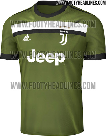
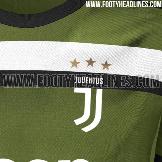
I think that's a case of the kit ruining the badge rather than the opposite. Hope we get something much nicer than that from Adidas.
 
I quite like it and would love United to update to a modernistic logo. I am probably a minority though.

I think it's nice, and would like a similar minimalistic take on the devil logo we have, but I'd stop short of replacing the club crest with it.
 
Maybe they should separate the logos for football related, and commercial use.

People might get used to the new logo, but it's more like an acceptance of 'well what can you do?' Like when United bought Fellaini.
 
I thought it was terrible at first. The more I see it, I think it's kind of slick.

Similar to the PL rebrand. I thought it was cartoony as feck. But the more I see it over everything, from their website, to TV graphics, even to the MotM award, I like it a lot.

Juve have been quite brave to be the first to do it out of the elite clubs, but you can see it having a knock on effect, and other clubs modernising their brand and imagery. Football fans in general are very resistant to change though. Like when Everton FC had to apologise to fans for the slight change they made to the badge. It's madness really. It's just a badge.
 
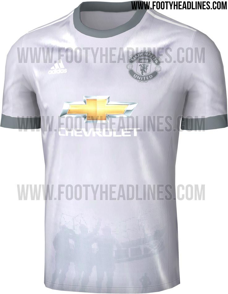
Saw it in the other thread. Dreadful, I thought that colour palette was just me not being able to work the software, but it seems it was fixed by Adidas in that silver/grey colour way. Why? Haven't we been through this before?