Minimalist
New Member
- Joined
- Dec 10, 2013
- Messages
- 15,091
They have a pretty iconic badge. This seems unlikely to continue that.
'juventus way of living'? Wtf is that?
.
Matchfixing and a strong espresso.

Don't show that to woody!!!!
Well said.Sickening.
That old Juve badge meant so much. So many Wednesday nights in the mid 90s were spent trying to overcome that badge.
The players they had. Ferrara, Di Livio, Del Piero, Conte, Pessotto, Deschamps, Davids, Zidane. What a team. What a struggle to overcome them. Then finally doing it in 99.
The old lady of Italian football has juncked her traditions for this photoshop looking garbage. Awful.
Wait till we unveil our new one and it's just a picture of Pogba.

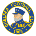
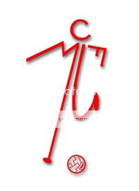
I'd say Chelsea's updated badge is a bit different, since they took most of their new logo from older badges like these two:
 =
=

Whereas Juventus went for something completely new, only retaining the stripes and name.
However, I agree about the moaning. People will get used to the new Juventus badge as well. It'll probably look decent on the shirts. Also, it's not like Juventus haven't done this before. The 80s horse logo also just retained one element of the old logo and added the club name.
Where is that old matchman man mufc logo we had in the early 90's? Time to bring it out of retirement!

Probably made a big contribution to kindergarten funds.The interesting questions are who called for a new logo, who was commissioned to create it and how much were they paid.
Hilarious stuff though.
Probably was. Would be easy to cut that into someones hair.This looks like it was designed by Pogbas barber.
But with the way things are going with brands and brand image, they are just the first, all the others will eventually follow.
It looks nice.
From a graphics design perspective though I'm not entirely sure what I can say about it, in terms of symbolism does it really say Juventus or Turin? not really.
'Disabled toilets this way'
Black stripes?
What the feck is that? I could do that in MS Paint.
I agree. It's simple yet clever at the same time.I think it's a fantastic piece of design, however I'm not sure I'd want to replace the club crest with it.
I changed my post slightly, black stripes doesn't really say Turin to me, unless there's a Turin flag I'm too lazy to research, I can see the horse from the old Juve logos in the "J" though which is maybe what they were trying to do (abstracted though) it's a bit radical for a football badge though!
 man, what an awful and lazy badge design for a club with long and great history like them. please Ed, dont ever try changing our badge design like juve.
I think it's a fantastic piece of design, however I'm not sure I'd want to replace the club crest with it.
