Juventus unveil bold new club crest at ceremony in Turin
- Thread starter KiD MoYeS
- Start date
You are using an out of date browser. It may not display this or other websites correctly.
You should upgrade or use an alternative browser.
You should upgrade or use an alternative browser.
SammyUnited_83
Full Member
- Joined
- Jun 17, 2011
- Messages
- 3,199
Agnelli: 'this is a symbol of the Juventus way of living'

It took a year to create, no wonder Pogba left.
Have you not seen Pogba new clothing line.
#07
makes new threads with tweets in the OP
- Joined
- Oct 25, 2010
- Messages
- 24,124
Sickening.
That old Juve badge meant so much. So many Wednesday nights in the mid 90s were spent trying to overcome that badge.
The players they had. Ferrara, Di Livio, Del Piero, Conte, Pessotto, Deschamps, Davids, Zidane. What a team. What a struggle to overcome them. Then finally doing it in 99.
The old lady of Italian football has juncked her traditions for this photoshop looking garbage. Awful.
Ramshock
CAF Pilib De Brún Translator
wtf are they thinking of?Tommy
bigot with fetish for footballers getting fingered
Looks shite.
One Night Only
Prison Bitch #24604
Americans by some chance?
Nope, England.
dove
New Member
- Joined
- May 15, 2013
- Messages
- 7,899
I quite like it. As someone mentioned before, it's clearly directed towards merchandise as this logo will look much better on clothing than a typical club badge.
dwd
Saturday Night Spies
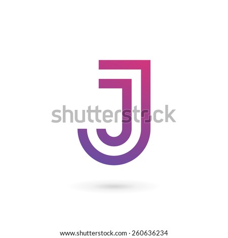
I keep reading it as JWENTUS
VorZakone
What would Kenny G do?
- Joined
- May 9, 2013
- Messages
- 37,987
I can not unsee this anymore.I keep reading it as JWENTUS
Eddy_JukeZ
Full Member
- Joined
- Aug 21, 2012
- Messages
- 17,843
It looks horrendous. I don't get why.
- Joined
- Jun 13, 1999
- Messages
- 25,582
Wow

That was one of the best around
That is a beautiful club crest. Don't see why they have to change it.
MounchesterUtd
New Member
- Joined
- May 26, 2016
- Messages
- 2,059
I for one think their old badge actually looks great in club merchandise. The new looks like one of those cheap Gameboy knockoffs that had preprogrammed games in them from the 90s.


dwd
Saturday Night Spies
The old one looked just as shite if you ask me.
Spoony
The People's President
I actually think it's quite clever.
Keeps It tidy
Hates Messi
I hope other clubs do not copy.
Untied
Full Member
- Joined
- Jun 12, 2009
- Messages
- 4,480
The old one was shit, the new one is shit
MounchesterUtd
New Member
- Joined
- May 26, 2016
- Messages
- 2,059
Hope it doesn't go over the white stripe on the kit
Yeah, I wonder how they'll do the stripes now. Will they have a black box surrounding the J lettering at all times?
Tiber
Full Member
- Joined
- Apr 22, 2014
- Messages
- 10,599
Is this a parody?
Does it not look a bit Jewish?
I'm not anti judaism in any way (more than any other religion anyway), but I doubt that's what they're looking for.
I'm not anti judaism in any way (more than any other religion anyway), but I doubt that's what they're looking for.
Scorpy
Absolutely crapping it and loving it!
spontaneus1
Hamster, damn!
Does it not look a bit Jewish?
I'm not anti judaism in any way (more than any other religion anyway), but I doubt that's what they're looking for.
Does it not look a bit Jewish?
I'm not anti judaism in any way (more than any other religion anyway), but I doubt that's what they're looking for.
You mean Hebrew?
Snow
Somewhere down the lane, a licky boom boom down
People who wear badged clothing don't care anyway. They were buying Adidas clothing already available but paying extra for the Juve brand.I quite like it. As someone mentioned before, it's clearly directed towards merchandise as this logo will look much better on clothing than a typical club badge.
It's bad and their supporters should feel bad.
Mockney
Not the only poster to be named Poster of the Year
It's not really that bad, it's just not what we expect from a conventional crest.
People will get used to it.
People will get used to it.
Raees
Pythagoras in Boots
- Joined
- May 16, 2009
- Messages
- 29,526
Not sure what to think first instinct is cool design but so anti football. Let's see it on the shirt before we judge
Fenômeno
Everything is fair game in capitalism!
- Joined
- Jan 8, 2014
- Messages
- 19,028
- Supports
- Dragon of Dojima
Agreed really nice badge the new was is fecking shite.Wow
That was one of the best around
- Joined
- Feb 2, 2016
- Messages
- 260
That looks like a logo that i made for art class about 20 years ago. It took me 30 minutes to make.
MartialsBeard
New Member
- Joined
- May 4, 2016
- Messages
- 591
Meh I like it.
horsechoker
The Caf's Ezza.

You mean Hebrew?
Quite possibly, the Js, the font, and the curves make me think of those candleholder things they have.
Clearly I know little of the subject, it's just what came to mind.
Flying_Heckfish
Full Member
Jermaine Jenas will be stocking up at their club shop.
Snow
Somewhere down the lane, a licky boom boom down
That's honestly a ground for a lawsuit. Valenica couldn't even have the bat on their new logo with the wings in a certain position because of the Batman logo.They've just cut the ends off a stock J
predator
Youth NITK
If the black followed the outline of the white bits then it would look ok. What other shape could it possibly be?
Ian Reus
Ended 14 years of Grand National sweepstakes
It's actually quite a marketable logo. So simple.
The black and white stripe(s) are there still too and of course it is the letter 'J'.
Easy to replicate too.
Anyone could look at that once and easily go outside and spray it on a wall. Easy to remember.
The black and white stripe(s) are there still too and of course it is the letter 'J'.
Easy to replicate too.
Anyone could look at that once and easily go outside and spray it on a wall. Easy to remember.

Share: