
Semper Fudge
Thinks people care when his birthday is.
- Joined
- May 3, 2021
- Messages
- 6,830
Looks fantastic.
Who are they?Snapdragon is a great sponsor.
Who are they?
Fair shout, feels much more complementary on the shirt than TeamViewer ever didFront looks great. Don’t like the back. Sponsor looks good though.

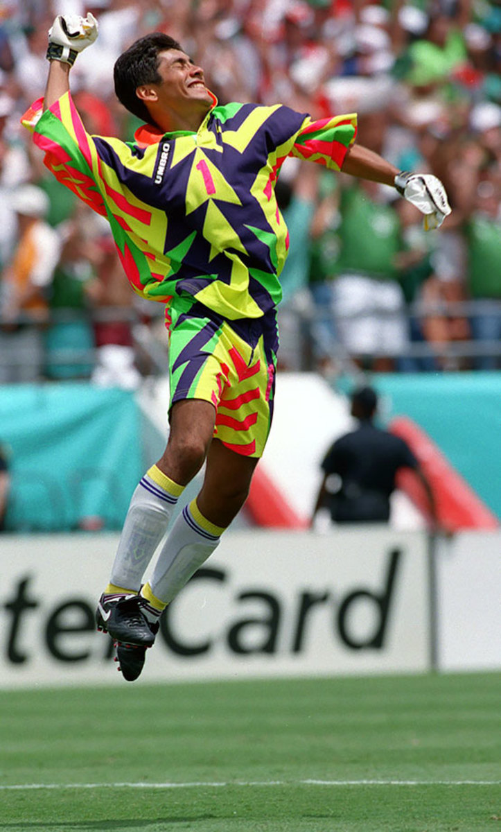
I grew up in the 80/90s where all GK kits were Picasso's wet dream, but figured the designs helped distract attackers in a 1 on 1.The GK kit is hideous - looks like some kids art project. Loved the black one from last season.
I grew up in the 80/90s where all GK kits were Picasso's wet dream, but figured the designs helped distract attackers in a 1 on 1.
In fact, the English Hockey League banned goalkeepers from wearing anything other than a solid colour top for that reason
Who are they?
At least that's symmetrical, Schmeichel's one's were mentalJorge Campos!!
Jorge Campos!!
Guess the black GK top is the away then?
Was a solid 4 for me initially but in the official pictures now I'd give it a 6.
Still hate the template across Adidas kits for this summer and upcoming season but they didn't get much else wrong outside of the side stripe.
Guess the black GK top is the away then?
Yeah, with the gradient it looks like even the players have a beer belly. Horrible addition to an otherwise fairly bland kit.Looks like a solid kit, but the gradient towards the bottom is unnecessary. The goalkeeper one is hideous.
Plus inspiring or unispiring looking sponsor signs.This fuss about shorts is something I can't even begin to understand.
I'll never forget the Chevy sponsorship. Anytime you don't like a new sponsor, just think back to the Chevrolet crap.Plus inspiring or unispiring looking sponsor signs.
When does the away kit drop?

That is dumb.Utd usually stagger these horribly so probably late July, early August. Then the third kit will come out after the season has started. So dumb.
There's a reason they aren't promoting the back view of the kit. What a mess.
(Didn't think the pic would be that big)
Orange? I can't see any orange on it.I like the kit, the orange spoils it.