IrishRedDevil
Not! Ruben's caf account. Honest!
I like it. Needs to be short sleeves though.
Yep. That was meant to be casual wear and all. They're football kits and only really odd people wear them trying to look cool.It's going to last as long as that grey kit from 96.
I like it. Needs to be short sleeves though.
A friend suspects the badge on the third kit is gradually being introduced to get rid of the traditional badge as it has an image of a slave ship on it.

When I saw leaked pics a few months back I thought it was black and white stripes.That's genuinely the worst shirt we've had in the last 20-25 years from my memory.
That green kit will look horrible on the football pitch but very suave off it. Will be a best seller among fans, will look very nice paired with a pair of trousers, nice casual look.
Is this a wind up?
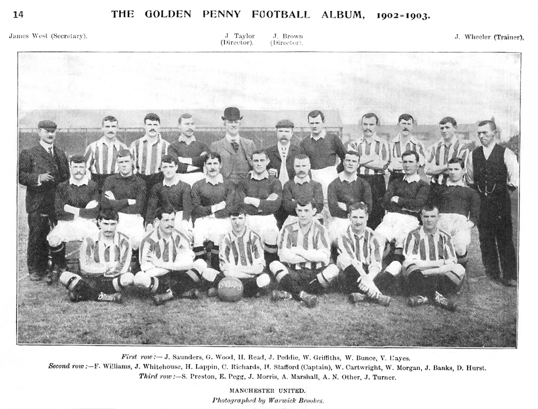
Wes Brown and Forlan looking good in the kit
A friend suspects the badge on the third kit is gradually being introduced to get rid of the traditional badge as it has an image of a slave ship on it.
Without wanting to get into that discussion, i don't believe that's the intent. With all the globalization and full commercialization of football, it seems we're heading toward an era of mega "football entities" that are global franchises more than they are football clubs any more. And franchises usually want people to associate them with a simple yet eye-catching symbol. Like that little devil. I also don't think it's a coincidence that the last big change on the badge was the removal of "football club" in 1998. We've been going down the route for quite some time now. Juventus and Inter are already ahead of us.
That green kit will look horrible on the football pitch but very suave off it. Will be a best seller among fans, will look very nice paired with a pair of trousers, nice casual look.
A friend suspects the badge on the third kit is gradually being introduced to get rid of the traditional badge as it has an image of a slave ship on it.

Slave ship?! Any more detail on this?
Thanks. So not exactly a slave ship, but more a ship that represents an industry that benefited from the use of slaves and exploitation during colonial times. Yeah, I can't imagine it will be on the crest much longer in this case.
That's genuinely the worst shirt we've had in the last 20-25 years from my memory.
Thanks. So not exactly a slave ship, but more a ship that represents an industry that benefited from the use of slaves and exploitation during colonial times. Yeah, I can't imagine it will be on the crest much longer in this case.
I remember the older crest that used to have two little football boots either side of the top banner. Used to love that little bit of detail as a kid
Is this a wind up?
Don't expect you to know anything about fash-hun.
Admiral era shirts around 1977 had the boots on them. All adidas did was add their three stripes to them in 1984.That's right, I remember the boots myself too on the crest, I think that was an Adidas thing in the 80s and I was a bit annoyed that we didn't go back to that when Adidas started making our kits again in 2015.