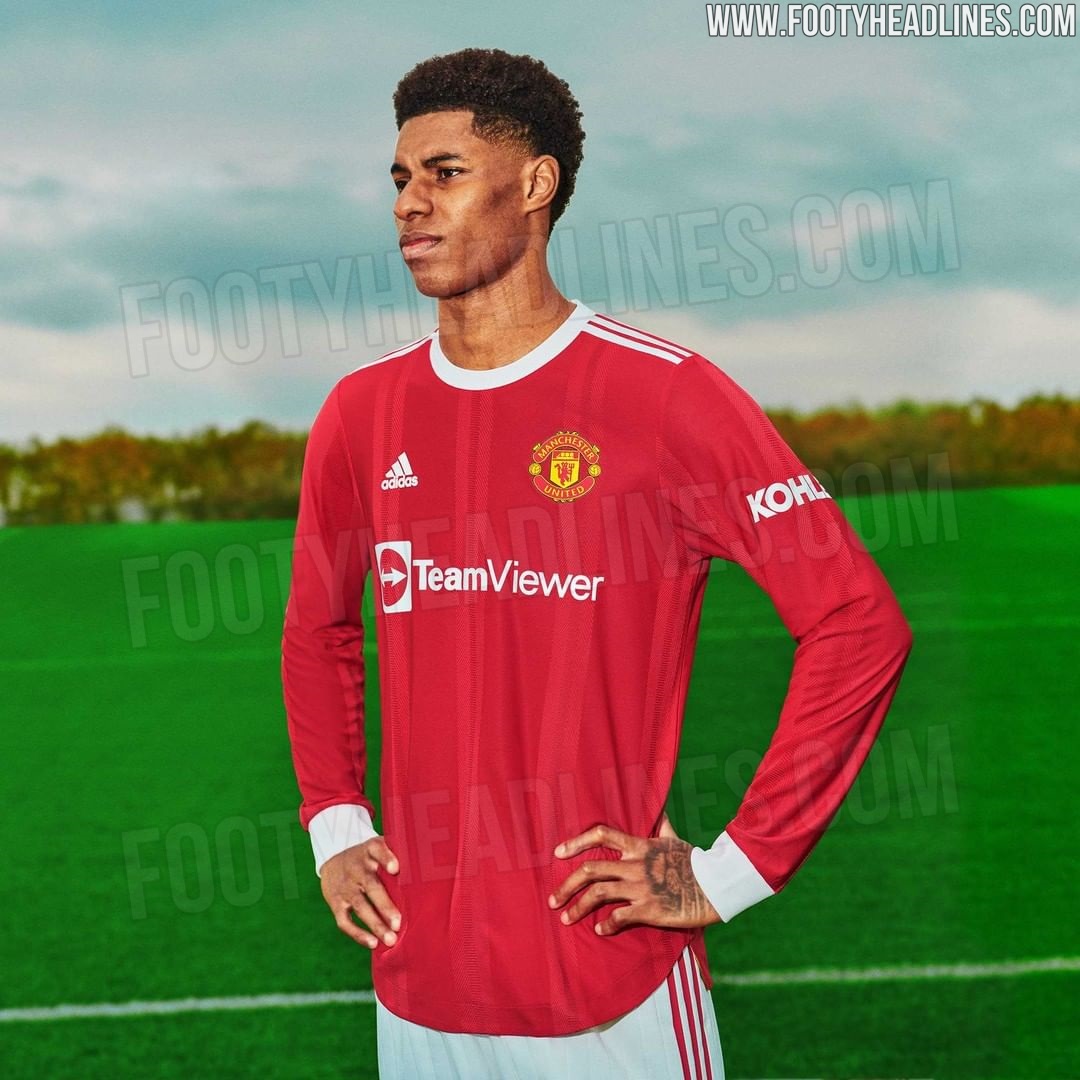
New Kits 23/24
- Thread starter Samid
- Start date
You are using an out of date browser. It may not display this or other websites correctly.
You should upgrade or use an alternative browser.
You should upgrade or use an alternative browser.
Andy_Cole
Full Member
Shock. Horror. Our home kit actually looks good when on a player.
Adam-Utd
Part of first caf team to complete Destiny raid
- Joined
- Sep 10, 2010
- Messages
- 39,946
I like the home clean. Prefer that 'clean' style to the crazy designs we've had over the last few years.
Maybe could do with a little more detail in places, i'd like maybe black/white/red in the sleeve endings but i'm certainly not unhappy with it.
Maybe could do with a little more detail in places, i'd like maybe black/white/red in the sleeve endings but i'm certainly not unhappy with it.
horsechoker
The Caf's Ezza.
Has quite a classic feel about it.

https://www.footyheadlines.com/2020/12/manchester-united-21-22-home-kit-info.html
Nice to see long sleeves coming back.
Someone will moan there isn't a dragon on it or something.
bosnian_red
Worst scout to ever exist
Yeah the subtle stripe thing saves it and makes it look quite good IMO.
Castia
Full Member
- Joined
- Jun 18, 2011
- Messages
- 19,676
Love the new kits. The red one on the players looks class.
Plant0x84
Shame we’re aren’t more like Brighton
Oh yes. Retro as feck. Love the stripes that mess with your eyes and make you think you are seeing things. Much better than any of the mock ups. Could use a dragon on it though.
Even better, Pogba is modelling which obviously means he is going nowhere.
Even better, Pogba is modelling which obviously means he is going nowhere.
Even better, Pogba is modelling which obviously means he is going nowhere.

DomesticTadpole
Doom-monger obsessed with Herrera & the M.E.N.
That was what I was going to say. Slightly old fashioned, which is a compliment. Not gimmicky, which ends up making a kit look ghastly. Boring is good.Has quite a classic feel about it.
Someone will moan there isn't a dragon on it or something.
Kearnkoff69
Full Member
I quite like the new home kit. As others have said, the subtle stripe lends it a little bit of pop and the large white cuffs look excellent particularly on the long sleeve version. It’s the kind of kit that won’t look dated when people ten years from now see footage of this season.
Bubz27
No I won’t change your tag line
- Joined
- Aug 17, 2009
- Messages
- 22,079
That was a photoshop. An official one but still, he technically didn't pose in the new kit.
Plant0x84
Shame we’re aren’t more like Brighton
I don’t think that’s a modelled promo shot though. Funnily enough I got Ronaldo vibes from the new kit pics, particularly the one of Marcus. There’s still time to sign him up!
The United Irishman
"Martial is championship material at best"
That new home kit is beautiful. Simple, classy, and kind of retro. Perfect. I haven't bought a shirt in years but I will but that.
horsechoker
The Caf's Ezza.
Buying the kits is supporting the Glazers.That new home kit is beautiful. Simple, classy, and kind of retro. Perfect. I haven't bought a shirt in years but I will but that.
The United Irishman
"Martial is championship material at best"
Like I said I haven't bought one in years and I need a new shirt for playing footy. It's your prerogative if you don't want to and I'll not have any qualms about that.Buying the kits is supporting the Glazers.
Pink is never a go to but grey wasn't that bad actually.Don't like any of our kits and that away kit is one of the worst kits I've ever seen at a top 20 club, just horrible.
The pink and grey kit in recent years are 100x nicer than these, and they were quite heavily criticised.
Judas
Open to offers
Pink is never a go to but grey wasn't that bad actually.
Why not? Our pink kit was great, not nearly as nice as the Juve one of a few years ago, but a decent effort.
Rolaholic
Full Member
- Joined
- Aug 1, 2016
- Messages
- 13,339
Loving the throwback look to the home kit, especially the long sleeved version
Pink is a girls' colour. Last time I checked these kits are for our male players. Bla bla bla backward bla bla bla obviously. You ask me, I answerWhy not? Our pink kit was great, not nearly as nice as the Juve one of a few years ago, but a decent effort.
Carl
has permanently erect nipples
- Joined
- Mar 6, 2008
- Messages
- 45,959
Buying the kits is supporting the Glazers.
Not when you buy it from China.
Paxi
Dagestani MMA Boiled Egg Expert
- Joined
- Mar 4, 2017
- Messages
- 27,669
Hopefully it will bring us similar success.That new red kit is lovely. It’s pure 07-08 nostalgia.

- Joined
- Jan 23, 2019
- Messages
- 385
Me too, probably vecause of the long sleeves and they have similar figures.I don’t think that’s a modelled promo shot though. Funnily enough I got Ronaldo vibes from the new kit pics, particularly the one of Marcus. There’s still time to sign him up!
AjaxCunian
vexingwijsneus
- Joined
- Mar 10, 2021
- Messages
- 4,886
- Supports
- Ajax & United
I really wish it looked like this, this is a perfect kit.That new red kit is lovely. It’s pure 07-08 nostalgia.

fergosaurus
Full Member
- Joined
- Mar 24, 2013
- Messages
- 4,454
I like this the more I see it!
This is gorgeous. The home kit is nice too but a bit meh (which is better than overcomplicating things).
welshwingwizard
Full Member
I really wish it looked like this, this is a perfect kit.
It maybe nostalgia but I thought all the AIG sponsored shirts were amazing.
Judas
Open to offers
That new red kit is lovely. It’s pure 07-08 nostalgia.

Last shirt of ours I owned, seen no reason to ever buy one since. It was the peak, same with the black away kit from that year.
ClaytonBlackmoorLeftPeg
Full Member
- Joined
- May 22, 2017
- Messages
- 13,248
But do they look good on middle aged men with beer bellies?Shock. Horror. Our home kit actually looks good when on a player.
I don’t like the synergy of the sponsor. Would prefer their logo central, then the words Team Viewer underneath - but I obviously that’s not the way they do it.
So players go from getting a complimentary car, to a shitty app, that they won’t ever use

- Joined
- Oct 27, 2011
- Messages
- 325
We'll have to wait and see but I'm almost positive those stripes on the shirt will only be on the player versions that cost close to £100 and not the fan ones
pseudo_canadian
Full Member
Love the look of the home kit. Clean and classic.
GledTheRed
New Member
We'll have to wait and see but I'm almost positive those stripes on the shirt will only be on the player versions that cost close to £100 and not the fan ones
No they won't.
Deery
Dreary
- Joined
- May 21, 2019
- Messages
- 18,590
It just looks like a top you’d pull on laying about the house doesn’t look like a £70 top…
Judas
Open to offers
To be fair anyone who spends 70 quid on football shirts in 2021 is a silly billy when there are so many cheaper options openly available.
Castia
Full Member
- Joined
- Jun 18, 2011
- Messages
- 19,676


https://www.footyheadlines.com/2020/12/manchester-united-21-22-home-kit-info.html
Nice to see long sleeves coming back.
You aren’t getting much better than that, easily the best home kit in years.
In today’s modern game with sponsors etc it’s about as ‘clean’ and retro as it can be. Absolutely brilliant kit in my opinion.
- Joined
- Oct 27, 2011
- Messages
- 325
No they won't.
So far none of the leaks of the fan version have the stripes but obviously they could be wrong
You can see in posts 1150 and 1055 there's no stripes on those fan versions, the ones from today are the more expensive HEAT.RDY version
Last edited:
Some details from the replica kit:


GledTheRed
New Member
So far none of the leaks of the fan version have the stripes but obviously they could be wrong
You can see in posts 1150 and 1055 there's no stripes on those fan versions, the ones from today are the more expensive HEAT.RDY version
The design won't be different, the material and the fit will be.
They are fake mock ups.So far none of the leaks of the fan version have the stripes but obviously they could be wrong
You can see in posts 1150 and 1055 there's no stripes on those fan versions, the ones from today are the more expensive HEAT.RDY version
KennyBurner
New Member
From the pictures I saw on twitter the kit needs more red. Its too light.
RedDevil@84
Full Member
Looks lovely.
Opens new tab and types dhgate.....
Opens new tab and types dhgate.....
Share:
