decorativeed
Full Member
Now that was a shit kit. Absolutely hated it.I like it a lot.
2018/19 Home?

Now that was a shit kit. Absolutely hated it.I like it a lot.
2018/19 Home?
Your country pioneered double denim. By association you don't get a say.
Kit looks great.
What do you expect, we have never won a league title in Adidas.
I expect a lot from Adidas. Was a big fan of theirs for most of my life but they've been losing it steadily since about 2010.
Nah, it's an improvement over the Chevy logo. It is only just slightly less shit though.It’s not as bad as people are saying, but the new sponsor looks like crap. I honestly preferred the Chevrolet logo.
Their 3rd kit isn't any better.

Nike have made some bizarre kits for next season.
Damn.
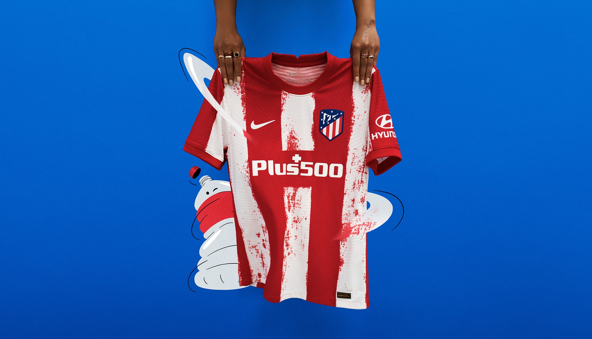
I'm a fan, very clean and simple retro look and the sponsor finally isn't an eyesore anymore
Quite like the new Atletico kit. Way better sponsor integration after last season's awful effort. (Can't post images yet)

Arsenal say HiWhat do you expect, we have never won a league title in Adidas.
Back to Umbro!What do you expect, we have never won a league title in Adidas.
Arsenal say Hi
Back to Umbro!
The away shirt is white and lighter blue, and the third shirt is black and darker blue. Throwbacks it seems to the away kits from 1990-1992 (http://www.historicalkits.co.uk/Manchester_United/images/manchester_united_1990-1992-change.gif) and 1993-1995 (http://www.historicalkits.co.uk/Manchester_United/images/manchester_united_1993-1995-change.gif).So our 2 away jerseys are both blue?
That's a thing of beauty, I miss Nike. Adidas has never been as good for United as they are for Bayern / Real. Made some fantastic kits for them over the years.Here ya go (agree on the sponsor integration, by the way):

Wait, we’re already at the “the fade to black kit was good actually” stage of nostalgia revisionism? Bloody hell.
Nah, some tiny minority liked it then and they continue to have no taste today, more like. I hated that kit when it came out and I hate it now. It was a shocking design just considering the shirt, but add the black shorts and red socks and it just wasn't a United kit.Wait, we’re already at the “the fade to black kit was good actually” stage of nostalgia revisionism? Bloody hell.
Arsenal say Hi
Yeah it was terrible, don't remember many liking it at the time.Wait, we’re already at the “the fade to black kit was good actually” stage of nostalgia revisionism? Bloody hell.
Nah, some tiny minority liked it then and they continue to have no taste today, more like. I hated that kit when it came out and I hate it now. It was a shocking design just considering the shirt, but add the black shorts and red socks and it just wasn't a United kit.
Everyone was desperate to get rid of the Chevy logo for something white and simplistic and now we have that people are still moaning.
The kits look fine.
