Judas
Open to offers
Also, the caf's obsession with all black kits. One thing everyone agrees on here is that kits should be all black and without any logos or sponsors, so basically a plain black tshirt.
Exactly right.
Also, the caf's obsession with all black kits. One thing everyone agrees on here is that kits should be all black and without any logos or sponsors, so basically a plain black tshirt.
Yes. That sounds perfect.Also, the caf's obsession with all black kits. One thing everyone agrees on here is that kits should be all black and without any logos or sponsors, so basically a plain black tshirt.
Gotta love a referees uniform!Also, the caf's obsession with all black kits. One thing everyone agrees on here is that kits should be all black and without any logos or sponsors, so basically a plain black tshirt.

Wait, we’re already at the “the fade to black kit was good actually” stage of nostalgia revisionism? Bloody hell.
Looking forward to going to Anfield in that and giving Liverpool a slap.I like this the more I see it!
Yeah. I like everything else about the kit, but that color clash ruins it for me.The red on the blue hurts my eyes.
That 18/19 home kit with the fade into black was probably my most disliked home kit ever from us. So ugly and came with a horrible season too.
Not a fan of any of the 3 really. The sponsor is boring but that's not a huge deal, the kits themselves just look mediocre IMO. Our 17/18 kit was probably my favourite home shirt since the 07-09 home shirt. 19/20 also quite good IMO.
I like this the more I see it!


I like this the more I see it!

Also, the caf's obsession with all black kits. One thing everyone agrees on here is that kits should be all black and without any logos or sponsors, so basically a plain black tshirt.
I sacrifice a goat everyday in thanks that Chevrolet is no longer on the United jersey.


Bayern always get nice kits while we get utter tripeBayern Munich’s away kit is the one. I hope one day United get something similar.


Bayern always get nice kits while we get utter tripe
That settles it thenThat shirt is bang average and looks tacky with the gold. United get plenty of nice kits.
That Dortmund kit that was all black was totally fire though.Also, the caf's obsession with all black kits. One thing everyone agrees on here is that kits should be all black and without any logos or sponsors, so basically a plain black tshirt.
Tbf it probably says more about those people's taste than the zebra kits being good-looking. They were and are ultra crap.Remember the zebra one having same reactions then people starting liking it once seeing it worn especially without the shorts
That settles it then
Bayern Munich’s away kit is the one. I hope one day United get something similar.


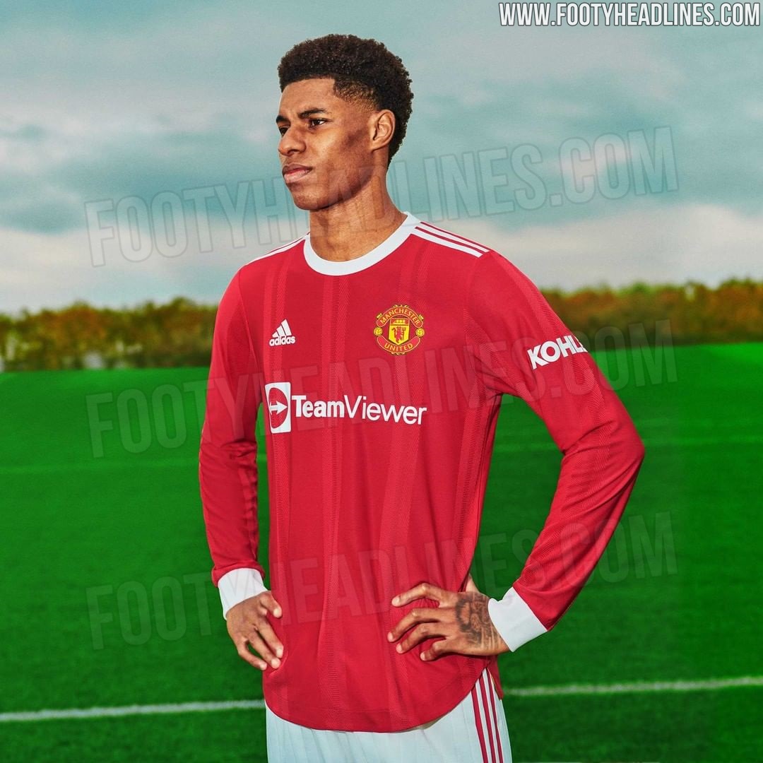
Spot on, I really like it.It's not plain red is it? There's a subtle shine stripey thing going on.
From a distance, looks as close to a retro classic kit you'll get these days with sponsors on.
I really, really love that. Nice and simple.https://www.footyheadlines.com/2020/12/manchester-united-21-22-home-kit-info.html
Nice to see long sleeves coming back.
I like this the more I see it!
