horsechoker
The Caf's Ezza.
So if she came up to you you'd tell her to feck off?Why does she have that kit tucked in like that? She’ll look like a right twat cutting around like that.
So if she came up to you you'd tell her to feck off?Why does she have that kit tucked in like that? She’ll look like a right twat cutting around like that.
No. No, I would not.So if she came up to you you'd tell her to feck off?
Why does she have that kit tucked in like that? She’ll look like a right twat cutting around like that.
I like
Spurs new away kit is awful. Looks like a wetsuit.
Why does she have that kit tucked in like that? She’ll look like a right twat cutting around like that.
So if she came up to you you'd tell her to feck off?
AFC Wimbledon's away kit is sexy this year. Obviously clashes with the home one but ah well.

Deleted scene from Hotline Bling?
The feck is this

The feck is this

The feck is this
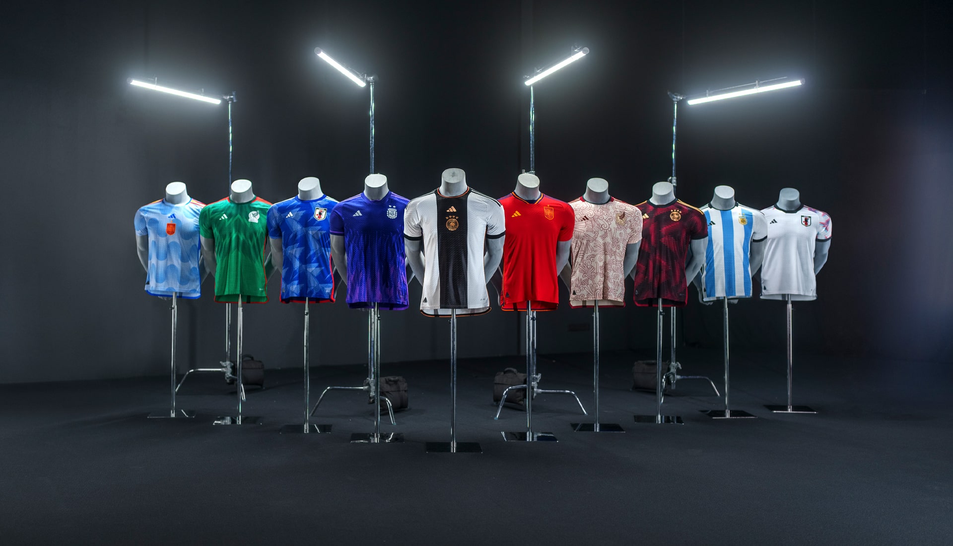
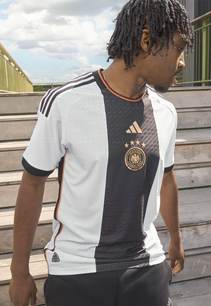
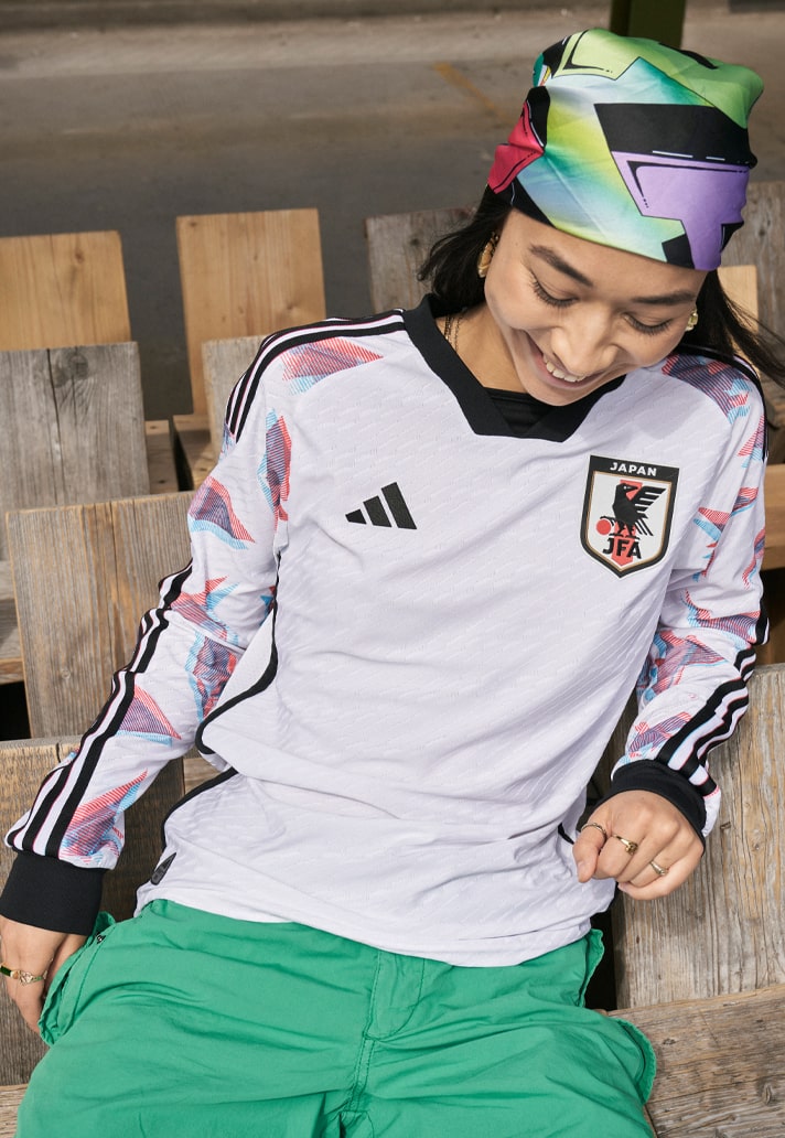


Vorsprung durch TechnikThat Germany kit looks like the designer carefully laid down the shirt and let his brother driver his Audi over it thus creating a perfect line in the middle reminiscent of a tyre mark

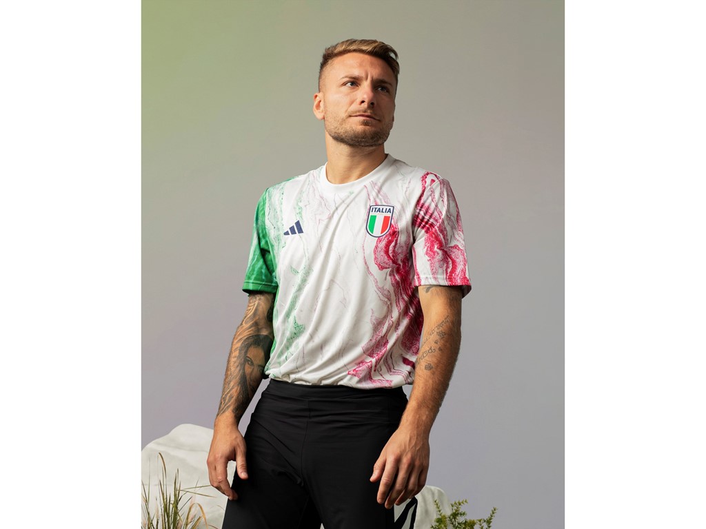
The white one is a training shirt. The actual away kit is very nice but that home one is an all time classic, its perfectItaly now sponsored by Adidas


https://news.adidas.com/football/ad...-the-s/s/baf3fbaf-dcbe-4fc0-b89e-4e3922b15ec9
The white one is a training shirt. The actual away kit is very nice but that home one is an all time classic, its perfect

That blue one thoughMarble counter top

They really have to drop this 3 stripes on very shirt abomination. I know it’s their identity and have always done that way but it makes their shirts so predictable and boring. A small three striped logo is enough on the shirt. Take off that three striped everytime all the way down and there would be plenty of innovative room open up.Iconic for bayern perhaps. Everytime I see an adidas kit it looks like bayern. Adidas have no innovation.
Gotta leave space for them sponsors...Hate the fact the stripes stop half way down the sleeve, would look a lot better if the stripes carried on to the cuff.
It’s not for the sponsors, it’s for the competition badgesGotta leave space for them sponsors...
It definitely ruined the classic home shirt.They really have to drop this 3 stripes on very shirt abomination. I know it’s their identity and have always done that way but it makes their shirts so predictable and boring. A small three striped logo is enough on the shirt. Take off that three striped everytime all the way down and there would be plenty of innovative room open up.
They really have to drop this 3 stripes on very shirt abomination. I know it’s their identity and have always done that way but it makes their shirts so predictable and boring. A small three striped logo is enough on the shirt. Take off that three striped everytime all the way down and there would be plenty of innovative room open up.
