New Kits 23/24

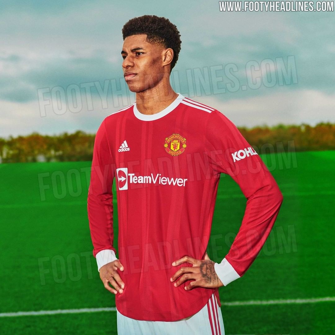
You aren’t getting much better than that, easily the best home kit in years.

In today’s modern game with sponsors etc it’s about as ‘clean’ and retro as it can be. Absolutely brilliant kit in my opinion.

yeah i like it.

very clean.

Not having that brash, hideous Chevrolet logo helps.
 
Home kit is good, away kit looks decent. Will be buying from dhgate because feck the Glazers.
 
Some details from the replica kit:

manchester-united-21-22-kit-5.jpg

manchester-united-21-22-kit-7.jpg

That's actually the player version of the kit. The replica does not have the stripes, which is very odd, and the collar is a lot less detailed. Very weird to have such big differences from the two versions, yet they will both cost a shit load.
 
Why not? Our pink kit was great, not nearly as nice as the Juve one of a few years ago, but a decent effort.

I'd completely forgotten we had a pink kit. It was only 2 years ago.
 
The design won't be different, the material and the fit will be.

They are fake mock ups.

I guess we'll find out soon enough but its definitely becoming a trend where the player/fan versions are differing more every year.

I cant post links but if you go to utdreport twitter you'll see they just posted the fan version and it doesn't have the stripes, maybe someone can post those pictures
 
Last edited:
Bring back Nike. Adidas giving us these dead kits whilst Arsenal doing up fashion shoots.
 
That new red kit is lovely. It’s pure 07-08 nostalgia.
VrOKbnFy.png
It looks absolutely nothing like it. That 07 kit is my favourite kit ever. The new one looks pretty bad to me. I don't like it.
 
One of the best home kits we have had in a while. I don’t quite get the complaining here. I’ve seen numerous posts over the years about how everyone wants a classic kit with 3 stripes on the shoulders. Adidas did just that with this kit. What more do we want?
 
One of the best home kits we have had in a while. I don’t quite get the complaining here. I’ve seen numerous posts over the years about how everyone wants a classic kit with 3 stripes on the shoulders. Adidas did just that with this kit. What more do we want?
Just plain red, no big ugly white collar or cuffs on the sleeves. And I don't like the new sponsor. Just because it's white doesn't mean it looks good. It looks cheap to me. Who the hell designed that logo? I could design that in 5 minutes on Microsoft paint.
 
too much white on it and not enough black, if were choosing only one secondary colour id rather its black.

To me the sponsor ruins it a little with its awful lopsided logo, wish the. logo was above the writing if that makes sense, (obviously just the lettering would be better.

Kit looks more like a Bayern, Benifa kit to me than Man utd
It's classic United. Basically a remake of our 1961-1971 home kit. If it looks like Bayern and Benfica, it's because they wore the same colours as us.

8f551e91a1a589050a15a9c7f6de5ca1.jpg

Agree on the sponsors logo though. It's an improvement on Chevy, but not a massive one.
 
I guess we'll find out soon enough but its definitely becoming a trend where the player/fan versions are differing more every year.

I cant post links but if you go to utdreport twitter you'll see they just posted the fan version and it doesn't have the stripes, maybe someone can post those pictures
I'm just saying don't take it as gospel just yet. A lot of fakes, that are very close to the final jersey but slightly off, fly around every year until the jersey's are fully released. They're usually based on information about the kit, so they're very close but not quite 100%
 
Yep agreed. It was and is an abomination.

United have often wore black shorts with a red shirt away from home. It has always looked great. The problem with the 18-19 kit wasn’t the break from the tradition of wearing white shorts at home. It was the design was mental.
 
United have often wore black shorts with a red shirt away from home. It has always looked great. The problem with the 18-19 kit wasn’t the break from the tradition of wearing white shorts at home. It was the design was mental.

I don't have an issue with black shorts the odd time. It was that weird train track fade-out design that made the shirt ugly as feck. Happy with the new home one though. The new sponsor isn't amazing but at least it isn't a big gold fanny pad.
 
I'm just saying don't take it as gospel just yet. A lot of fakes, that are very close to the final jersey but slightly off, fly around every year until the jersey's are fully released. They're usually based on information about the kit, so they're very close but not quite 100%

Oh I'm definitely not taking them as gospel its just Nike/Adidas etc etc seem to be putting more changes between the fan/player versions each season, its pure greed imo.

The most recent leaks of the fan version (post 1332) which were supposedly bought in official stores in the US haven't had those stripes but we'll sure find out soon enough.
 
It's much better with Team Viewer. Not the best, but way way better.

Shirt itself is lovely.
 
Some people like to complain for the sake of it.

This kit is simple and beautiful.
 
That new red kit is lovely. It’s pure 07-08 nostalgia.
VrOKbnFy.png
It looks absolutely nothing like it. That 07 kit is my favourite kit ever. The new one looks pretty bad to me. I don't like it.
That 07-08 kit is the best kit we have ever had, period. Stunning.

I bought two on e-bay because I lost the one I bought 07-08 season. Gives me CR7 vibes as well :drool:
 
Something about the home shirt gives me Sunday League vibes. The sponsor just looks cheap.
 
Love the long sleeved version, very retro.

Anyone seen the new Hull City FC away kit?

Anyone that likes black out kits will go wild for it.......