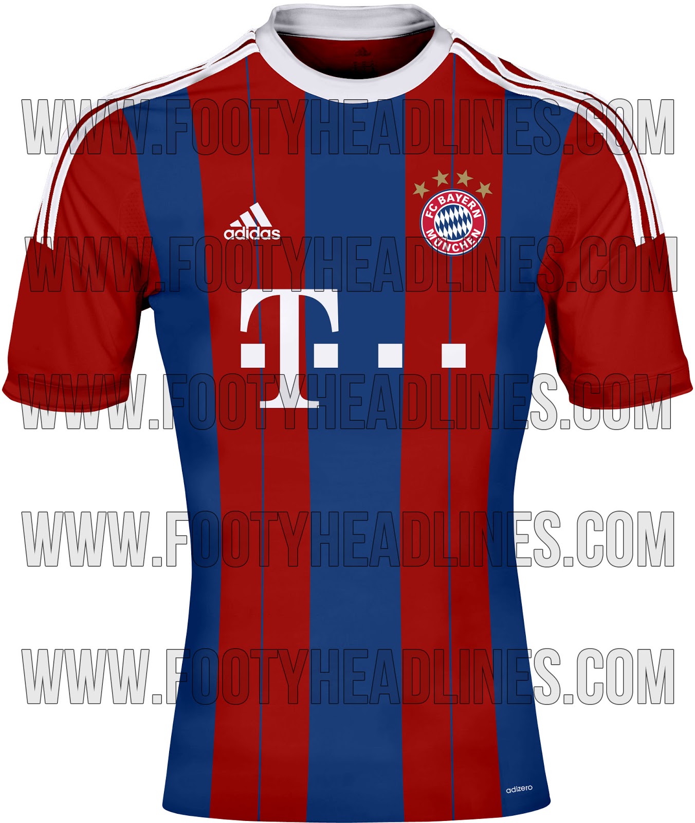
The New Kits Thread

What has that got to do with anything Scottish may I ask?. I cannot imagine that going down well in the mean streets of Glasgow :lol:
 
BhakBusCQAAlT0F.jpg


http://www.101greatgoals.com/blog/r...d-kit-for-201415-already-on-sale-in-thailand/

Dortmund-esque.
 
I guess if they really want to make the logo yellow inside then that's as good as it's getting... Although what is with our insistence on this checkered design? Make it stripes or hoops or something. Although the fading is done pretty well.
Basically despite the initial what the hell moment when you first see that, it does look half decent. Black kits usually do look great to be fair.
 
I know what you mean. I really should hate it, it's pretty awful, but for some reason my brain is registering it as alright. It helps that I've always quite liked those colours.

Objectively, it's terrible.
 
I know what you mean. I really should hate it, it's pretty awful, but for some reason my brain is registering it as alright. It helps that I've always quite liked those colours.

Objectively, it's terrible.
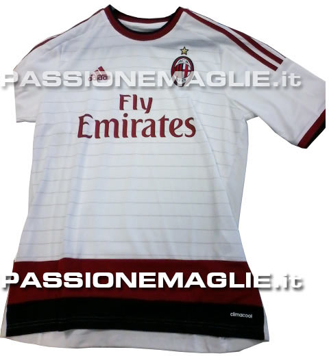
Yeah its a bit weird really. At first glance you just think "What the feck is that?". But then looking at it for a few more seconds you start thinking that actually looks pretty good. I think the yellow and black colours mix really well on the kit, and I guess it makes the horrid logo not that noticeable.
 
Last edited:
Yes, that's a point. If we've designed an entire kit around the idea of making the Chevrolet logo look less shit, then that's fine by me.
 
I really don’t mind that kit. Something totally different, though doesn’t exactly strike me as a United kit, but it works well with the chevron logo if that has to be in colour. Hopefully our other kits don’t have the logo in colour though.
 
If it is a fake they should drop whatever they are planning and go with this one, its gorgeous IMO
Aye, tis gorgeous. But two reasons it's not real

1. like LCK said, wrong badge, besides it's made in Fantasy Football template.
2. The "Fly Emirates" logo would never be that dark. Your eyes are supposed to be drawn to the sponsor, rightly or wrongly
 
I really don't want to see us play in bumblebee colors. Bad idea all the way around.
 
Portugal alternative kit for the World Cup. Better than the main one.

486868


Veloso_PNTaway_large.jpg


Ronaldo_PNTaway_large.jpg
 
Bayern+M%C3%BCnchen+2014-15+Third+Kit.jpg


Bayern+14-15+Home+Kit.jpg


Love the CL kit they have.. Bit confident them thinking they will have the winners badge though. Have they not seen who stands in their way in the QF's?
 
They keep the FIFA World Club Champions badge until the next World Club tournament is help next winter.
 
The problem with all these stupid kits, are that they don't look as good on me as they do on players. Kit manufacturers should work on that!!
 
That's the club world cup badge. When we won it, we wore it on our kit the following season.
We were the first club to wear it, and the English FA is the only FA that has blocked their teams from wearing the badge in domestic competitions. Typical of the English FA.