Snarky comments about its mother.What else would we burn it with?
The New Kits Thread
- Thread starter Plan M
- Start date
You are using an out of date browser. It may not display this or other websites correctly.
You should upgrade or use an alternative browser.
You should upgrade or use an alternative browser.
20solskjaer
Full Member
- Joined
- Dec 7, 2005
- Messages
- 3,447
Am i the only one who think the yellow/black checked kit looks like a training top?
Swearengen
I'm 19, but old skool
If true

Elliott
Likes Loan Stickies
- Joined
- May 7, 2004
- Messages
- 12,136
What's wrong with that? The shade of red? Looks good otherwise.
Heardy
Full Member
I thought the Liverpool badge was just changed for the season? Is the Gold Liverbird/LFC a permanent change on their kits now?
Wittmann45
Full Member
United is about to have a giant-ass hood ornament on the front of their kit, glass houses and all that
Swearengen
I'm 19, but old skool
It looks awful imo.What's wrong with that? The shade of red? Looks good otherwise.
- Joined
- Jan 3, 2009
- Messages
- 46,352
Don't like the curved lines on the Liverpool shirt. But it's not awful.
Can't decide on the black/yellow United one. I kind of hate it but think it might look alright on the pitch when it's moving about.
Why do Milan/Bayern/other teams get such nice ones?
Can't decide on the black/yellow United one. I kind of hate it but think it might look alright on the pitch when it's moving about.
Why do Milan/Bayern/other teams get such nice ones?
johnny boy
Liverpool Fan
- Joined
- Jan 9, 2011
- Messages
- 3,226
- Supports
- Liverpool
I think it looks okay would have preferred a proper collar , wouldn't say it was awful, that said Warrior on the whole have been pretty average.
Away kit is apparently all yellow which is encouraging given the current away kit we have.
Away kit is apparently all yellow which is encouraging given the current away kit we have.
christy87
Full Member
- Joined
- Jun 22, 2012
- Messages
- 7,379
- Location
- Chelsea manager soccermanager
- Supports
- Dipping tea in toast
It's that way for the last 2 kits now I think they have the flames on the back of the neck with 96 Inbetween the flames, as for that kit it's a bit shit, but at least warrior makes each seasons kit look drastically different for better or worse.I thought the Liverpool badge was just changed for the season? Is the Gold Liverbird/LFC a permanent change on their kits now?
Cheech Wizard
Liverpool fan
It's not bad, a bit training top like.. would of preferred a collar on it though. I've always liked the change of warriors home shirt in recent seasons, with the retro crest instead of the other one.
It's the away kits from them they produce which are horrendous. The god awful scuba diving and clown kit are recent examples.
It's the away kits from them they produce which are horrendous. The god awful scuba diving and clown kit are recent examples.
KiD MoYeS
Good Craig got his c'nuppins
Warrior do shite kits, I hope they don't go near us.
johnny boy
Liverpool Fan
- Joined
- Jan 9, 2011
- Messages
- 3,226
- Supports
- Liverpool
Warrior do shite kits, I hope they don't go near us.
I agree overall, though their first LFC home kit was good.
Seen some designs on forums that are much better than what Warrior have come up with - they should take note.
To be honest United's Nike one's of late haven't been great have they?
Brightonian
Full Member
I agree overall, though their first LFC home kit was good.
Seen some designs on forums that are much better than what Warrior have come up with - they should take note.
To be honest United's Nike one's of late haven't been great have they?
I quite like the current home kit, and was a big fan of the 2011-12 one. It was mainly the 2012-13 'gingham' aberration which left United fans a bit disillusioned with Nike. And for me, it wasn't even the pattern that was the main problem with that kit, it was the shitty cut and the shiny, cheap-looking 'recycled bottles' material. I'm hoping they've learnt their lesson from that one and steer clear of gimmicks with the home shirt as much as possible from now on.
Last edited:
ArmandTamzarian
Full Member
Aye its a pretty bland effort from Warrior, I always hate football shirts that just have a round plain t-shirt style collarI think it looks okay would have preferred a proper collar , wouldn't say it was awful, that said Warrior on the whole have been pretty average.
Away kit is apparently all yellow which is encouraging given the current away kit we have.
a_devil_inside
Big footed hermaphrodite
It's not awful or anything but just kind of looks like something a team in League 2 might wear
Wayne's World
Full Member


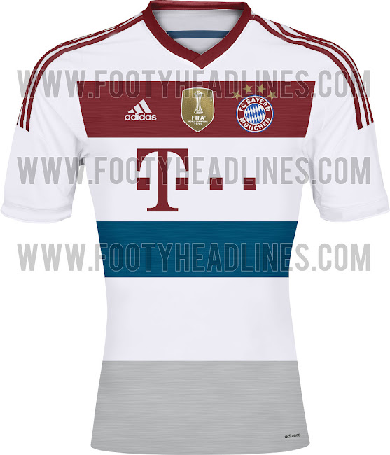
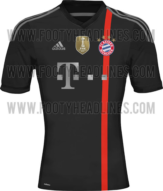
Loving the Bayern kits for next season, real classy
Igor Drefljak
Definitely Russian
The top one is nice, but I dunno if I like it, if you get me lol.
The black one looks amazing. I just wish we could come even close to something like that.
Our kits are always going to struggle to look good with this Chevvy logo though
The black one looks amazing. I just wish we could come even close to something like that.
Our kits are always going to struggle to look good with this Chevvy logo though

TheRedDevil'sAdvocate
Full Member
Juventus 1st and 3rd kit. The 2nd will be blue with 2 yellow stripes on the sleeves. Their 3rd kit is one of the ugliest i've ever seen... Guess they must feel lucky they're changing to Adidas from 2015-16.


One Night Only
Prison Bitch #24604
Sure it's not their keepers?
Earthquake
Pokemon expert
Maybe they're just fans of Van Gerwin.
soulblight3r
Full Member


Ramshock
CAF Pilib De Brún Translator
the white one looks like a cheap shirt from a department store
Earthquake
Pokemon expert
Looks exactly like this years shirt just white and with the new sponsor, surely it can't be real?
Jaxa
Full Member
That Logo looks f*cking dreadful, why does it have to be gold and massive, Bayern's T in there logo isn't purple, im sure there's quite a few examples like that as well, would look a lot better with there logo all 1 colour.
One Night Only
Prison Bitch #24604
If that's real nike can feck off right now.
Although, surely someone at the club has been ok'ing this shit for years? Whoever it is needs sacking. More so than Moyes.
Although, surely someone at the club has been ok'ing this shit for years? Whoever it is needs sacking. More so than Moyes.
Earthquake
Pokemon expert
Some of the early mockups where it was just the silver border, but done in white looked class. This, not so much.
Señor
Humongous twit who can't read
- Joined
- Jan 5, 2014
- Messages
- 8,720
If that is the next kit, we need to do a Cardiff (maroon shorts) and Everton (club logo) and react negatively to it vigorously online through various mediums in order to get the club to change it. It genuinely is the worst kit I've ever seen. The Chevy logo is bad but it doesn't have to be that bad. Fan mockups and even early fakes were better than the shite that's got leaked recently.
Plugsy
New Member
- Joined
- Sep 18, 2013
- Messages
- 6,584
Shirt looks alright, doesn't it?
It's red. It has the badge. Logo a bit big but that's not really a design issue. Other than having it festooned with other bollocks I don't know what else could be done?
It's red. It has the badge. Logo a bit big but that's not really a design issue. Other than having it festooned with other bollocks I don't know what else could be done?
is that top one the away kit? i haven't seen it, looks really nice imo.

Loving the Bayern kits for next season, real classy
walsh
Full Member
Really hope the actual shirts don't have such a garish Chevrolet logo. I mean, can we not have something that doesn't look quite so invasive and shit? On the white especially, the gold logo looks like absolute garbage.
Also the Juve kits look god awful, straight out of the 90s and they should probably go straight back.
Also the Juve kits look god awful, straight out of the 90s and they should probably go straight back.
Señor
Humongous twit who can't read
- Joined
- Jan 5, 2014
- Messages
- 8,720
Why can't the Chevy logo be small or scrapped altogether (although that's highly unlikely if they're paying what they papers are reporting they're paying us) and just have the Chevrolet name like Arsenal have Fly Emirates and Chelsea have Samsung on the shirt? Even if we couldn't get rid of the disgusting logo, if it were small and put somewhere aesthetically pleasing and convenient on the shirt, it'd look ten times better rather than the heap of shit it looks at the moment.
walsh
Full Member
It would look much better with a different version of the logo, especially on the away. Something without the gold, like this:

Or this:

Of course, we have no idea if those kits posted are even remotely legitimate.
Or this:
Of course, we have no idea if those kits posted are even remotely legitimate.
RedBistro
New Member
- Joined
- Oct 27, 2013
- Messages
- 4,314
Adidas kit porn. NSFW!


Raul Madrid
Full Member
- Joined
- Mar 24, 2014
- Messages
- 3,457
SharkyMcShark
Horrified
I quite like that away kit.
Audacious.
Audacious.
bigredmachine
Running smooth
The home kit without that ghastly Chevy logo would look really nice.
That'sHernandez
Ominously close to getting banned
- Joined
- Oct 30, 2010
- Messages
- 24,724
It would look much better with a different version of the logo, especially on the away. Something without the gold, like this:

Or this:

Of course, we have no idea if those kits posted are even remotely legitimate.
That's not the brand identity Chevrolet are going for. Look at all their cars and they only really have the gold cross on them.
Lynk
Obsessed with discrediting Danny Welbeck
- Joined
- Aug 28, 2009
- Messages
- 14,948
Dull, dull, dull. Between this and Bayern's new kit adidas are doing no better than Nike. The home one loks like this years and they had a red away kit last season.
Share:

.jpg)
.jpg)