The New Kits Thread

Yeah I was gonna say...Umbro have done a great job on almost all their (new) kits...The new rangers one for example. Understated, no silly nonsense, no stupid raised patch for the crest..and only ruined by the hilarious sponsor.

I'd kill to get umbro back

4642177140_dbb28a0017.jpg


I got Joe Cole's England shirt from the USA match in SA too...it's a lovely fabric to boot. Well made and with a good shape, something nike never take any care over...hence why non sportsmen look so ridiculous in nike shirts

Yeah this is a good effort. The only detraction is the sponsor with its black borders is slightly in your face, but otherwise it's a lovely shirt.
 
No one does...but they're everywhere apparently...and yet no one cares


it just makes me want to be sick over everything, everywhere. feck..Off

:lol: Cringe

What the feck is AON anyway? I can't be arsed to Google them. Nor am I bothered to be honest.

I suppose it looks better on the shirt than AIG did. That's all that matters to me.
 
Yeah I was gonna say...Umbro have done a great job on almost all their (new) kits...The new rangers one for example. Understated, no silly nonsense, no stupid raised patch for the crest..and only ruined by the hilarious sponsor.

I'd kill to get umbro back


I got Joe Cole's England shirt from the USA match in SA too...it's a lovely fabric to boot. Well made and with a good shape, something nike never take any care over...hence why non sportsmen look so ridiculous in nike shirts

You still havent told me how you got that!
 
You still havent told me how you got that!

Oh yeah...My dad was chatting to this bloke on the bus to the airport after the Slovenia game, he was a bit of a geezer and it turned out he was staying in our hotel so my dad went for a few drinks with him and it turned out he was Joe's dad....Joe apparently gives him all his shirts and medals and what not, and he asked him if "your lad would like a shirt?...he gives 'em all me ya see, good lad, I got hundreds"...Top bloke. And so is Joe apparently, though obviously coming form his dad, it's hardly the most unbiased source....but they got on like a house on fire mine and Joe's dads. Completely random WC story. Fits like a glove though and is easily the most comfortable football shirt I've ever owned....Funny thing was I'd been trying to get an England shirt the whole time I was out there but I could only find fakes, so the fact I ended up with not just a real one, but a real real one, and a free one was a result. Back of the net!

CIMG3557.jpg


Yeah this is a good effort. The only detraction is the sponsor with its black borders is slightly in your face, but otherwise it's a lovely shirt.

It was more the "tramp juice" association than the lettering tbh....I think Celtic should up their game and get Special Brew now....They know it makes sense
 
No

I don't know as I haven't got a replica one to compare it to...but it's got lots of random air holes in it which I doubt are on the replicas...some on the back, or in the armpits for example...but again, i'd need a replica to be sure to be sure
 
My dodgy England shirt has a load of random holes in it, but that's because its dodgy. :wenger:
 
No

I don't know as I haven't got a replica one to compare it to...but it's got lots of random air holes in it which I doubt are on the replicas...some on the back, or in the armpits for example...but again, i'd need a replica to be sure to be sure

Be quite intresting compare, the only reason i say is i often play football in football shirts and find they make me hotter, sweatier and smellier than actually wearing t shirts so just couldnt see the players wearing the same materials!
 
Southampton:

dggf4k.jpg

Wow.

Best new kit of the season.

We tried to do a "traditional" thing and we end up with a rugby top with no resemblance whatsoever to a classic United shirt. Meanwhile, how many times did one of our keepers wear the white shirt that actually did resemble the shirt the whole campaign was based on, and was marketed as our "home" keeper kit?

Edwin Van Der Sar clearly has some sort of thing about yellow, because he always wears it regardless of the fact it makes him look like a giant banana.

Secondary rant about us and retro - the Busby Babes tribute top from 06/07. Brilliant shirt in terms of design, but looked more like a Forest top than a tribute to the classic United 1950s/60s top.

Compare that to what Umbro has done, like with that beautiful Rangers shirt or England's current away.

We're missing out.
 
Be quite intresting compare, the only reason i say is i often play football in football shirts and find they make me hotter, sweatier and smellier than actually wearing t shirts so just couldnt see the players wearing the same materials!

This one is very t-shirt like, and fantastically comfortable for a football top...but so is the replica as far as I'm aware...partly why fat middle aged men look alright in it compared to say, Nike kits, which always make them look like complete spastics
 
This one is very t-shirt like, and fantastically comfortable for a football top...but so is the replica as far as I'm aware...partly why fat middle aged men look alright in it compared to say, Nike kits, which always make them look like complete spastics

Yer ive been meaning to get one, ive got the red away which is nice material too!
 
Yer ive been meaning to get one, ive got the red away which is nice material too!

Yeah weirdly there were an abundance of real away replica's but all the home ones were fake (with a plastic star and crest for example...odd)...even the fact that the home and away tops are different fabric and design is a nice touch, as opposed to our last seasons kit which is just the same shit top in different colours.

I agree wholeheartedly with Jason, we're missing out...and more annoyingly, the people making these great tops are bloody working for nike!!!..what's going wrong here?
 
No

I don't know as I haven't got a replica one to compare it to...but it's got lots of random air holes in it which I doubt are on the replicas...some on the back, or in the armpits for example...but again, i'd need a replica to be sure to be sure

Mine from JJB has them. I thought the printing had put the holes in at first but read that them holes are in due to the material not being the usual mesh type so they put those holes in to compensate.
 
Mine from JJB has them. I thought the printing had put the holes in at first but read that them holes are in due to the material not being the usual mesh type so they put those holes in to compensate.

Hmm...well then maybe there aren't any differences.

It was always going to have a sponsor.

Well clearly...I just didn't anticipate it would be a) a new one, or b) such a horrifically shit one.
 
No

I don't know as I haven't got a replica one to compare it to...but it's got lots of random air holes in it which I doubt are on the replicas...some on the back, or in the armpits for example...but again, i'd need a replica to be sure to be sure

The Umbro replicas are exactly the same materials as the players ones. The sizes might be slightly different but that's all.

Those little vent holes are indeed in the replica shirts. The placement of them is to do with the placement of the tudor roses on the crest apparently. I got sent a free one by Umbro for helping them identify a load of shirts in their archive on Flickr, which was really good of them. It's really nice but I don't wear football shirts and it was too big anyway so I gave it to my dad.

That new Rangers shirt is the same template. A United one like that would be great, but if they made one like the new Ireland shirt for us, that would be perfect. Bring back Umbro!
 
decorativeed, could you mock up what an Umbro top for us would look like...I tried on the England away, but couldn't get the collar right an it looked a bit too much like a rugby shirt....You could blantatly do a good one.

I just want to wank over it is all
 
Wow.

Best new kit of the season.

We tried to do a "traditional" thing and we end up with a rugby top with no resemblance whatsoever to a classic United shirt. Meanwhile, how many times did one of our keepers wear the white shirt that actually did resemble the shirt the whole campaign was based on, and was marketed as our "home" keeper kit?

Edwin Van Der Sar clearly has some sort of thing about yellow, because he always wears it regardless of the fact it makes him look like a giant banana.

Secondary rant about us and retro - the Busby Babes tribute top from 06/07. Brilliant shirt in terms of design, but looked more like a Forest top than a tribute to the classic United 1950s/60s top.

Compare that to what Umbro has done, like with that beautiful Rangers shirt or England's current away.

We're missing out.

First point: that kit was worn once. There's a reason most teams don't ever have white keepers shirts - they clash with the outfield players shirts. Most away kits tend to be white, so whenever we play a team in white, our keeper has to change. That kit was worn against Burnley at the start of the season and that was it. It really should have been the away kit the previous season instead of the white and blue one. That way it would have actually commemorated 100 years since the 1908-09 FA Cup winning season too.

Second point: In the late 50s, United and Forest both wore the same v-necked Umbro "continental" shirts that had "Styled by Matt Busby" on the labels. I don't really understand the criticism. Whenever we have a new shirt out I read comments from people saying "It looks like a Charlton/Forest/Bayern shirt" of course they look similar - they all wear red football shirts. There's bound to be a great deal of similarity. Back in the 60s, United wore exactly the same Umbro Aztec shirts as Liverpool, Forest, Aberdeen, etc.

Rip off of the Peru Natl Team Shirt.

national-teams-walon-peru-home-05-06.gif

Except that it's a remake of a Southampon shirt that they were wearing 40 years before Peru even had a national team.

Oh god....yet another good kit ruined by the sponsor...I really liked that Spuds one an all

Spurs fans will be going apeshit about that little red dot on it too! Honestly, the home shirt was interesting and ok, I suppose but Puma don't half make some dogshit kits. Every single team (barring Reading for some reason) has that collar that was supposedly designed for Italy's shirt to resemble a star representitive of their previous world cup win. Not only does it look utter crap, but it has no relevance to any other team that wears it.
 
decorativeed, could you mock up what an Umbro top for us would look like...I tried on the England away, but couldn't get the collar right an it looked a bit too much like a rugby shirt....You could blantatly do a good one.

I just want to wank over it is all

Disregarding the last sentence, I'll give it a go later but I've got to go out to the pub now. It's a hard life. :lol:]

Edit: I just remembered that I made a mock-up of a green and gold kit (with my redesigned club crest instead of the current monstrosity) based on the new Blackburn kit. While it's not as good as the England kits, it's still a nice simple design from them and I think it'd be great for a post-Glazer United celebration kit:
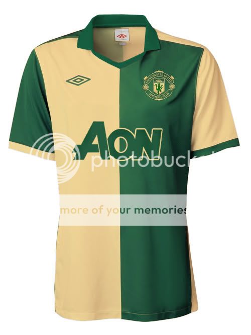
UmbroGreenandGolda.jpg
 
Arnt spurs having a new sponsor every month?
No. Spurs have one sponsor for the league (Autonomy) and are aiming to get a separate sponsor for the Cups including the CL.

It's 'Boro who are aiming for a monthly sponsor I believe.
 
Disregarding the last sentence, I'll give it a go later but I've got to go out to the pub now. It's a hard life. :lol:]

Edit: I just remembered that I made a mock-up of a green and gold kit (with my redesigned club crest instead of the current monstrosity) based on the new Blackburn kit. While it's not as good as the England kits, it's still a nice simple design from them and I think it'd be great for a post-Glazer United celebration kit:

UmbroGreenandGolda.jpg

Murray mints. The colours aren't very nice. Olive green is much better.
 
Disregarding the last sentence, I'll give it a go later but I've got to go out to the pub now. It's a hard life. :lol:]

Edit: I just remembered that I made a mock-up of a green and gold kit (with my redesigned club crest instead of the current monstrosity) based on the new Blackburn kit. While it's not as good as the England kits, it's still a nice simple design from them and I think it'd be great for a post-Glazer United celebration kit:

UmbroGreenandGolda.jpg

Oh my, that...that is just...:drool:
 
No one does...but they're everywhere apparently...and yet no one cares


it just makes me want to be sick over everything, everywhere. feck..Off
Haha, that's ridiculous. But why don't Solskjær, Vidic and Berbatov speak in their native tongues?
 
I Litterally never meet a football fan who doesnt want a shirt that looks exactly like that, a t shirt. The rangers one is exactly what most people seem to want yet no one who is paid to design them seems to agree!
 
Are the players ones made of different materials to the ones you can buy? and can i have it mockney?

Was a bit of a "kit myth" back in the days that.

However, I highly doubt it's actually the case.
 
Haha, that's ridiculous. But why don't Solskjær, Vidic and Berbatov speak in their native tongues?

Because only norwegians, Serbians and bulgarians speak norwegian, Serbian and bulgarian i suspect, does seem daft though. Maybe aon means fanny in one of thise languages.
 
Because only norwegians, Serbians and bulgarians speak norwegian, Serbian and bulgarian i suspect, does seem daft though. Maybe aon means fanny in one of thise languages.
But Dutch? There are as many estimated native speakers of Norwegian/danish/swedish as Dutch.