Americano
Make America Great Again!
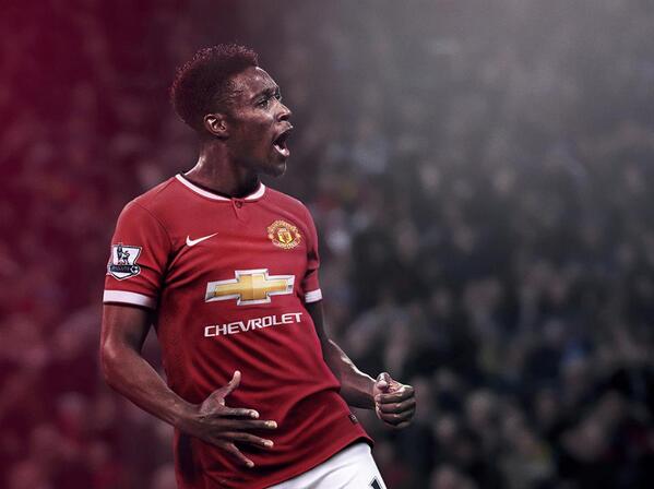
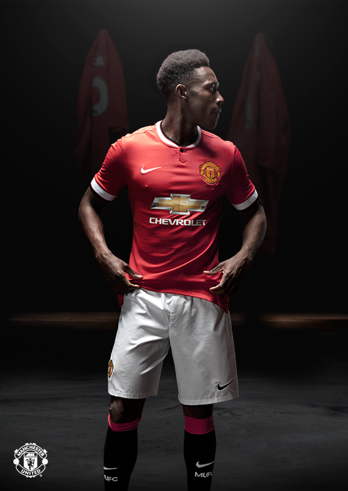
with the wide trim on the sleeves
I loved the look at first but the wide white band on the sleeves keeps making me think of Arsenal.
with the wide trim on the sleeves


http://store.manutd.com/stores/manutd/products/kit_selector.aspx?selectorid=518&intcmp=hptopcsl1
The long sleeve version looks very old school, I like it alot. Incidentally you can view them here and you can order them already....I may have to.
When I was young people used to complain that we changed team every 3 years. Taking the piss or what
Does every club change them each year? (its not something I ever really notice)
Forgive me but its probably just the angle but has Mata been tucking into the free supply of Churros at the Spanish team hotel?

Are people who are suggesting Chevrolet could have used a modified logo, serious?
Look at the amount of money they are paying us. They will want their logo to look prominent and original.

So what name should I get? I'm thinking Januzaj or Mata...
MataSo what name should I get? I'm thinking Januzaj or Mata...
They probably think it is the height if sophistication in Liverpool.They are loving it on RAWK.
To be fair, unless you are familiar with Chevrolet's logo/branding (which a lot of our supporters weren't) you wouldn't know who the sponsor is. That looks like an ambulance rather than a racecar. Or something Swiss related.They probably invest alot of money NASCAR too, where that outline logo is used. It's not a modified logo. It's the same logo. Just one is coloured in, and one isn't. They use both.

So what name should I get? I'm thinking Januzaj or Mata...
Don't know, nothing personal/not laughing at anyone. Just funny how the situation developed lol.and whats so funny bout that?
SteegmanWhos that between Januzaj & Mata at the front?
To be fair, unless you are familiar with Chevrolet's logo/branding (which a lot of our supporters weren't) you wouldn't know who the sponsor is. That looks like an ambulance rather than a racecar. Or something Swiss related.
Steegman

I completely agree with you that it would look a million times better in one colour but sadly I can also see why they haven't chosen that route. The fact that everyone is moaning that the logo is too prominent is music to the Chevrolet marketing team's ears.I'd still have expected our shirt to have the Chevrolet text, but just the outline logo instead of the brash gold one.
Not that it matters. New one is out. I just think an all white sponsor would have looked better. It's always been that way. I can't remember a sponsor ever incorporating another colour of their own on our shirt.

On another forum I am on, I have just seen an Arsenal fan argue that us adding the white trim to the sleeve is a slow attempt to gradually steal the iconic Arsenal look
 What?
What?On another forum I am on, I have just seen an Arsenal fan argue that us adding the white trim to the sleeve is a slow attempt to gradually steal the iconic Arsenal look


