Manchester United Kits 2014/15

Status
Not open for further replies.
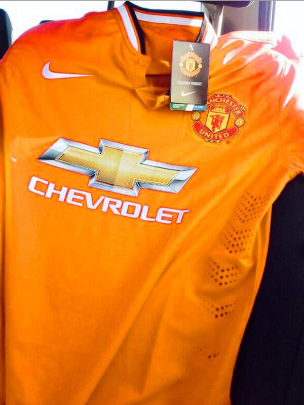
I really like the shirt. Also Chevrolet will not change their company logo just so it can make the company logo look better. Not sure why some are saying they should change it to silver or stuff like that. It's the Chevrolet logo not sure what some expected.

It's the away kit I have problems with though. I'm interested into seeing what the 3rd kit looks like. I'm hoping it is going to be black.
 
10486059_10152286347352746_3270486232263569460_n.jpg


Im happy that there is no Young and Fellaini is in a tottaly photoshopable place.
 
I really like the shirt. Also Chevrolet will not change their company logo just so it can make the company logo look better. Not sure why some are saying they should change it to silver or stuff like that. It's the Chevrolet logo not sure what some expected.

They have the outline print on alot of their NASCAR stuff, rather than the silver and gold. I think that would have looked better on the shirt. The yellow is a bit of a clash IMO.

Something like this, but white on red, obvs:

Chevrolet275.png
 
That new Swansea kit is one of the worst ones I've ever seen. The logo is diabolical.
 
#MUFCKIT is trending number 1 worldwide and has been for the last few hours now, pretty impressive for a kit launch that
 
The club is going to shit... You can so tell they just pulled Mata's kit out from the sealed bag and didn't even iron it.

Look at the scouse, theirs are perfectly pressed!
 
The kit itself looks fine it's just the Chevy badge that sucks, they could have at least left the word Chevrolet off to make it less tacky.
 
Forgive me but its probably just the angle but has Mata been tucking into the free supply of Churros at the Spanish team hotel?
 
They have the outline print on alot of their NASCAR stuff, rather than the silver and gold. I think that would have looked better on the shirt. The yellow is a bit of a clash IMO.

Something like this, but white on red, obvs:

Chevrolet275.png
Are people who are suggesting Chevrolet could have used a modified logo, serious?

Look at the amount of money they are paying us. They will want their logo to look prominent and original.
 
Status
Not open for further replies.