New sponsor contract starts on July 1st so AON are official shirt sponsors at this momentso weird that they haven't properly unveiled these yet. it's extra weird given that the official photos of their shaw and herrera unveilings have them with last year's kit. what could possibly be the reason for this delay?
Manchester United Kits 2014/15
- Thread starter bosnian_red
- Start date
You are using an out of date browser. It may not display this or other websites correctly.
You should upgrade or use an alternative browser.
You should upgrade or use an alternative browser.
- Status
- Not open for further replies.
GledTheRed
New Member
Kit whores make me laugh.
Who gives a feck?
Who gives a feck?
Antisocial
Has a Sony home cinema
- Joined
- Jul 15, 2010
- Messages
- 15,918
After the tablecloth, almost any kit seems fine to me.
I'll agree with this - getting my Merc was the best decision I've made in the last couple of years
And I will never buy a Chevrolet, only Bmw, Audi or Mercedes
I'll agree with this - getting my Merc was the best decision I've made in the last couple of years
Becknaldolencia
New Member
That's an okay shirt, but that logo is unacceptable.
Rykker_4united
Full Member
its meh
pseudo_canadian
Full Member
The shirt itself I have no issue with, it's fine. But that yellow logo takes away from the whole shirt and makes it look like a tacky rip-off. Would be much more acceptable if they just had the "Chevrolet" in white letting or the made the yellow logo all white. Just hideous. Can't believe we'll have to look at that for 7 years or whatever the deal is. Guess I'll be saving myself some money.
Minimalist
New Member
- Joined
- Dec 10, 2013
- Messages
- 15,091
The same mugs will still buy the thing. The kits are awful and the logo is 90% of the reason why.
That white kit might be one of the worst I've seen United play in since I've been born.
That white kit might be one of the worst I've seen United play in since I've been born.
Uniquim
Full Member
So is the full-color logo official now? I was really hoping it would be a one-color white logo.
nemanja15
Full Member
Am I the only person who actually likes them both? The away in particular. Simple and classy.
And AON still have a heavy presence around the club as they are remaining a sponsor and indeed training kit sponsor at that.
And AON still have a heavy presence around the club as they are remaining a sponsor and indeed training kit sponsor at that.
Castia
Full Member
- Joined
- Jun 18, 2011
- Messages
- 19,672
There is nothing wrong with the design, it's not Nike's fault that our shirt sponsors logo looks like crap. You could pick out the nicest kit in Europe next season and slap that Chevrolet badge on it to completely mess it up, you just aren't going to get a top class kit with a massive gold cross splashed across the front.
Mr Anderson
Eats, shoots, leaves
The shirt itself I have no issue with, it's fine. But that yellow logo takes away from the whole shirt and makes it look like a tacky rip-off. Would be much more acceptable if they just had the "Chevrolet" in white letting or the made the yellow logo all white. Just hideous. Can't believe we'll have to look at that for 7 years or whatever the deal is. Guess I'll be saving myself some money.
It was always going to be gold. After all Chevvy are targeting the European (amongst others) market, their goal ever since buying out Daweoo (sp?).
dwd
Saturday Night Spies
There is nothing classy about these kits. They look cheap as chips.Am I the only person who actually likes them both? The away in particular. Simple and classy.
And AON still have a heavy presence around the club as they are remaining a sponsor and indeed training kit sponsor at that.
nemanja15
Full Member
There is nothing classy about these kits. They look cheap as chips.
Wait until you see them on the players, or I don't know, an official photo. Any leaked shots nearly always look 'cheap'.
Hal9000
Full Member
- Joined
- May 24, 2010
- Messages
- 6,436
That white kit and the logo
At least they don't have the horrible black stripe down the middle.
Big Ben Foster
Correctly predicted Portugal to win Euro 2016
Which is why they've pulled out of Europe...It was always going to be gold. After all Chevvy are targeting the European (amongst others) market, their goal ever since buying out Daweoo (sp?).
Gazza
Full Member
United timed a sponsorship with Chevrolet pretty well. Football gets an upswing in popularity in the US after the World Cup and fair-weathers will probably want to sport a shirt brandishing an American car.
Kit looks fine imo. Like every other kit we've had, it could do with a smaller sponsor logo. Otherwise fine.
Kit looks fine imo. Like every other kit we've had, it could do with a smaller sponsor logo. Otherwise fine.
dave2528
Full Member
Easily the worst in a long line of terrible kits. It's one thing to suffer through Nike's uninspired designs, now we get a completely gaudy logo from Chevy to boot.
It looks like something a slovenly redneck would wear to a NASCAR race.
It looks like something a slovenly redneck would wear to a NASCAR race.
Judge Red
Don't Call Me Douglas
- Joined
- Feb 11, 2006
- Messages
- 5,992
Kit whores make me laugh.
Who gives a feck?
The home top is reasonable, the away something I'd be ashamed to leave the dressing room in. We can only hope the players are less fussy. They won the league in gingham so they must be.
Sandikan
aka sex on the beach
- Joined
- Mar 14, 2011
- Messages
- 56,678
I always think the shirts look bad at this time from the grainy footage.
By the time the players are wearing them they generally look decent
By the time the players are wearing them they generally look decent
Vato
Watches other men wank.Supports Real.Coincidence?
Next season's United kit is horrendous, and this is coming from someone who's club will be wearing a pink kit next year.
siw2007
Full Member
- Joined
- Jan 1, 2014
- Messages
- 2,599
Looks a little different from the other ones shown. There is a black button and the white bands on the arms are slightly bigger. I like the home one but will probably avoid the away one.
Next season's United kit is horrendous, and this is coming from someone who's club will be wearing a pink kit next year.
I'd happily swap our monstrosity for your pink kit.
Can't believe I actually just said that.
Bubz27
No I won’t change your tag line
- Joined
- Aug 17, 2009
- Messages
- 22,077
You think our sponsor dominates the kit?


Sandikan
aka sex on the beach
- Joined
- Mar 14, 2011
- Messages
- 56,678
compared to that we have nothing at all to moan about.
The United Irishman
"Martial is championship material at best"
You're actually going to buy that monstrosity? But yeah, you're right.Next season's United kit is horrendous, and this is coming from someone who's club will be wearing a pink kit next year.
Vato
Watches other men wank.Supports Real.Coincidence?
Not in a million years, mate. I'm not going full pink kit wanker.You're actually going to buy that monstrosity? But yeah, you're right.
The United Irishman
"Martial is championship material at best"
Not in a million years, mate. I'm not going full pink kit wanker.

pseudo_canadian
Full Member
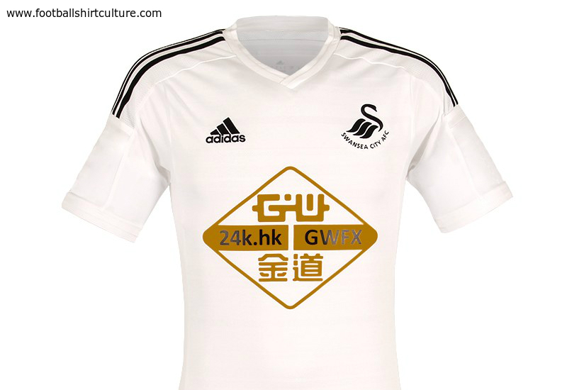
Oh my god, that is just vile.You think our sponsor dominates the kit?

Super Nani
Full Member
- Joined
- Aug 6, 2010
- Messages
- 1,361
Is that real? Jesus, that's the biggest sponsor logo I think I've seen on a shirt. Quite nice if you take that giant eye sore off it. Can't really moan about Chevrolet after seeing that.You think our sponsor dominates the kit?

ThaReaper01
Full Member
Agreed. It's not terrible. Could've been much worse, I'm sure.It's a grower, I'm beginning to like it, once you see it as a full kit it will look a lot better.
- Joined
- Mar 22, 2014
- Messages
- 15,574
- Supports
- Piracy on the High Seas.
Why can't they just put a smallass logo like this :

Looks much neater.

Looks much neater.
Sam
New Member
- Joined
- Aug 1, 2007
- Messages
- 31,585
This is the worst home kit we've ever had. It honestly looks like one of those cheap knock offs you get down the market, the ones that are sold as 'replicas'.
The United Irishman
"Martial is championship material at best"
It's the worst kit since the white flash across the sleeve and shoulder from 10 years ago..the season Rooney signed. Hated that kit!This is the worst home kit we've ever had. It honestly looks like one of those cheap knock offs you get down the market, the ones that are sold as 'replicas'.
Ramshock
CAF Pilib De Brún Translator
Kit whores make me laugh.
Who gives a feck?
Someone who came into the thread to ask who gives a feck?
- Status
- Not open for further replies.
Share:
