Manchester United Kits 2014/15

Status
Not open for further replies.
Not saying i particularly like the Chevy logo myself but why do people seem to appalled by it?

I have never been overjoyed by any sponsor we have had to wear but if most of the backlash is because its gold as it seems to be then im a bit puzzled to be honest, our badge is red & gold so it at least ties in with the colour scheme of the shirt.

2jfhz7t.jpg

Would be worse if it was say purple or green etc. then it would stick out like a sore thumb, in this picture above the logo doesn't look bad. The shirt itself looks almost exactly like the 2011/12 shirt though, Nike really have been phoning it in the last few years when it comes to our shirts after 12 years of Nike i think we could do with a change, my preference is adidas.
I'm really glad that I bought last season shirt (which I love). No matter what, the gold Chevy logo looks terrible. The rest is ok.
 
Actually that kit doesn't looks half bad. The leaked photos looked horrible but that one doesn't look that bad.

Problem with Adidas is that al their kits are the same for all teams bar the crest, colour and sponsor. I want a bit of diversity in my kits.

Yeah fair enough they do all mostly look similar, nike are as bad though plain red shirt then the big decision seems to be white or black trim over the last few years, they are even starting to rip off their own designs from a few years ago.

I think the quality of the shirts has nose dived since they started releasing a new home kit every year instead of every two years, they must have needed the extra year to put a bit of thought into it.

I just wouldn't mind a change in our kit manufacturer to be honest, Nike's offerings have gone stale and having grown up in the 80's watching us play in in 3 stripe kits i'd like adidas for nostalgic reasons if nothing else.
 
No the kit doesn't look that bad.

The problem is that we had the same 3 years ago, they only changed the sponsor.

The kit is quite simple, maybe too much, but be honest, out major problem is the team and not the kit.
 
What do people actually want from a United kit? I get the complaints about the logo because it's ghastly (although we can't really complain given the obscene amounts we get for it being there), but what do people expect from a United kit? When we had the gingham people complained that they wanted something more simple, and here's a simple design and people are still complaining. It's a shirt the team wears to differentiate themselves from the team they're playing against, it isn't a fashion item or an entrant to a catwalk in Milan.

Red? Check. United badge? Check. A nod to our other colours (white or black trim, or both)? Check.

What else is there?

And the complaints about Nike being shit are silly too. Our colours are simply plain red with white/black/both trim. What more can they do with it? All Adidas would do is stick 3 stripes down the sleeve.
 
Yeah fair enough they do all mostly look similar, nike are as bad though plain red shirt then the big decision seems to be white or black trim over the last few years, they are even starting to rip off their own designs from a few years ago.

I think the quality of the shirts has nose dived since they started releasing a new home kit every year instead of every two years, they must have needed the extra year to put a bit of thought into it.

I just wouldn't mind a change in our kit manufacturer to be honest, Nike's offerings have gone stale and having grown up in the 80's watching us play in in 3 stripe kits i'd like adidas for nostalgic reasons if nothing else.
What else can they do? Our colours are plain red and normally with white/black/both trim. What do you want from a United kit? Expecting something different is like wanting the wheel redesigned.

That's the only difference adidas would bring, 3 stripes on the sleeve. Cutting edge.
 
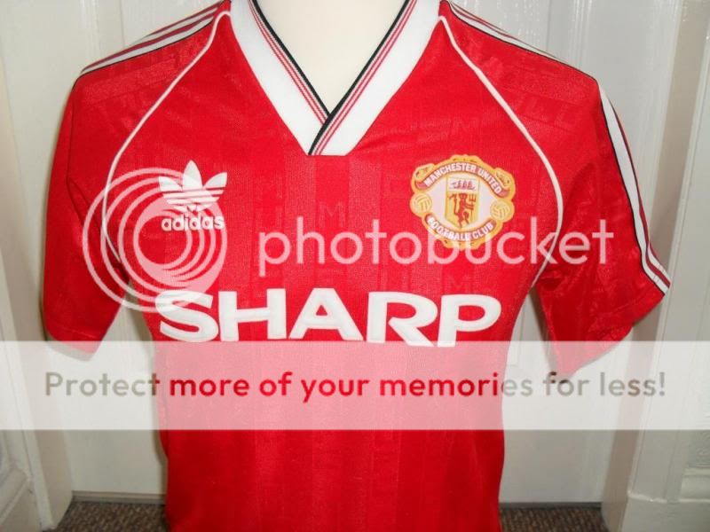
A lot of the people moaning about this new kit will post the likes of this up
https://static.weloveshopping.com/shop/iamsk38129/SHR-Man Utd-H1991.jpg
Or this
manchester-united-home-football-shirt-1987-1989-s_3017_1_zpsa01a8858.jpg

Followed by loads of these:drool::drool::drool::drool::drool:

But really, other than not having the gold thing in the middle, and having stripes on the sleeve, how much difference is there really between them? They're very similar.
And other than not having his face (and not looking like him at all), I look exactly like Brad Pitt.
 
What else can they do? Our colours are plain red and normally with white/black/both trim. What do you want from a United kit? Expecting something different is like wanting the wheel redesigned.

I know where you're coming from mate, for the most part i don't give a feck about our kits or what they look like, i personally don't buy United kits any more haven't for years but if i was going to spend £50 on one i would want a bit more than just a plain red shirt with a United badge stuck on.

Fair enough theres only so much they can do with a red kit but in recent years they have became more and more plain as i said red shirt with black trim one year, white trim the next, year three white and black trim. Then start the cycle again they are all just starting to look the same at least for the first 5-6 years under Nike the shirts were a little bit more original.

I don't think Nike put much effort into it these days to be honest, the simplest design they can come up with which is the least expensive to make will do it seems as they know it will still sell if they slap a United badge on it.


That's the only difference adidas would bring, 3 stripes on the sleeve. Cutting edge.

I don't disagree i said as much a few posts back, im not saying Adidas are any better just think we could do with a change in manufacturer to change things up a bit.
 
And other than not having his face (and not looking like him at all), I look exactly like Brad Pitt.

Ah, we have a wiseacre. Hilarious.

Plain red shirt with white/black/both trim, with 3 stripes on the sleeve :drool::drool::drool:

Plain red shirt with white/black/both trim, with no stripes and Nike tick :mad::mad::mad:

Daft.
 
Ah, we have a wiseacre. Hilarious.

Plain red shirt with white/black/both trim, with 3 stripes on the sleeve :drool::drool::drool:

Plain red shirt with white/black/both trim, with no stripes and Nike tick :mad::mad::mad:

Daft.
No, I'm not being a wiseacre (didn't even know that was a word but you learn something new everyday). Are you seriously suggesting that people are hating on it cos it's Nike? :lol: If you can't see why people have grievances with the shirt we have now, then you're in cuckoo land my friend. Those kits you've put up are infinitely better than the one we'll have next season and the reason for that is the bloody logo. You can't say 'other than' when that other than is as big and ugly as that Chevrolet logo. I don't even think the kit is that bad but comparing them two to next seasons' is like night and day.
 
No, I'm not being a wiseacre (didn't even know that was a word but you learn something new everyday). Are you seriously suggesting that people are hating on it cos it's Nike? :lol: If you can't see why people have grievances with the shirt we have now, then you're in cuckoo land my friend. Those kits you've put up are infinitely better than the one we'll have next season and the reason for that is the bloody logo. You can't say 'other than' when that other than is as big and ugly as that Chevrolet logo. I don't even think the kit is that bad but comparing them two to next seasons' is like night and day.
I mentioned previously that the logo is obviously a bone of contention, but read the thread. We'd still have that logo under Adidas, Puma, Warrior, whatever other manufacturer you'd want to pick, but people are complaining about it being too plain, or the trim, or it being boring because we've had it before, or wanting rid of Nike. That's nothing to do with the logo.

Read the thread and the comments.
 
A lot of the people moaning about this new kit will post the likes of this up
https://static.weloveshopping.com/shop/iamsk38129/SHR-Man Utd-H1991.jpg
Or this
manchester-united-home-football-shirt-1987-1989-s_3017_1_zpsa01a8858.jpg

Followed by loads of these:drool::drool::drool::drool::drool:

But really, other than not having the gold thing in the middle, and having stripes on the sleeve, how much difference is there really between them? They're very similar.

Aside from all being red, the kits are hugely different. Odd post.
 
Aside from all being red, the kits are hugely different. Odd post.
Pretty much plain red, with white trim with bits of black on the trim. They're very similar, yet two will be nostalgically loved and the other will be denegrated as Nike shite.
 
apart from the necks, size of wording, layout, colours of stripes and lines, yeah identical.
Don't be a dick. You know full well the point I was making, with people complaining in this thread that the new kit is shite because 'Nike just make plain red kits with white or black (or both) trim'.
 
As long as there's a new midfielder (or two) wearing it come August and it's red, I couldn't care less what it looks like.
 
Don't be a dick. You know full well the point I was making, with people complaining in this thread that the new kit is shite because 'Nike just make plain red kits with white or black (or both) trim'.

I wasn't actually addressing you, but the chap saying they were nearly identical.
When you can see that aside from being red they aren't at all.
 
I wasn't actually addressing you, but the chap saying they were nearly identical.
When you can see that aside from being red they aren't at all.
You said it was an odd post, completely ignoring the obvious point in it. Nowhere did I say they looked the same, just that they're plain red shirts with white/black trim, yet they're held up as classics, and the new plan red kit with white/black trim is shite and unispiring.

They're similar in that they're red kits with white and black used in the neck trim. I know it's a difficult concept to look at the greater idea of a post but it's nice to give it a try.
 
Stop getting mad over football kits and step away from the keyboard.

im calm, I just popped in to say the kits aren't that similar.
I don't have much opinion on them as I'm over 25 and don't buy kits anymore!
 
Bp63bpXCQAAtiul.jpg

:( :( :(

That's just beautiful. No sponsor though.
 
Chevrolet are paying us around £60m a year without presence in Europe. Even I'm not a big fan the gold logo, it should've been mono colour - but we should be a little more grateful.
 
Chevrolet are paying us around £60m a year without presence in Europe. Even I'm not a big fan the gold logo, it should've been mono colour - but we should be a little more grateful.

Grateful? They're not doing it out of charity, mate.
 
Grateful? They're not doing it out of charity, mate.

:lol: People don't realise that Chevrolet will be exposed all over the world and be plastered across thousands of TV Channels, Posters, Merchandise and countless commercials making them lot's of money.
 
The home kit is alright. Nothing for the designers to be proud of when compared to the likes of Roma but not something the players should feel embarrassed to be seen in. The away one is just piss poor, though. If they sent me one for free, I'd never wear it.

Regardless of the logo, I still consider Chevrolet to be a better sponsor than the previous ones we've had. Not that I'll ever buy one of their cars.
 
Agreed.. they could wear pink with white polka dots if they gonna give us crazy money every year..

Really? I'd rather someone pay us the market rate (which is substantial enough) for a club our size instead of loony money because playing in something other than red is a disaster.
 
Who cares how the kit looks? It's not a fecking fashion show. All that matters is that the team win.

Disagree. Whenever I think of good memories from United sides, that's automatically associated with the kit they were wearing. Subsequently I love the 06-07 and 07-09 kits but am not a massive fan of 11-12 kit. However, I'd take more money from a rubbish sponsor if it resulted in on the field success rather than us looking good and scrapping for 7th again.
 
The sponsor will hardly be noticeable on TV anyway, and the kit is nice. It could be a lot worse, I remember Porto having a frog on the front of their shirts.. A FROG!
 
Agree with this.

Eh? Why? A boatload of companies would line up to pay United 60m to get their name /logo on our shirts. Chevrolet should be grateful to United for accepting their offer to stick a nasty logo on our shirts advertising shite cars.
 
Disagree. Whenever I think of good memories from United sides, that's automatically associated with the kit they were wearing. Subsequently I love the 06-07 and 07-09 kits but am not a massive fan of 11-12 kit. However, I'd take more money from a rubbish sponsor if it resulted in on the field success rather than us looking good and scrapping for 7th again.
What? You've disagreed with his point by agreeing with it. You like those kits because we were successful in them, which is precisely his point. It doesn't matter what the kit looks like really, as long as it's not a Warrior/Liverpool car crash, all that matters is how the team do.
 
Status
Not open for further replies.