Maintenance complete. Now give yourself to the dark side!

Blue doesn't really fit into the overall colour scheme. Plus we don't want people thinking this is a Man City site! :eek:

You can play around with it in the developer tools in your browser - if you know how what you're doing that is :)
I do not :(
 
Sorry - remove my thread. Didn't realise there was dozens of us. Sorry but the underlines don't work. Just have a bright/light red. Job done.

Any better suggestions?

Before this change there was no way to distinguish a link from a normal piece of text. We updated links in posts a few days ago to be underlined but there were many other parts of the site where the problem remained.

Happy to look at alternatives but this has probably been the most challenging part of the dark theme - differentiating links.
 
Blue doesn't really fit into the overall colour scheme. Plus we don't want people thinking this is a Man City site! :eek:

You can play around with it in the developer tools in your browser - if you know how what you're doing that is :)
Bannable offence to suggest blue, really.
 
Any better suggestions?

Before this change there was no way to distinguish a link from a normal piece of text. We updated links in posts a few days ago to be underlined but there were many other parts of the site where the problem remained.

Happy to look at alternatives but this has probably been the most challenging part of the dark theme - differentiating links.
I mean in the standard theme it shows an underline when you hover over it. Before you do that, there's no real differentiation right? Why not just make it the same on dark mode?
 
Also, not sure why a soft pastel red is a bad idea. I think it would work well.
 
Links tend to be blue on other platforms. And we quite often play in blue!
Looking at Github they do use blue links in their dark theme and it works:

blue-links.png


But rolling that out everywhere would make things look very blue - we have a lot of links on some pages like the homepage, thread lists. So keeping certain links white and not underlined and then having blue ones elsewhere would look weird.

Could it just be done so that the forum list stays white and not underlined unless hovered over (is that needed? It's not underlined in the regular theme and we know what's clickable) and then maybe blue for links in threads, and red for tags maybe?
 
Looking at Github they do use blue links in their dark theme and it works:

blue-links.png


But rolling that out everywhere would make things look very blue - we have a lot of links on some pages like the homepage, thread lists. So keeping certain links white and not underlined and then having blue ones elsewhere would look weird.
I think going back to everything just being white on the homepage, thread lists etc on dark mode as it was is fine. It's not a problem to figure out where the links are, especially with underline on mouseover.

Then using blue for links in actual posts (where it's actually difficult to differentiate them from normal text) should be plenty, without turning the whole site into BlueCafe.
The majority of visitors are on mobile where there is no mouseover. It will be a problem for people to figure out what's a link if they're new / not regulars to the site. In many places it's not obvious at all, the links look exactly like a normal piece of text.

I'll have a play with the blue links as you suggest.

Could it just be done so that the forum list stays white and not underlined unless hovered over (is that needed? It's not underlined in the regular theme and we know what's clickable) and then maybe blue for links in threads, and red for tags maybe?
The homepage and forum/thread list titles shouldn't be underlined - unless you're seeing something different?

It's not underlined in the regular theme as links are a different to normal text. Currently in the dark theme they're not. So we either need to underline the links or change their colour.
 
I think going back to everything just being white on the homepage, thread lists etc on dark mode as it was is fine. It's not a problem to figure out where the links are, especially with underline on mouseover.

Then using blue for links in actual posts (where it's actually difficult to differentiate them from normal text) should be plenty, without turning the whole site into BlueCafe.
Mouseover isn't super helpful on mobile devices. I also have to say the link colour in the original colour scheme wasn't great for me (colourblind); I often missed links.

What's the text colour now in dark mode? It's a little grey, right? Maybe links could be full white + underlined? The combination should be enough, underlining is almost never used in text by posters.
Yes normal text is slightly off-white - #efefef

Links are already pure white, but it's a subtle difference, hence why I'm trying the underline option.
 
Yes normal text is slightly off-white - #efefef

Links are already pure white, but it's a subtle difference, hence why I'm trying the underline option.
I think the underlining might be enough. Or at least, I rarely ever see posters use underlining for regular text.
 
Won't new users/guests be using light mode anyway?
 
Won't new users/guests be using light mode anyway?
Initially yes until they choose to switch to the awesome dark theme :)

I don’t think relying on remembering what’s a link is a particularly good strategy. We need some kind of differentiation. The question is what.
 
Mouseover isn't super helpful on mobile devices. I also have to say the link colour in the original colour scheme wasn't great for me (colourblind); I often missed links.

What's the text colour now in dark mode? It's a little grey, right? Maybe links could be full white + underlined? The combination should be enough, underlining is almost never used in text by posters.
Yeah, on mobile it doesn't look too bad. The only thing underlined when browsing threads is the latest post with 2 minutes ago or whatever. The other links are out of the way down the page, and half the stuff you'd see on the same screen on desktop isn't shown.

On desktop, the entire right hand side of the page is just underline city. Number of replies, most recent post time, last poster, staff online, each name on the member list, all pointlessly underlined. On mobile, that stuff either isn't there, or is tucked away at the bottom of the page. It also just looks strange to have the OP of the thread's name there normally below the thread title, but the most recent replier's name is underlined.
 
:lol: woops! That shouldn't have happened.
 
Ok I've tweaked the underlines further so it's only in a select few places where it's less obvious that something is a link, or doesn't add much value (e.g. the who's online list).
 
Ok I've tweaked the underlines further so it's only in a select few places where it's less obvious that something is a link, or doesn't add much value (e.g. the who's online list).
Nice one. Much neater now. :+1:
 
I find the amount of white text people use after this update a bit much. It's one of the caf's trolly hallmarks, but this is just overkill.

Can we do black text now?
 
I find the amount of white text people use after this update a bit much. It's one of the caf's trolly hallmarks, but this is just overkill.

Can we do black text now?
You can, but if you tried black mode, you'd have seen that it's more like grey mode...
 
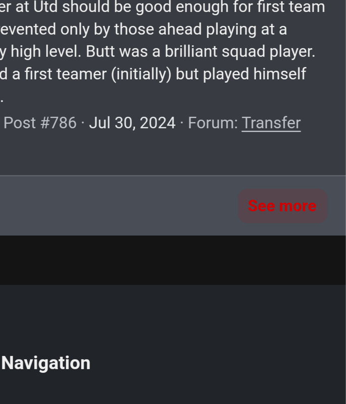
I'm noticing that some of the buttons in Dark Mode have text in red on a dark grey background. For example, if you edit a post and want to click 'Cancel', the text is there in red on a somewhat darker grey background. Or if you go to someone's profile, clicks on Postings, and then scroll down, it's the same with the See More. I don't know how others see this, but I find that text extremely hard to read; at first I didn't even notice the Cancel button was there. Maybe these texts should also become off-white?
 
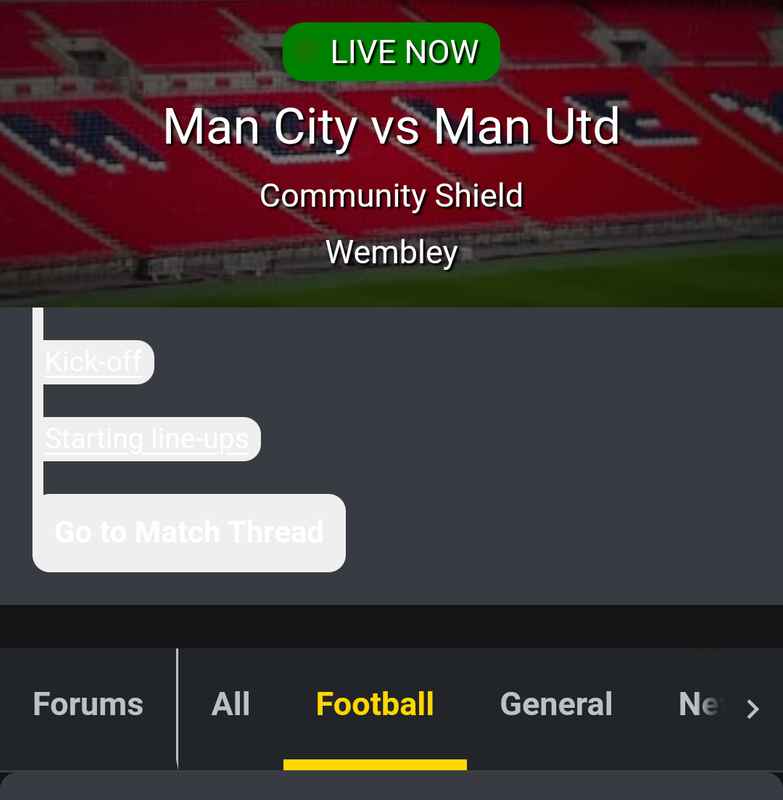
@Niall - now we got a match going on, I'm noticing the threadmarks on the frontpage are pretty much unreadable (to me, anyway):
Screenshot-20240810-102939.png

And as I mentioned in the post above, there a couple of places with text like this that's hard to read:
Screenshot-20240810-103016.png
 
And there's also an issue when selecting the team for predictions on the dark mode - there's the same lightish grey background around the button to save selection. I can't take a screenshot now but if needed I'll take a screenshot for the next match.
 
And there's also an issue when selecting the team for predictions on the dark mode - there's the same lightish grey background around the button to save selection. I can't take a screenshot now but if needed I'll take a screenshot for the next match.
Thanks, will check that too.
 
8a3jZh8.png


That is what it looks like
Thanks :+1:

Haven't had a chance to fix that or the other match related snags that showed up during the Community Shield. Will sort it after today's match.
 
Having experienced the new version over a number of weeks, I'm afraid I don't see any benefits. I preferred the old version.

3 main gripes:

1. When posting in a fast moving thread, e.g. Matchday, the thread doesn't update automatically. So, if you posted something 5 minutes ago, unless you refresh the thread, your new post will display directly underneath your previous post, without updating the with the posts in-between.

2. Copying and pasting a post into a different thread seems to be so much more difficult than before.

3. The new menu bars for e.g. emojis, quote, text effects etc are a bit shit.

I'm sure there are benefits which we don't see, but as far as user friendliness is concerned, for me, it's definitely a step backwards.