Big Ben Foster
Correctly predicted Portugal to win Euro 2016
Sevilla's kit is shocking. Porto's is surprisingly decent.


Holy feck how horrible are Worriors shirts..This is what Warrior has designed for Sevilla and FC Porto


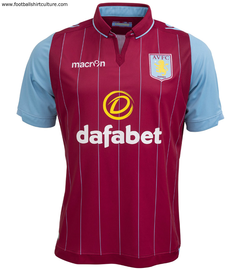
And this is Aston Villa's new kit


I really like that. Would struggle to replicate something like that with the Chevvy logo though.


took me all of 2 minutes on a crude editor.
i'm not a fan of the design anyways.


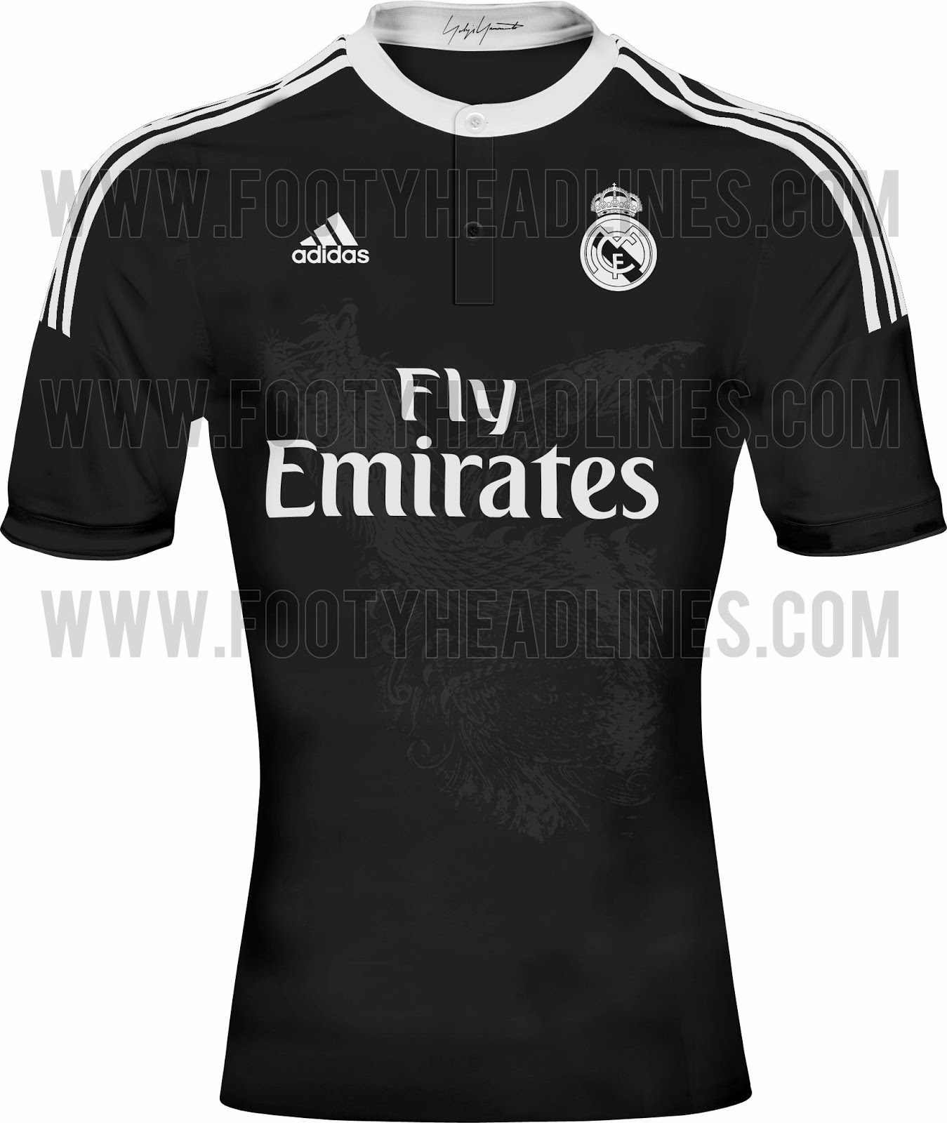
Are any of those real? The Madrid one is stunning.

That Arsenal one looks more like a dress with the length of it....Please let it be true
I know it won't be though, nobody can make a kit that bad....Apart from Warrior
It'd make ours look 'ok'

Really? It's got a fecking chinese dragon through the middle of it.Are any of those real? The Madrid one is stunning.

That's fake, because aren't we putting Manchester United FC on the badge next season.
took me all of 2 minutes on a crude editor.
i'm not a fan of the design anyways.
 @ Celtic and Rangers...absolutely terrible
Christ, we're actually really going to wear that away kit next season. Here I was hoping it might be a fecking joke. It kind of is, I guess.
Don't know whether to laugh or to cry...
Our current one. Its too gingham, that was such a bad design. Although in fairness, the Red one looks a lot better in person that it does on TV.Saw United's away kit on somebody in Thailand the other day. Looks just as bad in real life.
i know it's fake, i made it. it was just a design some fan made with the aon logo, and someone asked to see it with the chevy logo, so i added it.That's fake, because aren't we putting Manchester United FC on the badge next season.
Oh right.i know it's fake, i made it. it was just a design some fan made with the aon logo, and someone asked to see it with the chevy logo, so i added it.


Topical...Oh dear...

Lovely.
