The New Kits Thread

The new Barca home shirt is gorgeous. Seems like Nike just like f*cking up our designs for some reason.
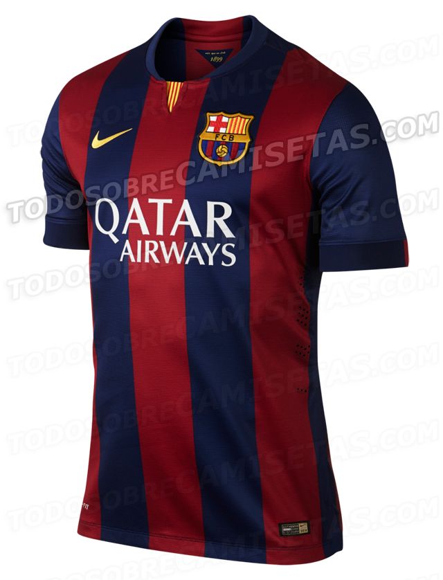
 
The new Barca home shirt is gorgeous. Seems like Nike just like f*cking up our designs for some reason.

Chevrolet are doing the fecking up this season, not Nike. The designs are ok. Well, the away shirt is a bit dodgy but the home shirt is actually quite nice.

Also, gorgeous might be a slightly strong word. They've basically just produced the most unremarkable, classic Barca shirt design possible. There's literally nothing on it to describe other than as a football shirt in Barca's classic colours. Now, that's what almost all football fans want - I'd certainly like United shirts to be more like that. So it's not a criticism. But gorgeous is an odd way to describe it.
 
Decent kit that, the Colours and stripes are bold and original how they used to be. Been too experimental with home shirt in recent years with them stripes. Got rid off the yellow too.
 
More detailed pics:

14BARCALEAK2.jpg

FC+Barcelona+14-15+Home+Kit+(2).jpg
 

Anyone else find this picture odd, they were obviously photographed separately then photoshopped together but their heights look off.

Going by this picture Pique and Busquets are only slightly taller than Messi & Xavi. Why don't they just photograph them together, would that be so difficult?


Nice kit all the same though.
 
This shit?

Bn72UYZCcAAo0x1.jpg

These are so disappointing when seen in this thread alongside others. There were complaints about the slim black collar on this year's home top. Well, it looks even less suited to that white one. Additionally, the material looks absolutely horrendous in that photo. Nike love to make our players look like sweaty Betties.

You look at that Barca kit and some of the other ones and how can you come to any conclusion other than Nike hates us?

The home shirt design isn't a total abomination, and the anorexic mannequin does it few favours when it comes to making the logo look even more massive, but it's still a class below Nike's other kits for next season.
 
Our kit design in those leaked pictures is fine, it's not Nike's fault we have the worst looking sponsor ever.
 
Colors, design and cut of the kit are great improvements over recent years. It should come off very well on the pitch, on the players
 
The Chevrolet logo is so tacky :(. The plain black one is marginally better I suppose but there's not much better we can do with it.
 
That's pretty decent now we're all honorary Dutch fans. Er, they are releasing it for sale before Holland go out at the group stages, right?
 
If that training top was in our red colours, I would be more than pleased with that as the home shirt.

let's hope that logo will be used on the real kit!
 
That training top looks decent, even if it is fake. Really hope someone at the club sees sense and we go with the no coloured version of the logo.
 
The logo's still pretty horrible but I'll take it after the monstrosity we saw in the leaked pictures. It was probably Nike's and Chevrolet's plan to make it that rank. Put that disgusting gold logo up, let it cause controversy knowing United fans will hate it while making bad publicity (no such thing as bad publicity), then change it once United fans lower their demands and expectations, and hey presto, we're actually really happy with the logo and the kit even though it's crap.
 
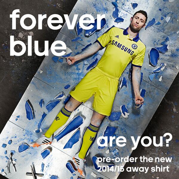
New Chelsea away. "Forever Blue"........but it's yellow.
cfc-142818.jpg

BoJPuPuCYAAkDaU.jpg
 
Cahill looks comfortable in that pic! :lol:
:lol: Also looks like he hasn't had a shower in a month.

Have to say, though, Adidas make some really nice kits. They're safe and simple every season it seems but they are nice.