decorativeed
Full Member

This is the first photo for next season's potential City shirt that seems to have a hint of authenticity about it.
It has no hint of authenticity as it is clearly a photoshop of the France shirt:


This is the first photo for next season's potential City shirt that seems to have a hint of authenticity about it.

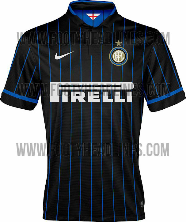
This is what Vidic will be wearing next season, tbh i truly love it, i think Nike have outdone themselves with this one.


This is the first photo for next season's potential City shirt that seems to have a hint of authenticity about it.
Your home kit this season was decent enough I thought.I like those. The best warrior kit we've had so far.
Just saw Liverpool's third kit

 It looks like what Freddy Kreuger would wear if he ran out of red cloth.
Yet all they serve us is shite these days. It's especially frustrating when you see other clubs getting class kits like this.
Beautiful. I can see Inter fans being upset about the lack of blue though.This is what Vidic will be wearing next season, tbh i truly love it, i think Nike have outdone themselves with this one.


Crystal Munchen
Even if we were changing to Adidas it would be the season after next, 2015/16. I don't know if they'd be selling Nike products cheaper a year early if we were changing.I don't know if it's a sign for a change, but maybe we need to get rid of Nike stuff to make space for Adidas...

It has no hint of authenticity as it is clearly a photoshop of the France shirt:


You underestimate Nike's laziness.
The design of the shirts I have no problem with. However, if the Chevrolet logo was plain white on the home and plain black on the away with the Nike tick black on the away they'd be great looking shirts. On the away it's a complete jumble with the sponsor logo being gold, Nike tick red and collar black.
Completely agree, I think unfortunately it's simply a case of Chevrolet paying us so much for the sponsorship that they demand the logo be in their original colours. Massive shame cos it ruins the shirts, don't understand why it's such a big deal really when loads of sponsors logos are put in a certain colour to actually go with the kit. Let's hope it looks better than it does in the leaked picture but looks doubtful. A lot or fans will choose not to part with the money to walk round with that big eye sore logo on but if they've decided on those colours then we'd better try to get used to it I guess as it will be on our shirts for a damn long time!
What is that?

Is it a mixture of all the shirts they have had over the past few years?
http://www.dailymail.co.uk/sport/fo...edition-shirt-commemorate-FA-Cup-victory.htmlIs it a mixture of all the shirts they have had over the past few years?
Spoiler that shit. Could induce an epileptic fit.

