Utd Kits 22/23

Hahah it's such a minor change yet I hate it and its perfectly in line with most kit sponsors this year who want to experiment and fail. Adidas used to have some of the best kits, classic looks. Now they have some of the worst, but luckily for them Puma exists who take that 10/10 times. Those WC shirts looked like generic create-a-club mode kits in older FIFA instalments and were an absolute crime.
Yep, I'm not one to moan about kits, I somewhat end up liking most of them, but the Puma WC ones were fecking atrocious, an actual purchase deterrent for even the most hardcore fans.
 
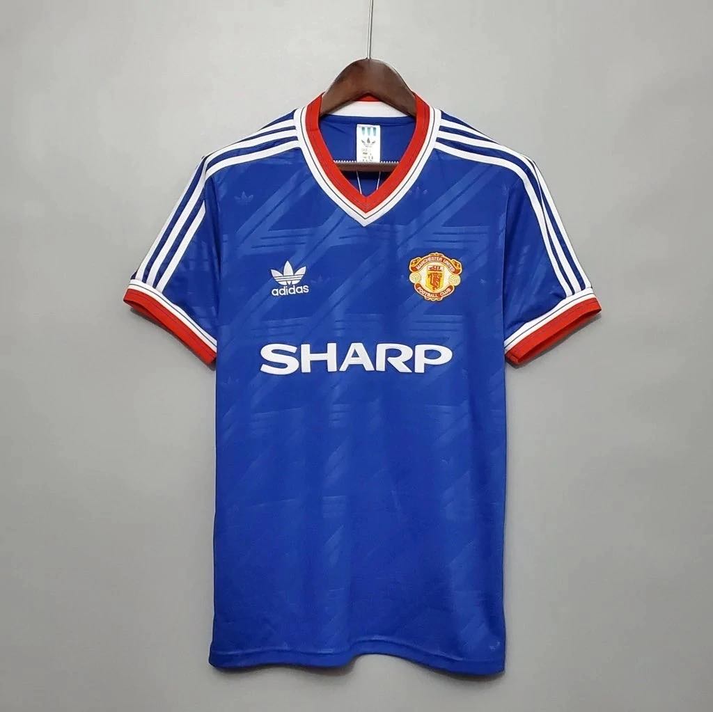
One of our greatest ever kits was the 1986 away kit, would love to see Adidas re-release this one:

274054680_3150305095245785_1127432944805042827_n.jpg


I own a snide version of it and it's absolutely mint.
Mega. Where’d you get the snide version?
 
Mega. Where’d you get the snide version?

I got one from dhgate. Please kill that link if not allowed.

Mine has the badges and Adidas stripes... I'm sure some poking around on that site will get you what you want. It's not exactly an easy-to-use website, but the goods arrived surprisingly quickly and of decent quality - though some peeling occurs if washed at almost any temperature.
 
Wish we could just wear this year's kits forever

This season's home shirt has grown on me, but I still think we've had a few better ones during the Adidas run. 19/20 was the best home shirt they've done for us so far.

That being said, I think it's pretty ridiculous that the club change kits every season. It's a shameful money grab. At the very least the home shirt should be staying the same for 3 or 4 seasons.
It's a shameful money grab that we were one of the last clubs to adopt. Everton started the trend in this country about 20 years ago.

Last time we had a home kit that lasted more than 2 years was in 1975 (not counting the 1997-2000 European home shirt - a money grabbing outlier).
 
It's a shameful money grab that we were one of the last clubs to adopt. Everton started the trend in this country about 20 years ago.

Last time we had a home kit that lasted more than 2 years was in 1975 (not counting the 1997-2000 European home shirt - a money grabbing outlier).

It's just really odd to me, but of course my perspective comes from the USA. If you look at MLB, the NFL, NBA, etc, most teams create a set of home and away uniforms and stick with them for literally decades. Most now have 3rd uniforms as well, which sometimes change every few years, but sometimes stay for decades as well.

Ever since Nike became the official uniform supplier of the NBA a few seasons ago, things have gotten out of control. Some teams literally have 5 different jerseys each season. It's ridiculous, but of course they're printing money as fans love to buy all these different jerseys and ultimately that's the decisive factor in all this.

If I had my way, United would go back to Nike, have them design a simple, classy home kit for us that we stick with for several seasons. Then make an away kit that stays for at least 2 seasons at a time, and let them go crazy on third kits that change every season.
 
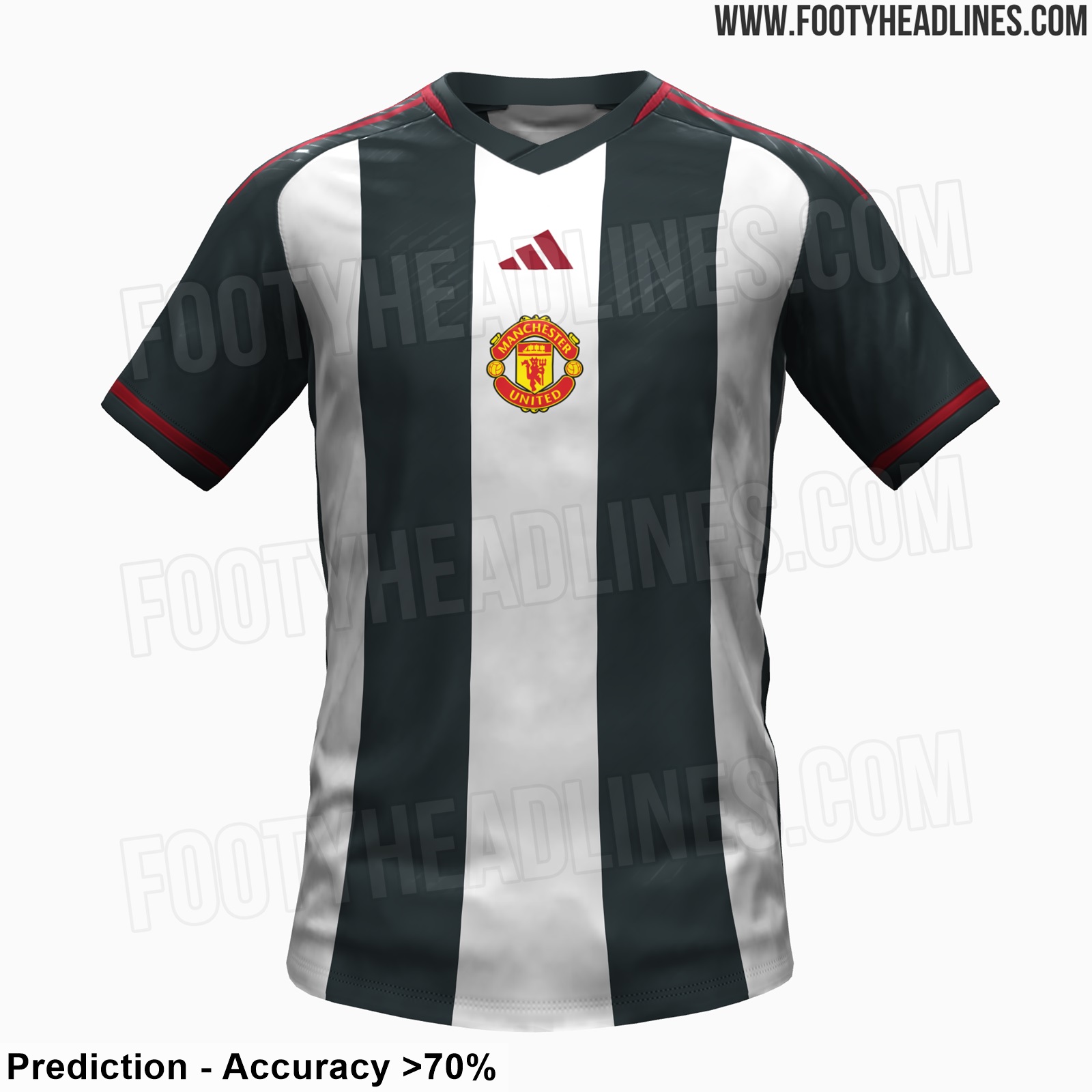
Completely agree about central badges being hideous. Hope they don't go for that...
 
I like that we could end up with a better Newcastle kit than Newcastle.
 
The 2015/16 home and away kits were perfect (minus the Chevy logo). I would have happily seen us stay with that kit for a decade. Just needed to swap the black/orange out for a black/yellow or blue/white. Strangely, I associate this kit mostly with Bastian Schweinsteiger.
 
The red one has Teamviewer on it but the lack of a sponsor on the striped shirt is telling. It may look neat and balanced as it is but slap Teamviewer complete with their icon on the left on it and it'll become a mess. Striped tops were never meant for sponsors. You'd also need to see the back. Striped or hooped fronts with plain backs are another UEFA/FIFA devised modern day hell.
 
The Newcastle look is ridiculous (for us, fine for other clubs), but the mock-up of the home kit is fantastic.

A classic red home kit, obviously, a classic white with adidas sleeve stripes, and then for opponents like Brentford a green and yellow shirt would be mint but if that’s out of the question a classic dark blue resembling the 1968 shirt or that very cool shirt that was posted earlier on this thread, updated just a bit to align with quasi-futuristic sensibilities of the red shirt.
 
if we do central I'd love it to be with a circle around it like 96. Add FC back to the badge too!
 
The most recent home mockup looks good, but it'd be better without the black shoulder stripes- been there, done that this season.

The away mockup is hot garbage.
 
I don’t love the black stripes. But the collar is way better than the previous collar design!
 
Not sure about it, need to see it in person. Are we not changing from TeamViewer to a new sponsor?