Utd Kits 22/23

Any ideas for a kit lads?

Yeah, let's make one look like a swimming pool on holidays.
I’m sure the marketing team have spun it as the swimming pool in Barcelona Sir Alex was inspired by when thinking of the tactics to beat Bayern in the final of 99’.
 
"Chelsea blue", you mean that colour we won the European Cup in in 1968 & wore in our famous semi final win at Arsenal in 09? In addition, we wore "Chelsea blue" before Chelsea were even founded. As I said before, it's pretty deep in our history and rightly isn't going anywhere.

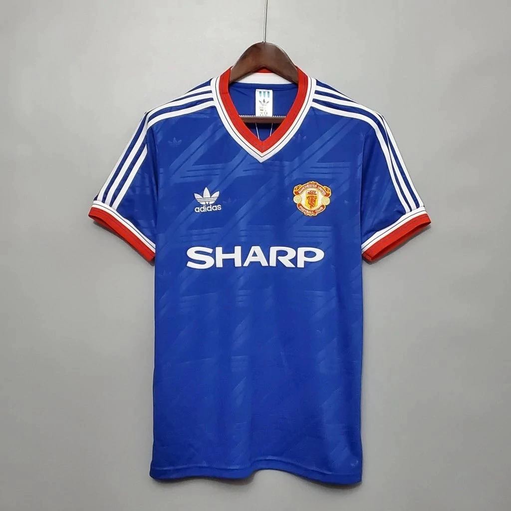
One of our greatest ever kits was the 1986 away kit, would love to see Adidas re-release this one:

274054680_3150305095245785_1127432944805042827_n.jpg


I own a snide version of it and it's absolutely mint.
 
One of our greatest ever kits was the 1986 away kit, would love to see Adidas re-release this one:

274054680_3150305095245785_1127432944805042827_n.jpg


I own a snide version of it and it's absolutely mint.
I've got the same one somewhere - it's a great shirt.
 
One of our greatest ever kits was the 1986 away kit, would love to see Adidas re-release this one:

274054680_3150305095245785_1127432944805042827_n.jpg


I own a snide version of it and it's absolutely mint.

Is 1986 the best year for shirts when you take both home and away into account? Both are absolute bangers.

Just a great year all round really.

261c49fb-1.jpg
 
Is 1986 the best year for shirts when you take both home and away into account? Both are absolute bangers.

Just a great year all round really.

261c49fb-1.jpg

I've also got a snide version of that red one too :drool:

Sadly the fit isn't as good as the blue one (although better than the re-release Adidas recently did which is 1. incredibly expensive, 2. made out of horrid, plasticky material) but it's still a nice kit.

Yep all round kit excellence 86-88, the blue was the third kit and the away kit was this white one too: https://www.footballkitarchive.com/manchester-united-1986-87-away-kit/

Wow didn't realise they were all the same season, perfection. May have to buy the white one now to complete the set!
 
I wonder why adidas never release these classic tops as a nice fitted Cotton t-shirt instead of terrible polyester.

They would make an absolute fortune.

Apart from all the usual classic United ones, they would make a mint from the likes of Argentina 86, Germany and Cameroon 90, Bulgaria / Romania / Sweden 94, France 98 etc

I'd probably bankrupt myself.
 
I wonder why adidas never release these classic tops as a nice fitted Cotton t-shirt instead of terrible polyester.

They would make an absolute fortune.
Cotton is poor as a performance fabric, which I assume is the reason why, but how many people are actually playing football in them? Kids shirts maybe moreso. I also find polyester pretty horrible, aside from Nike's Dri-Fit tees which are great.
 
Cotton is poor as a performance fabric, which I assume is the reason why, but how many people are actually playing football in them? Kids shirts maybe moreso. I also find polyester pretty horrible, aside from Nike's Dri-Fit tees which are great.

I had always assumed cotton is more expensive than polyester so not as high profit margin (just a guess). Never really thought of people playing football in them tbf so a good point, certainly wouldn't want to be running round in a cotton t-shirt sweating.

I had the Germany away top from 1990 as a cotton t-shirt and was an adidas originals, real quality . Bought it in a pop up world cup shop in 2010 on Market Street in town so it's been done in the past. Still remember the guy behind the counter saying they hadn't sold many of that particular top with it being Germany.
 
Our 08/09 third kit was basically the most perfect alternate kit I've ever seen us wear. Simple and classy and our blue kits always look best when they have either no accent colors or only white. Having red on the blue kits looks stupid if you ask me.

In fact our entire 08/09 kit lineup was pretty much perfect and I don't think we'll ever have a season again like that where all 3 kits looking fantastic. Certainly not with Adidas at any rate, we haven't had a season yet with them where at least one of the shirts wasn't gross.

The third kit with the white shirt and blue shorts was amazing as well.

I also loved the previous year, Great clean kits with the single stripe on the back for some character. The black away kit that year was amazing.
 
There's a terrible training kit the boys are wearing this week - the one Licha was in when the club announced his return.

I know about different strokes for different folks and all, but that kit is ugly. Wonder if the colour scheme is a nod to Argentina, but it just seems like they're wearing baggy t-shirts on top of ill fitting jumpers
 
The new home kit has a centered crest. Not sure if I like that idea although 97/98 was one of my favourites
 
There's a terrible training kit the boys are wearing this week - the one Licha was in when the club announced his return.

I know about different strokes for different folks and all, but that kit is ugly. Wonder if the colour scheme is a nod to Argentina, but it just seems like they're wearing baggy t-shirts on top of ill fitting jumpers

The training kits are generally horrific lately, its been ages since I saw one and thought that looks good.
 
The new home kit has a centered crest. Not sure if I like that idea although 97/98 was one of my favourites

Is this confirmed?

Centered badges are literally the ugliest trends in football shirts, I will be pretty bummed if that happens.
 
That sucks massively, especially for a season immediately after City having a centered crest.
 
It’s just a red shirt with a United badge in the middle? :lol:

Hahah it's such a minor change yet I hate it and its perfectly in line with most kit sponsors this year who want to experiment and fail. Adidas used to have some of the best kits, classic looks. Now they have some of the worst, but luckily for them Puma exists who take that 10/10 times. Those WC shirts looked like generic create-a-club mode kits in older FIFA instalments and were an absolute crime.
 
Is this confirmed?

Centered badges are literally the ugliest trends in football shirts, I will be pretty bummed if that happens.

Doesn't say anything in the article about the badge being central next season. The mock up was made to show how the new team viewer logo would look on a shirt. I think the concept designer had a bit of fun and placed the badge in the middle to make the design stand out.
 
Doesn't say anything in the article about the badge being central next season. The mock up was made to show how the new team viewer logo would look on a shirt. I think the concept designer had a bit of fun and placed the badge in the middle to make the design stand out.
There was a previous piece on the centre logo.
 
Why are footy headlines referring to city as Manchester Blue? And to puma as ‘the cat’. Have they been threatened?
Yeah Puma have been onto them so all Puma teams are now referred to as PES style names.

Also our kit last season was supposed to have a centred logo and they changed it late on in the process, so it may well not be settled just yet.
 
Central badge all the way for me, it’d make a refreshing change. 1984-86 kits are still my all time favourites.