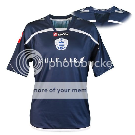
The New Kits Thread

I really like these two:

Urawa Reds:
UrawaRedsHSS0910.jpg


Kaizer Chiefs:
kaizer-chiefs-09-10-nike-home-shirt.jpg


: poundit:
 
Birmingham

birmingham-city-09-10-home-umbro-kit.jpg


Liverpool European Away (I really like it)

dummy.jpg
 
The Everton away actually would be a very nice kit if it had white trim instead of pink.

What's with clubs these days adding color to their badges as well?
 
Prepare for the best new kit of the year, courtesy of Getafe:

getafe-09-10-joma-kits-4.jpg


getafe-09-10-joma-kits-3.jpg


getafe-09-10-joma-kits.jpg


getafe-09-10-joma-kits-2.jpg


:lol:

I definitely need tha kit ! Burger king + The king printed inside the shirt. feck me they really need help.

I love the Urawa reds kit by the way, i'd have loved if united had chosen that one instead of our star trek kit.

EDIT : :lol: at the everton kit. Hope the designers will get fired.
 
Inters is the best of the lot by a country mile, the Reading one is fecking awful . Umbro must have been scraping the bottom of the barrell with that West Ham kit, jesus it looks like its from 1988. I was expecting Tony Cottee or Frank McAvennie to be modelling it
 
This year's award for the most ugliest home shirt goes to....us

Rubbish, have you not seen Everton's? Or Chelsea's special moob-support shirt? I'm not a huge fan of our new shirts, but they're nowhere near as bad as some, and at least we don't have fecking Burger King sponsoring us
 
As with the new home shirt, the away version features the brand new club crest which has been re-mastered by the Umbro team. Explaining the process, Blanch said:
Every stitch on the crest has been specifically drawn. From the beginning, we knew we wanted to create the best looking City crest ever. The aim was to make the crest look so technically crafted, using the most technical machines available to us but combine that with the sensibility that is associated with craftsmanship.
What we wanted to move away from was making the crest too flat; we needed to breathe life back into the crest and make it really stand out from the shirt.
With the crest, we have embedded it onto the shirt. Each stitch has been carefully considered.

http://www.footy-boots.com/manchester-city-away-shirt-7446/

both of city's shirts look top class, and their third kit looks to be brilliant as well. umbro also made the new england kit look and feel top notch too. nike spent about 5 seconds on our shite kits, whereas a nike SUBSIDIARY looks to have put in time and effort into making good kits. since nike own's umbro, i'm sure they want umbro to be the best it can be, hence they should dedicate umbro to the needs of united. umbro would make much better kits for us IMO than the soulless bland twats at nike can.
 
Got my United shirt today, gotta say they look better in real life than they do on TV imo.
 
I'm pissed off with Nike. I love the retroness of the bremen kit, and find the Burger King face a masterstroke, shame about the front bit. Siddey's kit is top notch as well. We need to change kit supplier, or sack the man who approves our kits. Unless it is Fergugod himself, in which case I love it to bits, you cutting edge design master you!!!
 
Sierra+Leone+Home+Shirt.jpg


Dunno if this was posted before, but I think it's brilliant...

Sierra Leone home shirt.