Opinion on the current Manchester United crest?

I like the devil and it's alright. Keeping up with modern times is a way in football and I don't think any club is special in that matter. The Juve example and Arsenal (to a lesser extent) spring to mind. That being said the only thing that remains and should remain on the crest is the ship that is a symbol of the Manchester ship canal which means so much to the local community (and City have it as well as they should).
 
I would have gotten it tattooed years ago if it didn’t have a devil on it.

The devil doesn’t massively offend my sensibilities, but I wouldn’t go as far as to tattoo one on myself.
 
Should never have been changed from the Manchester coat of arms, the red devil will always be Salford rugby club to me
 
Last edited by a moderator:
That's way WAY too "busy" by modern branding standards. It might look nice on an old building but it'll look shite on a shirt.

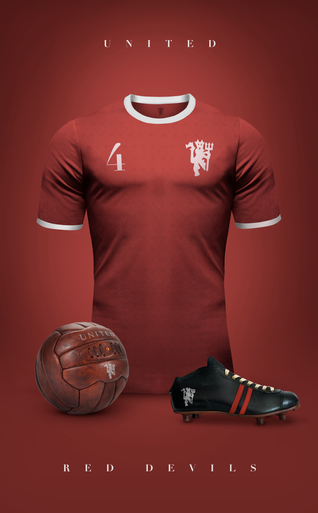
If we go for a brand redesign I reckon they'll strip it down to the devil alone, like they've done with the fashion range for quite a while now...
2ZxSU1c.png


football-shirt-concept-man-utd.png

Is that your design? It's brilliant. Eitherway, that is a very "graphic designer" opinion. Minimalist but perfect for modern day football [and marketing].
 
  • Like
Reactions: Invictus
It’s shit. When Louis Edwards opened the shed that was the Red Devils Souvenir Shop as a gift to Busby for helping him in to become chairman, the Red Devils brand took a hold. Yes, it was always there in the background as a supposed nickname but nobody said “are you going to see the Red Devils on Saturday “. It was always The Reds. The crest they wore for the 68 ECF or the 63 cup final should be the club crest... or even the one with the Phoenix rising from the ashes that was worn after the air crash. Looks like a winning effort from a Primary school competition but most are brought up with it so know no different.
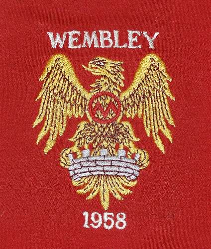
 
It’s shit. When Louis Edwards opened the shed that was the Red Devils Souvenir Shop as a gift to Busby for helping him in to become chairman, the Red Devils brand took a hold. Yes, it was always there in the background as a supposed nickname but nobody said “are you going to see the Red Devils on Saturday “. It was always The Reds. The crest they wore for the 68 ECF or the 63 cup final should be the club crest... or even the one with the Phoenix rising from the ashes that was worn after the air crash. Looks like a winning effort from a Primary school competition but most are brought up with it so know no different.

How many times do we have to point out that it is not, and never was, a phoenix? It's an eagle: https://munich58.co.uk/downloads/1958badge.pdf

The same eagle City used for about 15 years:

3792186647_39c13d8df5-1499150536-800.jpg
Manchester_City.svg


The Manchester coat of arms is owned by the city council. It is used by them and various other Manchester organisations, so why would the club want to share a key element of its identity with others? The whole reason clubs make their own crests is so they can control their identity and how it is represented.

I'm not a fan of the current design of the crest, and it's not as old as some other clubs - only coming in post-1968 - but if you're under 50 years old, it's what you've grown up with (in some form or other) and is a big part of our identity now. It's not something you could easily confuse with any other club or organisation, which is exactly what you would want to achieve as a club.
 
Last edited:
I like this one below. I like the Manchester United Football Club more than simply Manchester United.
images

That's more like it. That with the devil more in the style of the lion in the op would look :drool:
Sewn badges always look classier though.
 
Think redesigning is the last thing on our mind right now. The current crest is fine, not the greatest, but it still looks good.
Wouldn't mind a slight colour change to it though like the image below, but keep the shape (maybe change slightly), the circular shape gives me a City vibe, which for me is a no.

Agree with this. I think there is too much yellow on the current crest. I think of United colours as red/white/black.
 
Agree with this. I think there is too much yellow on the current crest. I think of United colours as red/white/black.
The yellow is just a bastardisation of gold, which is what the older crests used to be. When they redesigned the crest in 1997, they took away the Football Club bit, but they also changed the gold to yellow and added an ugly black outline. These are the things that make it look so dated, in my opinion.
 
I like it more when it's two tone on the away kits. The yellow is usually a bit too abrasive for my liking. Would like to see it toned down to a more lighter gold.

Can't see it having any drastic changes any time soon though.
 
Basically we're all so sick of United that even the crest is getting it. Shit club.