EyeInTheSky
Full Member
It should be the Phoenix
And the 3 lions are a fable from old days past rightYeah, we wiped them unicorns and dragons out completely. Rule Britannia.
It should be the Phoenix
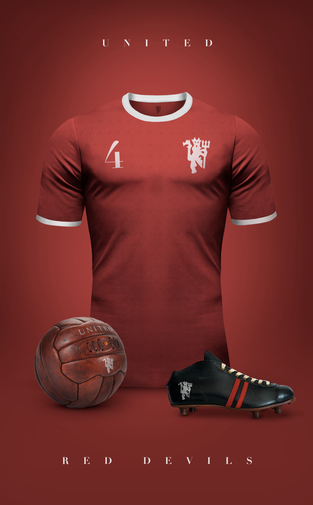
Should be simplistic. I dabble in graphical design and made this:


Next thread "old traffords name, should it be rebranded".
Oh wow how adorable. You think because they were plundered from other continents and brought to northern European castles as exhibition pieces you think they are “from there“. Wow such knowledge !So cute, they think that lions were only african. hahahaha. Just because we killed them all like the dumbasses we were/are doesnt mean they didnt exist in europe
I think it should have more black and white. It's not like we wear gold/yellow anyway, even if it's a reference to the coat of arms.
EDIT: What the poster above said.

Oh wow how adorable. You think because they were plundered from other continents and brought to northern European castles as exhibition pieces you think they are “from there“. Wow such knowledge !
I guess African slaves of Jamaica are from here too. The British colonist were just lucky to have them there to work the land for free. Isn't that something
Lemmi guess. Some prehistoric animal that was out and about and the extinct before any one was alive or gave a feck ?That's because they are colonist at heart and plunder everything.
This. Like on the 1958 FA Cup Final shirt.
And what a showcase that was
Tqlka bout a thread solving a problem that doesn't exist.
Next thread "old traffords name, should it be rebranded".

The current one is perfect, thread closed.
In the details.Where's the devil?
I personally quite like the current design of our badge though it could probably do with a some slight design changes to improve the overall appeal of it.
However I made these just to showcase a design aspect in which our club may choose to implement if it's decided the badge needs a change in favour of a more "brand orientated" route.
![SPOILER]](https://imgur.com/BJi7gYb[/SPOILER])
![SPOILER]](https://i.imgur.com/BJi7gYb.png[/SPOILER])
![SPOILER]](https://i.imgur.com/FPAUdxq.jpg[/SPOILER])
![SPOILER]](https://i.imgur.com/QiA1zqv.png[/SPOILER])
The club has a strategy of waiting for social media platforms to mature before launching on them so while other clubs embarrass themselves trying to get to grips with new and developing formats, we let them work through the kinks and learn from their mistakes. It's worked a treat so far with Twitter, Instagram and YouTube.
Oh wow how adorable. You think because they were plundered from other continents and brought to northern European castles as exhibition pieces you think they are “from there“. Wow such knowledge !
I guess African slaves of Jamaica are from here too. The British colonist were just lucky to have them there to work the land for free. Isn't that something
We need something modern and fashionable, to reflect the Caf's recently found love for pleasing-on-the-eye football above all else.

Thanks, now I can't get this abomination out of my head. Everytime I close my eyes, it's there, haunting me. Brilliant way to disgust three sets of fans though.
That's way WAY too "busy" by modern branding standards. It might look nice on an old building but it'll look shite on a shirt.
If we go for a brand redesign I reckon they'll strip it down to the devil alone, like they've done with the fashion range for quite a while now...


I do love this one. Looks retro with a modern touch.Nothing wrong with the current one, although the 2007 spin on it with the gold was fecking beautiful.
Much better than bright yellow. It’d go with the Chevrolet logo too.
It should be the Phoenix
The one that's not a phoenix? The same one that was on City's crest for up until a couple of years back?This. Like on the 1958 FA Cup Final shirt.
We're not saying to act like them, just that their new crest is smart.I agree. There's something undignified about the brightness of the red. Like a child's toy wagon. The old crest (1993) had the perfect colour combo.
Juventus' redesign makes it look like a logo that belongs to a johnny-come-lately sports brand like Under Armour or Gymshark. "The juventus way of living" - what's that? Bribing refs and bottling it in Europe?
We need something modern and fashionable, to reflect the Caf's recently found love for pleasing-on-the-eye football above all else.


Exactly.This is just moaning at the club for moanings sake...
Why do we need to re-brand it? This version of the crest was done as part of a re-branding process that occurred because different departments within the club used different versions of the old crest...
The only thing I'd do with the current one, is put Football Club back on it...
That's fecking horrific. If you ever do anything like that again, do it as a 'spoiler' and have a clear warning, in capitals.We need something modern and fashionable, to reflect the Caf's recently found love for pleasing-on-the-eye football above all else.

Yes YouTube officially launched in December 2005 but it didn't introduce in video advertising or partner programs until late 2007, it didn't introduce analytical tools until mid-2008 or promoted videos until November 2008 – around the same time it started getting blocked in half-a-dozen or so countries over various political tussles. At this point what incentives were there for United to launch on the platform? It was also largely unregulated and rife with rights problems so again, why the feck would we tie ourselves to them in any way especially when we had our own international content delivery system in the form of MUTV? As time's gone by, things have improved greatly and YouTube has become more widely accepted as an established entertainment portal but even 13 years in they're still trying to get to grips with moderation problems. But don't take my word for it, just listen to our Managing Director Richard Arnold speak explain why you're completely wrong here:YouTube has been around since 2005! So it's well past the point of mature.....sorry how are other clubs embarrassing themselves exactly by using these platforms? What kinks?
That’s what I’m talking aboutWe need something modern and fashionable, to reflect the Caf's recently found love for pleasing-on-the-eye football above all else.

Think you're missing his point. The way some United fans drool over City and Liverpool, I wouldn't be surprised if they were all for it!

