carpy
Puff the magic dragon
- Joined
- Jan 6, 2007
- Messages
- 4,538
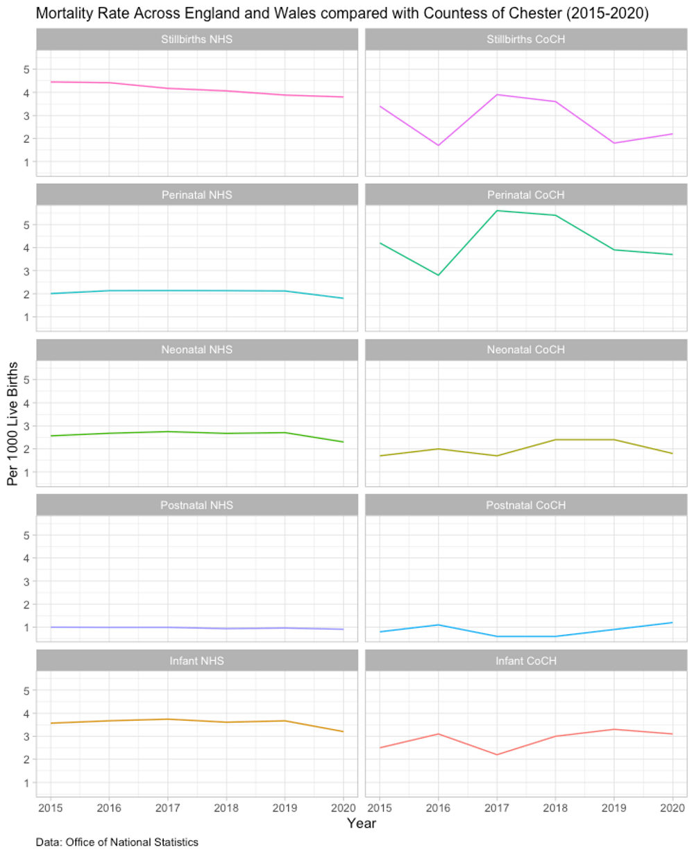
Perhaps, I have seen this graph which I would like to understand better, eg why such variance in reporting?


I've only looked at the first graph but the yellow bar is showing neonatal death rates in Cheshire West/Chester. Countess of Chester wasn't the only neonatal unit in that area.
Last edited:


