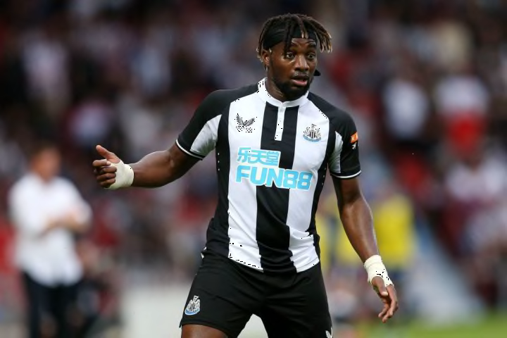
btw, that Newcastle home jersey it said that if you saw the number 4 you couldn't un-see it.
I can't see the number 4.. anyone can help?

Between the neck and the sponsor.
btw, that Newcastle home jersey it said that if you saw the number 4 you couldn't un-see it.
I can't see the number 4.. anyone can help?

Between the neck and the sponsor.


The worst part is we have awesome kits this year but i cannot buy Sancho or Bruno ones because do not wanna have numbers that gonna be changed next season and probably the same with Varane and nr 4, i think we really miss a trick with those. But kits looks awesome, i love the home and away but was very sceptical about 3rd one after those photos, but on the video it's looking quite good.
This could get some use...
Two blue kits is weird. I prefer this one to the light blue one but stillMy least favourite of the three. If the second kit is already a shade of blue I don't see why you'd have the third also be blue.
Seriously, i still can't see it... can someone draw for me?
Yeah that looks great on the players.

Our best trio of kits for a good few years.
Look at Cavani the handsome bastard!Yeah that looks great on the players.
This could get some use...
This could get some use...
Suffering from long covid, he needs all that salt just to taste something.What sort of idiot puts that much salt on his chips, he's supposed to be a bloody professional athlete? Get rid.
Suffering from long covid, he needs all that salt just to taste something.

Treat yourself to one and just wear it on match day around the gaff… that’s what I’ve limited myself to now at 35.I like all 3 this year. I'm Too old to buy any but they will look good on my kids .
