New Kits 23/24

Have you seen the shit they've been serving up for Liverpool? I've been disappointed by some of the Adidas stuff, and I've really disliked a few of them, but Nike have made some awful stuff since we switched. For a few seasons they gave all of their teams the exact same template home and away kits, with only the colours being different. The third kits have been much more experimental, and there have been some really good ones, but on the whole, I don't think they've been any better than Adidas.
That's a bit unfair. There's no way to dress a grown man up as a Heinz ketchup bottle and make him look good. Liverpool kits have never in my lifetime been interesting or attractive.
 
Everyone always points to what Adidas do for Bayern and suggests they always have much better kits than us, but I'm not seeing it. Their home and third kits this years are nothing to be envious of.

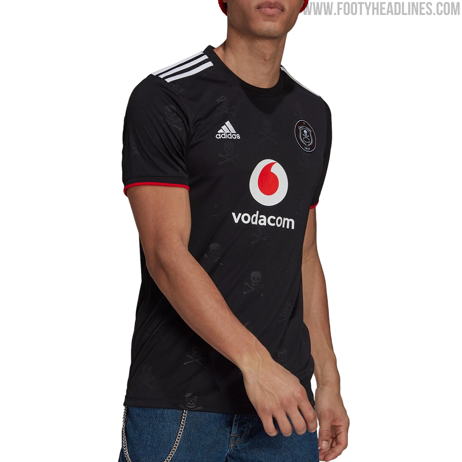
Orlando Pirates away kit is cool though. Swap the skull and crossbones for a devil with a pitchfork and you'd have a United kit people would go mad for.

orlando-pirates-21-22-kits%2B%25286%2529.jpg
People would go mad for sure, it would be the tackiest shirt ever :lol:
 
Kit looks quite simple honestly. Not great, not terrible. Can't really get excited over it.
 
I do miss black United away kits with red details on. Can’t remember the last time we had a proper black kit to be fair. The one with the weird stretch marks on a couple years back was officially green hahaha
 
I do miss black United away kits with red details on. Can’t remember the last time we had a proper black kit to be fair. The one with the weird stretch marks on a couple years back was officially green hahaha
That was last season. Our last black kit was two seasons ago in Ole’s first full year, it had red details. We had one in the 15/16 and 17/18 seasons too.
 
The away looks slightly unfinished, still looks good. Will look better in proper promotional shots.

I just can't help but feel that the kid could've been an absolute classic! It looks good, it could've gone done as an all time great.
Something like this.
690.jpg
 
That was last season. Our last black kit was two seasons ago in Ole’s first full year, it had red details. We had one in the 15/16 and 17/18 seasons too.
None of those kits were anything like that in the pic, or say the away/third in 2007-09. One of them was black and orange ffs
 
Part of the problem with the black Adidas kits has been the gold Chevrolet logo. Ideally, black United kits should be menacing and the red detail should pop, but the gold logo draws the eye and stands out over everything else. That said, I wasn't a fan of the infra-red/orange detailing on the above kit and I felt like the black kit with the rose pattern had a lot of potential but didn't quite get there for me.
 
This was actually a bad ass kit. Compared to the bland nothingness we’ve had since
i distinctly remember everyone complaining about the colour and then going on and on about the chevy sign. These days i have come to realise nobody really realises how nice a kit is/was till a new one comes out , then they hate that one and one from 4 years ago was the best ever
 
i distinctly remember everyone complaining about the colour and then going on and on about the chevy sign. These days i have come to realise nobody really realises how nice a kit is/was till a new one comes out , then they hate that one and one from 4 years ago was the best ever
Yeah agree. They always look better on the players/in person as well.
 
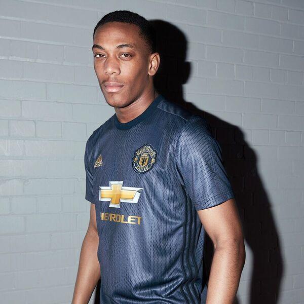
We had a blue away kit a couple of years ago with gold which was beautiful, think we wore it when we beat Juve with that Mata free kick :drool:
 
We had a blue away kit a couple of years ago with gold which was beautiful, think we wore it when we beat Juve with that Mata free kick :drool:

Martial-Third-Kit-2018-19.jpg

This one? One of the few where the Chevrolet logo didn’t look completely out of place
 
I like both versions. You didn’t like this kit?

I know some didn’t like the orange-ish colour but overall it was a pretty cool looking kit
Yeah, kind of. I'm turned off by most sponsors logos, and was one of the Chevy haters, so I'd always wonder what they would look like without it. Now I have a sleeve sponsor to irritate me too!

The main issue I had with the first one is that in real life, it really did look more orange than red. It still baffles me they've not done one black kit with proper red and white details. Last one we had was the 2007/08 Nike away that is pretty universally adored.
 
It seems this is an unpopular opinion around here, but I don't like the PSG away kit. The offset/asymmetrical pink stripe on either side of the sponsor just doesn't look good to me and feels like Nike is trying too hard. I do like their home kit this year, though it bucks tradition by getting rid of the stripe.

That Spurs kit is an abomination.
 
I don't know if it has been mentioned here but new Barcelona kit is a crime against humanity. Who in his right mind said all right we'll go with this or maybe it was some Madrid double agent.
It just doesn't make sense.
 
I am never going to complain about a United kit again:

4NvI2w3.png


They should genuinely be docked points for this.