Castia
Full Member
- Joined
- Jun 18, 2011
- Messages
- 19,643
HahaOh aye... The misuses probably wouldn't be able to wait to get them off you.
Just not in the good way.

HahaOh aye... The misuses probably wouldn't be able to wait to get them off you.
Just not in the good way.

Instant classic
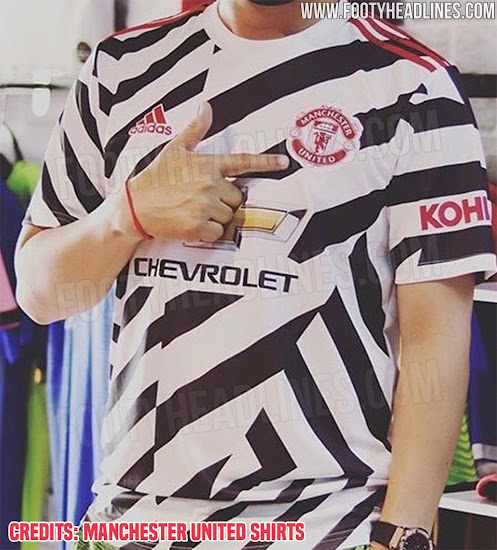
I'm still not convinced what colour it is,looks black on some pictures, dark green on others and looked brown on the players the other night ( maybe my eyesight is going)Thought our away kit (dark green) will be OK out of al l3 but even that looks like a cheap quality shirt on players. Not the best kits for sure .
I second this post that third kit (if real) is the biggest abomination known to man.Hope the season gets fully cancelled so we don't ever have to see that shit.
Disagree. The new home kit for next season is way better than the home kit from 2018/19 which was that tribute to the railways and it had black lines on it. How can you say the new home kit is the worst when that railway tribute kit was way worse. I also think that gingham kit from Ferguson's final season is worse than next seasons home kit. Saying this is the worst set of kits is a bit dramatic when we have had worse.Probably the 3 worst kits I ever recall seeing for United.
Key word “set”Disagree. The new home kit for next season is way better than the home kit from 2018/19 which was that tribute to the railways and it had black lines on it. How can you say the new home kit is the worst when that railway tribute kit was way worse. I also think that gingham kit from Ferguson's final season is worse than next seasons home kit. Saying this is the worst set of kits is a bit dramatic when we have had worse.
I like the shorts. Will buy those for chilling around the house. The shirt however is one of the worst looking kits to date.
Maybe that is the point, when they run around it hypnotises the opposition.My eyes hurt.
I will bet that this shirt will become a classic in 20-30 years..Why's nobody posted the photo? I've also put it in the thread on the United forum:
It's here: https://www.footyheadlines.com/2020/03/manchester-united-20-21-third-kit-dazzle-camo.html

Maybe that is the point, when they run around it hypnotises the opposition.
It's still awful though.Wouldn't be surprised. They are goalie kits by the the way so not much running around but there has been research done on that. The research wasn't extensive but tests have been done between very bright colours versus plain, drab or dark ones and 'keepers in bright, eye-catching tops were said to have a slight advantage.
Instant classic
Instant classic
Love them. Good throwback to the early 90’s Danish keeper jersey.

Why's nobody posted the photo? I've also put it in the thread on the United forum:
It's here: https://www.footyheadlines.com/2020/03/manchester-united-20-21-third-kit-dazzle-camo.html


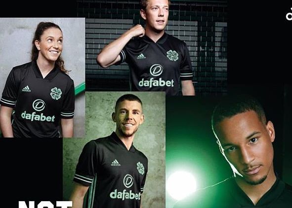
Would have been nice of you to show us the third kit than be a tease...Anyone seen the new Celtic black away kit?
Absolutely stunning stuff...

No, instead we got our own (almost) black away kit.This would work beautifully for our 3rd / away kit. The red white black details on the sleeves fit our colours perfectly and the design is nice.
Instead though we get a WW1 battleship.
I think the one above should have been our away and then our new away kit (print type) as the 3rd.No, instead we got our own (almost) black away kit.
I agree that the above would have worked really nicely for us. It's the template kit pretty much every Adidas team has been given this year. The only team who haven't been given some variation on it is us, funnily enough.
So we'd have two kits practically the same colour that clash with each other? Okay.I think the one above should have been our away and then our new away kit (print type) as the 3rd.
Are you being purposely thick? i'm talking about the design of the shirts. A colour could quite easily be altered.So we'd have two kits practically the same colour that clash with each other? Okay.
How am I supposed to infer that from what you wrote? It might have been what you were thinking, but nobody could know that from the actual content of your post. Try writing more clearly.Are you being purposely thick? i'm talking about the design of the shirts. A colour could quite easily be altered.
That Sao Paolo Shirt could be white and work just as well.
You assumed - then ended your reply with attitude for no reason. We were talking abou designs and templates in the first place.How am I supposed to infer that from what you wrote? It might have been what you were thinking, but nobody could know that from the actual content of your post. Try writing more clearly.
It's fair to assume when you say something in a post that you are writing down the entirity of your point. You can't expect people to guess at hidden subtext.You assumed - then ended your reply with attitude for no reason. We were talking abou designs and templates in the first place.
Not my fault you've decided the colours have to stay the same.
exactly
My apologies!!Would have been nice of you to show us the third kit than be a tease...

Celtic fans are generally very happy with all three shirts released. Which is an outlier perhaps haha, Adidias seem to basically have 2 standard templates for European teams, and also 2 basic templates for all the MLS teams (which is mad, they are all literally wearing the same kit with colours changed over there). There is no actual "design" at all involved. Remember the 90's when teams strips were all distinct?
Anyone seen the new Celtic black away kit?
Absolutely stunning stuff...
Except with a shamrock instead of the typical Celtic badge and sexy mint detailsLooks like a no frills black shirt to me. ¯\_(ツ)_/¯
