New Bayern Munich club crest

This will revolutionize the whole crest-changing business for ever imo. Spectacularly bold move from Bayern.
 
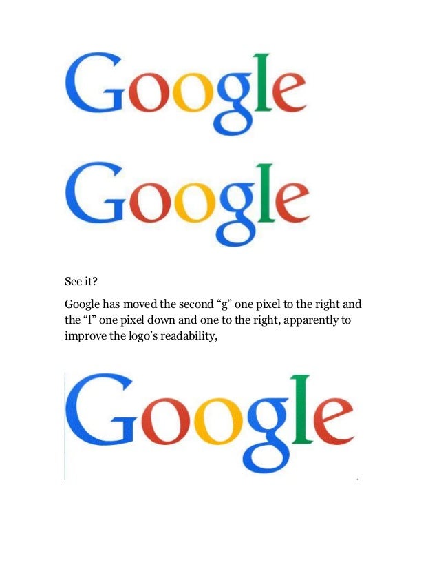
change-in-google-logo-1-638.jpg
 
Thank the Lord. Bayern is my favourite crest so would've been gutted if they'd done anything daft.
 
Looks like they've switched from Arial Bold to Helvetica, as you can tell by the 'tighter' C in 'FC' and 'Munchen'. A solid move, and a reflection of their ambition.

You can't win anything with Arial in your crest, as Alan Hansen once said.
 
Someone has probably been paid millions to come up with that.
 
This is disgusting. You can't just feck around with the Bavarian lozenge. That 30 degree angle used to stand for something. Now I just don't know any more.
 
Typical German refinement.

The minimalist improvement approach that probably cost a 5 digit sum from a professional design company? Yeah sounds like us... :P

Imagine the meeting with Bayern bosses... revealing the new logo and then going "There you are, pure design genius, that'll be 50,000 Euros if you please..."