- Joined
- Oct 27, 2011
- Messages
- 324
The adidas stripes look like electrical tape.
All the stripes are like that on the adidas player versions, normal stitched ones on the fan version

The adidas stripes look like electrical tape.
And purple details. It's fantastic.Anybody else liking the look of that orange keepers kit. I only saw it for a few seconds at a time on a bad stream on my phone but it looked good.
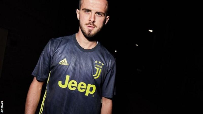
All the big Adidas team’s third kits are part of the parley recycled ocean plastic campaign by Adidas, so presumably they’ve made them the same design to bring awareness to it.Anyone seen that Juve's third kit is pretty much the same as ours but with different colours? I thought Nike were lazy by using templates for different teams but it seems they're all as bad as one another.
https://www.bbc.co.uk/sport/football/44870339


A few of our training and pre-match jerseys. Pretty sure Mourinho wore the pink one against San Jose.
The plain black one with the AON logo is just..
They've vowed to use only recycled plastics for all their polyester clothes and shoes by 2024.It's a shame Adidas hasn't gone all out with the recycled plastic jerseys and made all their kits from that material.
Middle one is far nicer than any kit we have this year
Got mine on release day, quite happy it doesn't have the sleeve sponsor on my one. I'd imagine that's because the first run of jerseys were already made before the sponsorship was signed and it will be on the next kit.
It's optional.
Can get it printed on if you want
Anyone know if the Adidas store in Manchester sells the authentic kit?
That's beautiful.

Imagine that with a Trefoil and a 'Football Club' crest
Agree. Easily our best kit of 18/19 and Niels better than the home one. Wish those two were our home and away kits.


By far our best kit for the upcoming season. What a beaut.
A fourth kit, and a pink one at that if true, is just odd. However, seeing as we've never had a pink kit before, I'd buy it just because it's so bizarre (never fecking wear it though).
Eh? A 4th kit?
Home, Pink is the Away, grey blue ones third. 3 kits.
You are correct sir, my error.
We've had the middle one two seasons ago I think it was, only difference was the AON badge was red and it had a big red Adidas badge on the back. I've got said training top and it's really comfy to wear


A few of our training and pre-match jerseys. Pretty sure Mourinho wore the pink one against San Jose.
The plain black one with the AON logo is just..


Imagine that with a Trefoil and a 'Football Club' crest
I've always preferred the red/white combo on our home shirts rather than red/black. But this one is growing on me now a bit, looks slick enough. Be a nice change up. Will be weird having such a dark looking kit at home.
I live the black training top in similar design as Argies away / Columbia / Mexico. Why don't we have kits like that!?

For everyone asking what it will look like with white shorts:

Yeah, I'm not saying I think it looks good.That's a flattering picture completely hiding the black gradient into the white
For everyone asking what it will look like with white shorts:
