Manchester United Kits 2017/18

That 08/09 third kit (40th anniversary) is my favorite United kit. Why couldn't they use that blue.
 
only issue with ones like these is that they seem to be inferior quality compared to those made by nike for example.
Yeah, the quality is poor, the fabric is stuff and unpleasant.

I've had the privilege to get my (gloved) hands on a couple of examples of the player's original match shirts, and while I wouldn't have fancied running around in them for 120 mins on a hot evening in may, they are completely different and very soft, made of pure cotton.
 
Saw the third kit in the flesh yesterday and it's not as nice in person as it is in pictures.

The gold doesn't pop as much and the blue is too dark.
 
People saying that Blue kit is nice but it isn’t half as good as the anniversary kit 10 years ago.
 
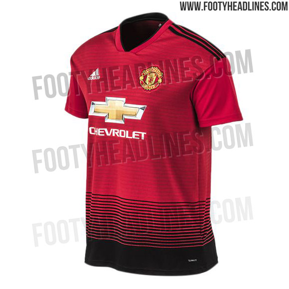
That new leak of the home kit looks horrendous. The giant black bar at the base of the kit, with the thin stripes only going partially up the torso and then stopping. Oof.
 
Would have looked decent without the black lines at the bottom. The subtle red lines are fine
 
Terrible jersey. Thank god the blue 2nd choice one is quality.
 
I like this. Dunno why people saying it is awful

 
Would have looked decent without the black lines at the bottom. The subtle red lines are fine
it mirrors the socks. The black starts on the socks with thin lines, goes into thick black and through the black shorts, then onto the top where it goes back to thin lines.
 
Spurs jersey for next year is pretty much the exact same in white and navy it seems.
 
it mirrors the socks. The black starts on the socks with thin lines, goes into thick black and through the black shorts, then onto the top where it goes back to thin lines.
That makes it worse for me. Not a fan of the red and black socks, and black shorts.
 
Looks like it got jammed in a printer or something? It might not be so bad on the players, tucked into a pair of black shorts, hiding the bar.
 
Looks like it got jammed in a printer or something? It might not be so bad on the players, tucked into a pair of black shorts, hiding the bar.

It’s not like before, no one really tucks in their kit anymore.
 
Looks like a kit you design on one of those formation selector websites. That's even worse than the tablecloth.
 
Lack of white in the kit is slightly controversial but like a kit with a v neck and we've taken a bold route which I kind of respect, nothing worse than a template kit.

socks are interesting too and black shorts usually looks slick. Could be a grower!
Resist any urge to mention Bournemouth..
 
I thought that the transition from red to black would be much smoother. Not sure about this one now, even though I don't hate it.