DomesticTadpole
Doom-monger obsessed with Herrera & the M.E.N.
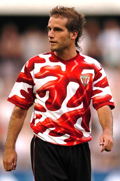
Problem is when they do try to go creative, we end up with gingham.Why are all modern shirts just generic bullshit? There's no creativity involved, just rehashed basic designs.
Problem is when they do try to go creative, we end up with gingham.Why are all modern shirts just generic bullshit? There's no creativity involved, just rehashed basic designs.
Very nice. As always, shame about the damn Chevy logo.
Which would you prefer:

or

?
There's no denying that the second one is far more creative. Personally I prefer simplicity.
 Poor old Sir Bobby with the wayward combover
This please.
Very nice. As always, shame about the damn Chevy logo.
Which would you prefer:

or

?
There's no denying that the second one is far more creative. Personally I prefer simplicity.

 love it.
love it.
There's perhaps a happy medium elsewhere. Basically Addidas has 3 templates and they change the colour/badge accordingly.
These guys are paid a small fortune to come up with these kits, you would've thought that with all time and resources considered they'd be able to come with something creative and nice once a year.
Yeah it's possible, but it's rare for kits to be both original and nice. A few of the nike ones have come close to managing it, but again even their more unusual designs are pretty simple. For some reason when kit designers try to be creative, it ends up looking like someone's let loose a three year old with a bunch of crayons.
Are they though? I'd have thought that they spent the majority of their budgets developing the fabric and stuff like that - they always seem to go on about them in their marketing. I wouldn't be surprised if the budget allocated to the actual visuals was relatively small in comparison to marketing, technology, etc. That said, anyone can come up with a nice kit given 30 minutes in photoshop, so there really is no excuse.These guys are paid a small fortune to come up with these kits, you would've thought that with all time and resources considered they'd be able to come with something creative and nice once a year.
Are they though? I'd have thought that they spent the majority of their budgets developing the fabric and stuff like that - they always seem to go on about them in their marketing. I wouldn't be surprised if the budget allocated to the actual visuals was relatively small in comparison to marketing, technology, etc. That said, anyone can come up with a nice kit given 30 minutes in photoshop, so there really is no excuse.

I would love us to use the old tri-leaf adidas logo. Something like the above would be great.
Possibly, though most companies seem to play it so safe that the creative designs are never explored at all. Thinking about it, couldn't it be a cost issue? I imagine it'd be far cheaper to produce simpler kits than more complex ones.I am almost sure that copyrighting is involved in the problem, most of the mock kits are not original, they are nice but they come from designs already existing.
That's basically a Liverpool shirt with a United crest on. Horrific
Said every Addidas designer for the last 20 years.Similarities to Liverpool given red and white. But there's nothing horrific in the design at all. Add a black pinstripe to the collar and around cuff of the sleeve and it'd be perfect.

Love how you chose the sweatiest picture of itNo kit will ever be as good as this one

Pure class.

Possibly, though most companies seem to play it so safe that the creative designs are never explored at all. Thinking about it, couldn't it be a cost issue? I imagine it'd be far cheaper to produce simpler kits than more complex ones.
Yup, reminds me of the planned obsolescence thing. There's more profit in making crap that people have to replace every year than in making something great that lasts a longer timeThe safe attitude is probably due to the fact that they have to come with new kits every year, if they go down the creative road they will be without options after a handful of years, it is best for everyone to have a classy yet predictable kit.
And like you said ingenious designers are expensive, the outcome might not be popular, the production cost will be higher, they have care about copyrighting and they absolutely need to sell millions of shirts, every year.
Similarities to Liverpool given red and white. But there's nothing horrific in the design at all. Add a black pinstripe to the collar and around cuff of the sleeve and it'd be perfect.
No kit will ever be as good as this one

Pure class.
No kit will ever be as good as this one

Pure class.
Why are all modern shirts just generic bullshit? There's no creativity involved, just rehashed basic designs.
No kit will ever be as good as this one

Pure class.
That's basically a Liverpool shirt with a United crest on it. Horrific.
The classy ones before it were much nicer..
Personally, I like the three stripes and think anything thats close to Bayern's kits will be great.
We'll probably end up with something new and wank though.

So, one red shirt with white trim and three stripes (which is almost identical to our 1986 kit) is 'horrific', while another red shirt with white trim and three stripes is 'classy' and this one is great?

Even though it's the exact same shirt as the 'horrific', 'Liverpool' shirt? Bizarre.
Looks like a Liverpool shirt, tho.....Would be an easy one for the counter fitters that
Seriously though that kit with a nice material and a club badge would be great, will never happen though.

Horrific my arse. As you said it's like our 86 kit (which I had...).
Looks like a Liverpool shirt, tho.....
Text in white.


Must be photoshoppedThe fook? Sir Bob's lush mane was a comb-over?
didn't we lose that game?
Ah yes the 50s and 60s, the great footballing eras of wealth and global commercialism!Yeah, there was so much creativity in the 50s and 60s when everyone wore either a crew neck or a v-neck. I'll bet the crowd went home hoarse from complaining every week...
didn't we lose that game?
Yes 2-1 to Man City (of all the teams to beat us on the 50th anniversary it had to be them)didn't we lose that game?

There is a way, they could've just let us use their monotone logo. Company logos always have multiple versions, at the very least there will be both colour and monotone. I'm a graphic designer so I make the damn things, it's standard practice. The reason for this is simple: it's cheap to produce a monotone logo for apparel like embroidered employee shirts. A full colour logo in that situation would be wasteful.There is no way Chevrolet would ever allow us to have just Chevrolet or there logo in white so whatever top design we have it's always going to be hindered with that, try and find your favourite united top and stick the Chevrolet logo on it and then see how it looks.

