Manchester United Kits 2014/15

Status
Not open for further replies.
Can't remember the last kit i liked. 2007-09 was nice and simple, that or the one before it probably, 06/07. Nice white shield around the crest.
 
Just look at the Chelsea/Liverpool shirts in recent years they have been no better than ours and the 3 stripes down the arms is horrible.
 
Just look at the Chelsea/Liverpool shirts in recent years they have been no better than ours and the 3 stripes down the arms is horrible.

Always loved the Adidas stripes, so it's all subjective, hate everything Nike related. That's why I am excited as hell about this Adidas news, hope it goes through!
 
Fake or not, as one of the biggest clubs in the world, why do we continually end up with what look like last minute designs....
The kits have been below average for so many years.

The most disappointing part about it is, the fans on here could all produce nicer looking kits.
I wish they came up with X amount of designs and let the fans vote. At least then if its crap, its more than likely our fault :lol:

These kits are one reason I would happily see us go with Adidas
 
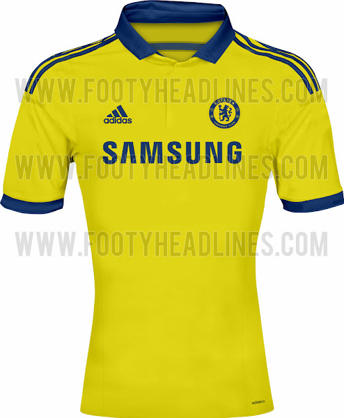
http://www.footyheadlines.com/2013/12/exclusive-chelsea-14-15-home-and-away.html

Chelsea+14-15+Home+Kit+(1).jpg

Chelsea+14-15+Away+Kit.jpg

Chelsea+14-15+Third+Kit.jpg

What do people think of the new Chelsea kits? I like the yellow one but the other two look shite especially that third one.

Our home one this year is better than all of them imo and in fact our home shirt this year looks almost exactly like that yellow away shirt.
 
Last edited:
The away kit is pretty good to be honest

The home kit is terrible...a fusion of ours in 2011/2012 with this years little collar....

Pathetic home kit from Nike... I understand now why we'll conclude a deal with Adidas

It has zero to do with how nice the kits are and everything to do with Adidas paying us £60m per year for 10 years.
 
That leaked away shirt is awful. The logo makes it look like someone took a piss on the shirt.
 
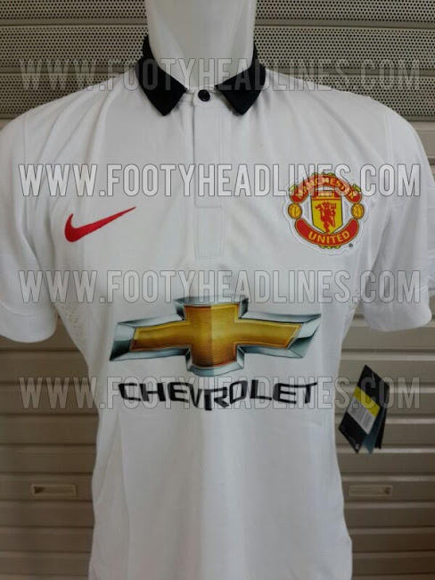
I think the away shirt itself is nice, but the Chevrolet logo is as bad as we all thought it'd be.
 
Guys can we stop treating it like it's the actual shirt? Everything points to fakes, from the lack of dri-fit logo on the white shirt, to the uneven badges, to the tag on the sleeve to the pixelated emblems.
 
Why oh why can't we just, for once, have a simple classic design with basic colours and no fancy tarting up.
 
Why oh why can't we just, for once, have a simple classic design with basic colours and no fancy tarting up.
This season? I thought the home shirt was pretty fecking good to be honest. It will be forgotten though given how shit the league has gone for us.
 
Hope to god they're fakes. Firstly the logo looks like someone's stamped a big shiny gold sticker in the middle of our shirts. The away kit is basically this years home kit in white, I wonder how many days it took the geniuses at Nike HQ to come up with that. Horrible.
 
Home is nice.
Third kit is ok. Take away the daft lines and it would be a very nice kit.
I love the yellow top :( I always wish we would get one, but will never happen
 
http://www.footyheadlines.com/2013/12/exclusive-chelsea-14-15-home-and-away.html

Chelsea+14-15+Home+Kit+(1).jpg

Chelsea+14-15+Away+Kit.jpg

Chelsea+14-15+Third+Kit.jpg

What do people think of the new Chelsea kits? I like the yellow one but the other two look shite especially that third one.

Our home one this year is better than all of them imo and in fact our home shirt this year looks almost exactly like that yellow away shirt.

I actually really like the look of the Home and 3rd kit (mainly because it's different). Bright luminous shit belongs somewhere there is a health and safety risk, not on a football pitch.
 
Those leaked united kits are awful. Not sure they'd be decent without the logo but the logo especially with the colour makes it so much worse. Really hope that's not it.
 
http://www.footyheadlines.com/2014/05/manchester-united-14-15-kits.html?m=1

Have you seen them on the mannequins on this page? The home kit looks pretty smart and also, on the Newbs someone posted a mock up of the kit and it matches it perfectly, he deserves some kudos.

The away one is straight up hideous, the red tick looks awful and the logo looks absolutely disgusting.
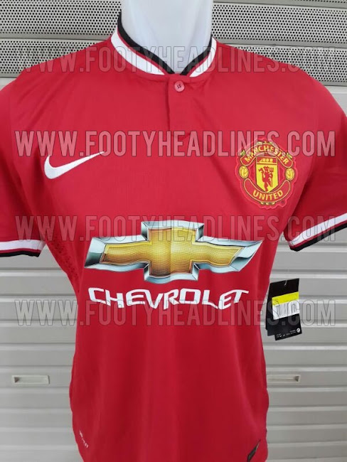
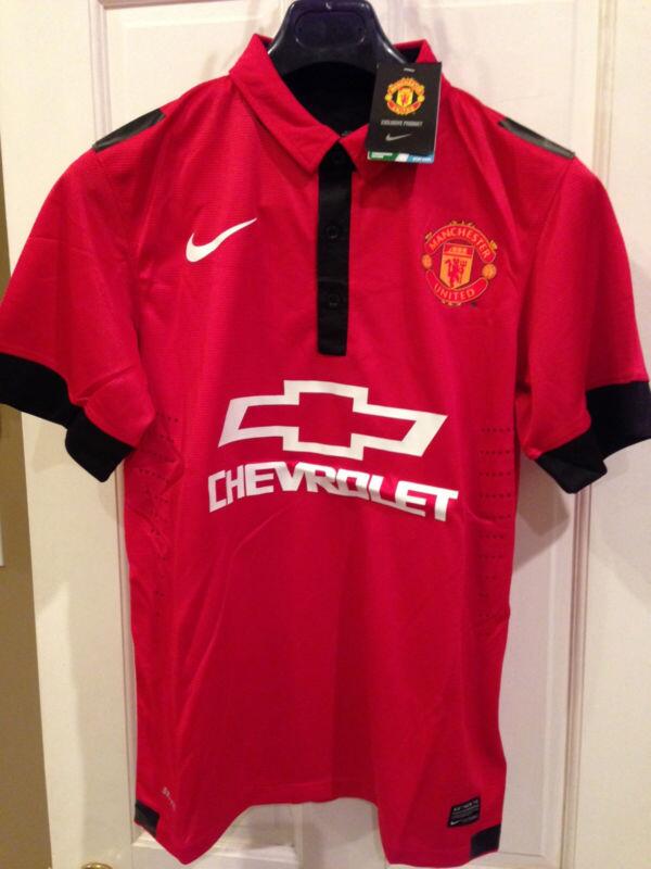
The manequin pictures look a lot more genuine. My first thought is I like the home kit more than the away kit for the first time in a few years.

The new Manchester United 2014-2015 Third Kit will be presented in August 2014, while Nike will also unveiled a blue / orange Manchester United Third Kit in September 2014.

This bit doesn't sound right, 2 third kits or what?
 
Manchester-United-14-15-Home-Kit.jpg


is at least way better than:

BYZ6BrCIgAA-i2f.jpg


Shame we couldn't have the first one with the logo of the second one.

And this:

Manchester-United-14-15-Away-Kit.jpg


is obviously better than this:

Biyi_UMIEAEtSGy.jpg:large


Pretty genius of Nike to leak absolutely god-awful kits so the actual ones don't seem too bad in comparison.
 
I don't understand why there's a need for a button on the home shirt when we don't even have a collar. I think if it wasn't for that stupid button on the home shirt then the home kit wouldn't be that bad. The away one is straight up hideous.
 
They look as bad the Liverpool away white kits this season.
Let's not exaggerate now. They're decent kits in and of themselves (particularly the home one), but the Chevy logo is huge and clashes somewhat. Still, nothing will ever be as bad as that Liverpool away kit.
 
I actually really like the collar and cuffs on the home shirt. Very sharp. Just a shame about that car-crash (pun very much intended) of a logo.

At least now we know why they're paying us so much!
 
That would be a gorgeous kit if it wasn't for the silver and gold logo.
 
Status
Not open for further replies.