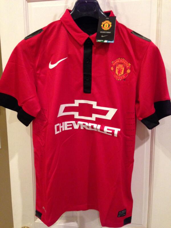
Manchester United Kits 2014/15

Status
Not open for further replies.
The logo is pretty shite, but I dig it.
 
The gold and silver logo doesn't stand out very well, not very recognizable at any distance I would think.

Black and white would have been better.
 
There's some stellar design work gone into those shirts. The white one especially.
 
Now you see why I would rather an Adidas shirt. Nike seems to do their designs in a taiwanese basement.


This guy raises a fair point, the kit looks a lot faker in the larger pic. Also, the white kit is missing a black "dri fit" logo and all the logos look pretty pixelated, a sign of photoshop.
 
That is just the angles of the picture and the crease on the shirt
It doesn't explain the lack of a drifit logo on the white kit. The Nike logo on the red kit looks uneven, regardless of creasing. And further more, the sale tags are never on the sleeve? Aren't they on the neck and in black usuallly?
 
We're running out of ways to put white/black trims on a plain red shirt.

Just keep this years shirt and put a shit Chevrolet logo on it. People would still buy it. It's all the away shirt is.
 
I much prefer that compared to the main one being leaked. It's not a good one but it's better than some of the leaks.
 
The "leaked" shirts look awful. Nike, generally, do not make good looking footie shirts.


I feel violated.

Those are pretty awful. Fingers crossed they're fakes. I'm not hard to please when it comes to kits, the simpler the better but those are so poorly designed it's beyond belief.
 
Home kit is decent. Away kit looks like a teamwear kit they'd design for Fulham or something.
 
This is it, I believe:

BYZ6BrCIgAA-i2f.jpg
Anyone who buys that needs their head examined. Truly horrible.
 
I don't think that home one is that bad. Similar to the one two years ago, I wasn't a fan of it but it was simple enough.

I think most are just thrown by the logo, same thing happened when we changed from vodafone. AIG and AON were similar so not much changed. We will get used to it.
 
The logo containing the full colours and not just being a white outline is what turns my nose up personally. I'm sure others are the same.

Just looks dreadful from a design perspective. United's colours are red, white and black. Any other colours should be minimized where possible. A load of gold in the middle of the shirt is just dreadful.
 
Them leaked ones are truly, truly awful. Feck off Nike.
 
So the away kit is essentially the home kit now but white? these look pretty terrible to be honest.
 
the chevrolet logo needs to be smaller and/or(at least) all white!!!!!
Not a huge golden logo in the middle of the shirt please. it will look like the kit of a portuguese team or an IPL cricket team that also have different sponsors listed on the sleeves, below the jersey number and across the butt.
 
The away kit is pretty good to be honest

The home kit is terrible...a fusion of ours in 2011/2012 with this years little collar....

Pathetic home kit from Nike... I understand now why we'll conclude a deal with Adidas


I feel violated.


That home shirt has to be a fake, if its real whoever designed it needs sacking. Not only is it crap its basically just the 2011/12 home shirt rehashed.

Although with Nike it wouldn't surprise me if it was real, the shirts the last few years have been atrocious for the most part.
 
Both the home and away looks fine to me, but someone need to re-design the stupid logo whether it's the colour or the size of it
 
This season's shirt is really nice though. I'd rather we just keep that. It's the nicest shirt since 06/07. It'll be completely forgotten too as people's favorite shirts are invariably one's we're successful in. Hence why people seem to bafflingly love the '99 and '08 iterations despite neither being remotely nice or well designed.
 
This season's shirt is really nice though. I'd rather we just keep that. It's the nicest shirt since 06/07. It'll be completely forgotten too as people's favorite shirts are invariably one's we're successful in. Hence why people seem to bafflingly love the '99 and '08 iterations despite neither actually being remotely nice or well designed.

'99 was awful, but the black away from '08 was nice.
 
'99 was a clusterfeck of a shirt and horrible to wear (not that I wear shirts anymore, but when I did it was all jutting pipping and a stupid plastic zip collar) but the Champions League shirt for that & the previous year was really nice. I've no idea why we did that for 2 seasons. What was that about?

The '08 black shirt was the same design as the home was it not? Hmmm, didn't really like it myself. The shinyness of the fabric annoyed me. I like the idea of a black shirt though, but they always put too much 'stuff' on them. The best black shirt is easily 94/95.
 
I hope we get away from the idea of white away kits. I cannot stand white kits, black or blue is far more preferable.
 
'99 was a clusterfeck of a shirt and horrible to wear (not that I wear shirts anymore, but when I did it was all jutting pipping and a stupid plastic zip collar) but the Champions League shirt for that & the previous year was really nice. I've no idea why we did that for 2 seasons. What was that about?

££££

The '08 black shirt was the same design as the home was it not? Hmmm, didn't really like it myself. The shinyness of the fabric annoyed me. I like the idea of a black shirt though, but they always put too much 'stuff' on them. The best black shirt is easily 94/95.

I liked the bits of red on the black. It was pretty simple, but effective. Black shirts are generally awesome - see the all black special edition Brazil shirt from 2011.
 
'99 was a clusterfeck of a shirt and horrible to wear (not that I wear shirts anymore, but when I did it was all jutting pipping and a stupid plastic zip collar) but the Champions League shirt for that & the previous year was really nice. I've no idea why we did that for 2 seasons. What was that about?

I think we actually wore that shirt for 3 seasons 1997-2000, if i remember correctly it was released to 'Commemorate' the 1968 European cup win, but it was probably just another money grab.

It was a nice shirt though.
 
Status
Not open for further replies.