Manchester United Kits 2014/15

Status
Not open for further replies.
Might as well put this in here.

I got this new training top today:

mufc-147003.jpg


It is absolutely brilliant! By far my favorite United top - I might have to get a few more of these before Nike are gone..
The nike training range is just brilliant every year, I would really want to have the training sweater which is exclusive for players from 2012/2013
Daniel+Welbeck+Manchester+United+Training+P_TwQ5ye1E5l.jpg
 
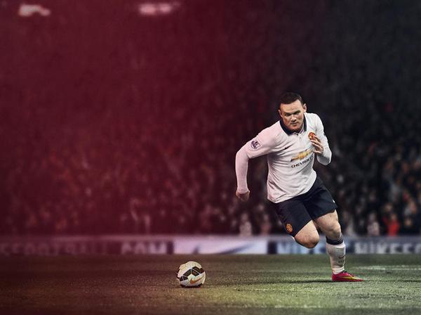
I don't know if I should praise the Photoshoppers or surgeons, but someone's finally done a decent job of restoring Rooney's thatch.
 
:lol:..I never thought I'd say our home kit is better, considering how terrible it is. Glad I got a vintage jersey the other day. The size of that badge:lol: Come on adidas!

That United badge is huge not a fan.

Is our third kit this season black?
 
Well, as is always the case with these kinds of topics, the kits this year aren't as bad as first feared. I'd say they look nicer than the ones we had last year and seem a little more restrained as it were. A good way to start a new era under Van Gaal.
 
Both kits without the logo are brilliant. Chevy are to blame, people, not Nike. That said, bring on Adidas.
 
It is. I've had some player issues from last season in my hand today as well as the new kits. They are exactly the same size. The difference is that the new players kits have fully embroidered crests this season.
 
Anyhow, I like the bigger crest. The pre-2011 ones were a bit too small. This one reminds me of the 1972/73 shirts with the prominent large crest.
 
So glad we're getting rid of Nike. Plain white kit and they still feck it up.

Swear the tick and the badge have gotten bigger. And the completely unnecessary neck/line thing. Ugh.

I wonder if Chevrolet enforced the gold coloured logo or if they'd have been fine with it being white on red/black on white. You'd suspect they demanded it be gold.
 
You guys bitching about nike are absurd. Some kits are better than others, but these are fine. Adidas kits are ridiculous for their insistence to have the three stripes on every. fecking. Kit.


When a nike designer starts designing a kit, you would imagine he starts out with a plain white template. So he selects paint bucket in photoshop makes collar black, adds Nike tick, sponsor, club badge, hey presto job done and all in 2 minutes flat. Revolutionary design here.

Nike really are ripping the hole out of it charging £55 for shit like this isn't worth more than £15-20. Between the ridiculous price and now 2 new kits every year instead of every two Nike and Adidas are taking the piss out of people.
 
Very simple, I do like it. The Chevrolet logo doesn't look as obnoxious on it as it does on the home kit (it's still pretty obnoxious though).

Really wish they brought back black kits though.
 

When a nike designer starts designing a kit, you would imagine he starts out with a plain white template. So he selects paint bucket in photoshop makes collar black, adds Nike tick, sponsor, club badge, hey presto job done and all in 2 minutes flat. Revolutionary design here.


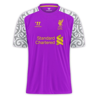
The alternative being adding loads of pointless random shit just to make it look like it's been designed. I dunno, like this..

Aq60TITCAAAokYL.jpg


or this..

Liverpool_Warrior_third_1314_IMG11.jpg


Or God forbid....This

255606d1340627833-hermanchides-kit-request-thread-2.gif


They're a rip off, agreed, but if I'm going to get ripped off (I'm not, I don't buy shirts, but if I was) I know which approach to football kits I prefer. All it is is last years home kit (which was nice) in white anyway.
 
Last edited:
The alternative being adding loads of pointless random shit just to make it look like it's been designed. I dunno, like this..

Aq60TITCAAAokYL.jpg


or this..


Or God forbid....This

255606d1340627833-hermanchides-kit-request-thread-2.gif


I know which approach I prefer in football kits. All it is is last years home kit (which was nice) in white.

That top Liverpool kit is not real surely? I know warrior are bad but they are not that bad. Having said that the second one is an abomination as well.

About that white United kit, i don't dislike it from an aesthetic point of view, its nice as a polo shirt. I recently bought two United polo shirts which are virtually the same albeit red & black instead of white.

But it winds me up they are getting away with charging £55 for it every year now, if adults want to pay that fair enough, but its also £42 for the kids version, £20 for the kids shorts (feck knows for the socks probably another £10-15), theres the best part of £80 for a kids kit complete rip off. I only have one kid but imagine having 2 or 3 and being soft enough to buy them all an £80 kit.

To this day that grey United kit still baffles me what the feck were they thinking, i had it and the bottom half i actually liked but the top half i hated. If the whole thing had been like the bottom i think it would have been a decent shirt.
 
Last edited:
Love the home shirt, not a fan of this one. It just looks cheap somehow, not sure why. Doesn't seem to sit as nicely on the players either.

EDIT: Looking at more pics, it looks decent on Rooney. Just hangs a bit on the skinnier guys I suppose. I've probably judged it too harshly.
 
So I've got a question.

Usually our third kit is the previous year's away kit, even in 2010-11 when we changed from AIG to AON sponsorship we continued that pattern. However last season's away kit was white, same as this season's, does this mean there's a new third kit announcement coming or anything like that?

EDIT: nvm I was confused, last season's away kit wasn't white
 
Last edited:
So I've got a question.

Usually our third kit is the previous year's away kit, even in 2010-11 when we changed from AIG to AON sponsorship we continued that pattern. However last season's away kit was white, same as this season's, does this mean there's a new third kit announcement coming or anything like that?

Last seasons away was the blue/dark blue gingham abomination
 
Do they need to have a full colored Golden cross only on every kit ?

They can surely change it's color or do just outlined sort of cross? As in something like this -

images
 
Is it just me or is the Chevy logo different tones in different released photos of the away kit?

37B574F1ED6A4E9093F3AE27DF7F9C9F.ashx


55D0C7220E794B5F8A2EB65836FFB798.ashx


The logo in the Rooney picture seems a lot duller in colour (and is the better for it imo)?
 
The gold Chevy looks worse on white than red. Kit is alright otherwise. I am not a fan of the collar on it (or on last season's home kit) but it's not intolerable.
 
Might as well put this in here.

I got this new training top today:

mufc-147003.jpg


It is absolutely brilliant! By far my favorite United top - I might have to get a few more of these before Nike are gone..

I've been looking at getting this as I much prefer the black kits. The only thing that concerns me is the back as it looks like fishnets from the images online. Is it see-through? I love the front, I'm just concerned about looking like a gimp from the back. Literally.
 
I've been looking at getting this as I much prefer the black kits. The only thing that concerns me is the back as it looks like fishnets from the images online. Is it see-through? I love the front, I'm just concerned about looking like a gimp from the back. Literally.

Don't worry, it doesn't show when you are wearing it. It is see-through in the sense that you can see your fingertips if you run them against the back from the inside and look carefully - but it is not noticable when wearing it.

Edit: I could probably put up a picture or two later if you are curious.
Yes please mate if you get time. I'm definitely going to look at one in person before I buy but it would be good to see some photos either way.
 
Status
Not open for further replies.