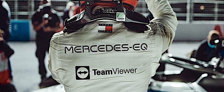
Yeah and I think, as others have said, the squad logo will be placed above/under the TeamViewer writing which would balance it out a lot.I think it’s because it’s too long, so it looks weird. Ideally the logo would be within the outer boundings of the Adidas and club badge. This would give it a better balance.
I think once they do that we will have some very nice kits in the near future, these included (imo.)
A bland logo is like a blank canvas when it comes to kits. Chuck a Chevy logo in the middle and your only trying to polish a turd.

 But they clearly must have researched the general likeability levels etc. so I guess our taste is just completely different to the one of your typical shirt-buying aficionados.

