matherto
ask me about our 50% off sale!
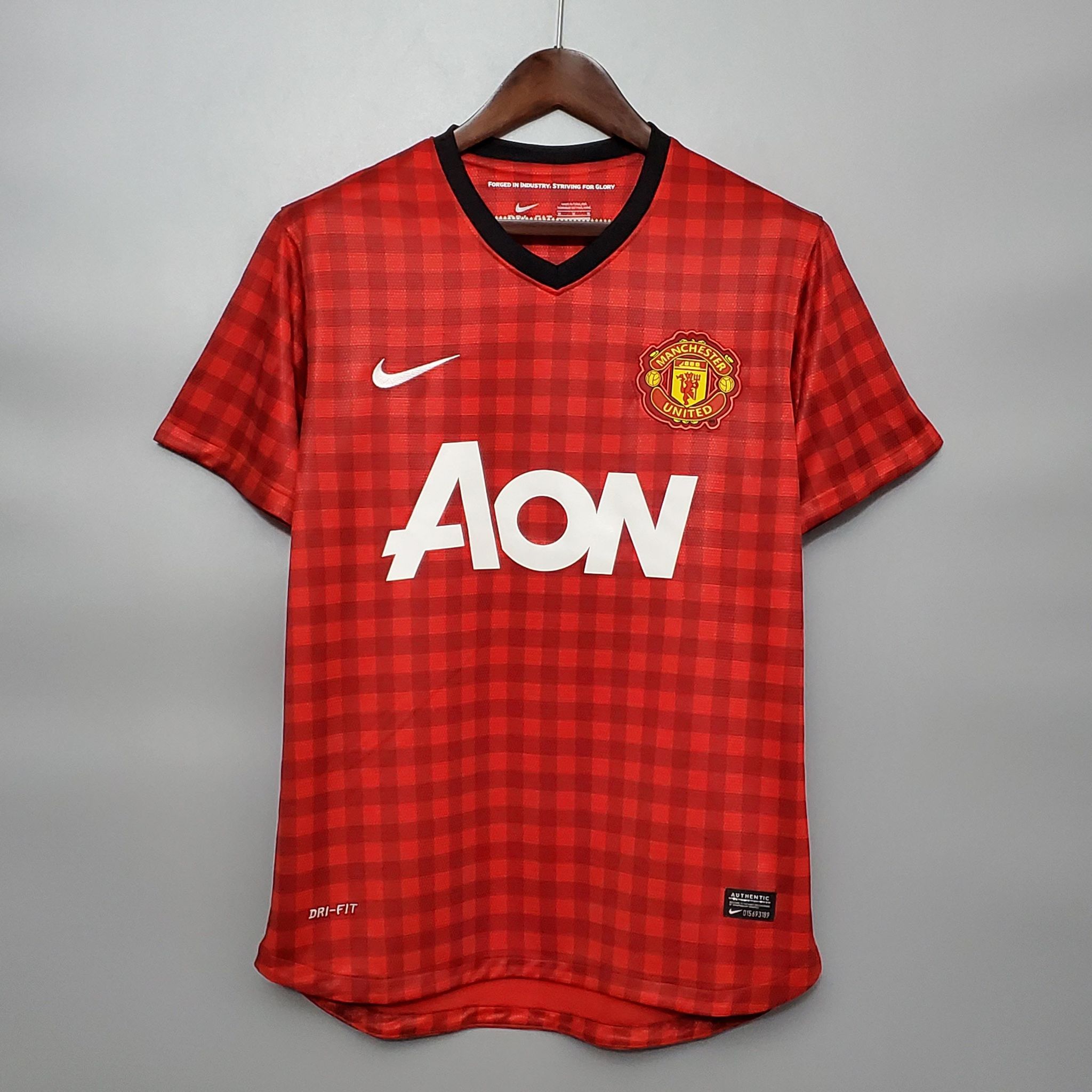
Still think this was worse, the print was disgusting and the colour worse in real life than pictures.
Y'all are forgetting that grey kit from the 1990s.
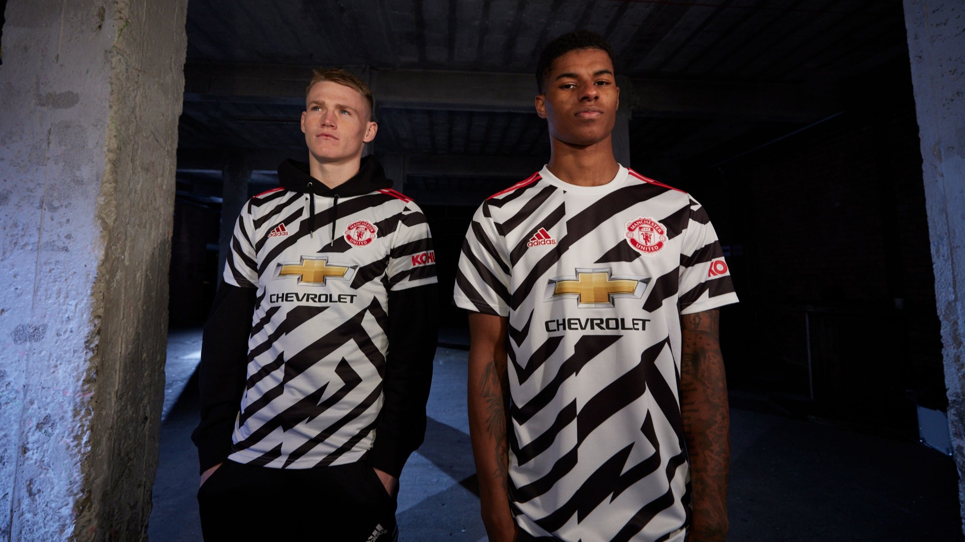
This.Zebra kit was elite.

Still think this was worse, the print was disgusting and the colour worse in real life than pictures.
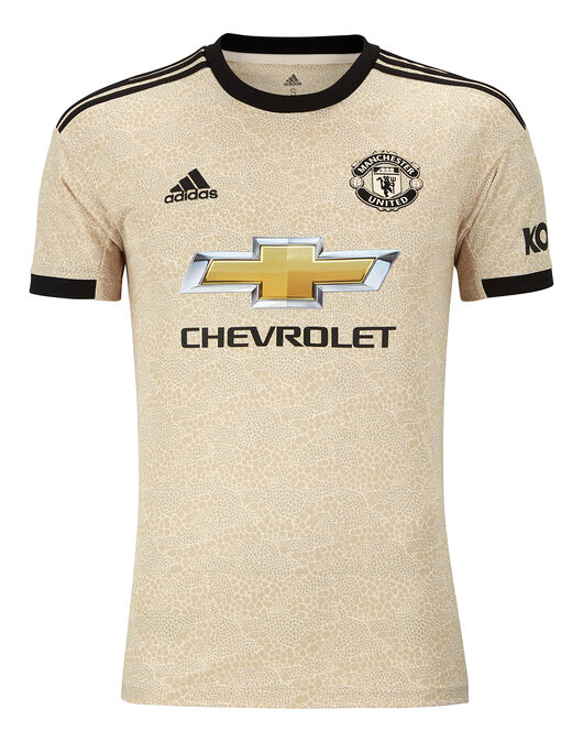
Oppa gingham styleThought this one was horrible.
Thought this one was horrible.
I often feel the quality of our shirts against others like City, Arsenal etc and they feel cheaper.... Side note, don't recommend randomly walk up to opposing fans to stroke their shirts, save your weirdness for J.D Sports or similar.All the kits are shit this year. The quality is crap for the price. I miss the umbro and Nike kits.
Next level terrible?Kit is next level
Yep that’s heinous. Ah god just look at it, I had wiped it from my memory. My eyeeeees!Thought this one was horrible.
Don’t think this was soooo bad in the end, it kinda grew on me. At least it’s United colours. Green stripes is worse I think.Joint worst with this
Joint worst with this
Onana would look good in a bin liner tbh but I do not like this mint humbug strip. The third kit in white is a doozy though its beautiful.I hated it when I first saw it, then I saw this picture of Onana looking cool as feck in the tracksuit version and now I love it.

Why is Silvestre the first person I see in that kit so strange how the mind works.Nah too many good memories to call that an ugly kit. RvP vibes
Username checks out.The white kit is very much see thru, so get ready for the world to see your nips.
I love how this design is referred to as tablecloth universally in all countries.Thought this one was horrible.
Apparently it was picked as that was one of Utd's original coloured kits, with the stripes. The red is for the red bricks around Manchester or some shit.
Despite all that, it's just hideous.
Next level terrible?
This to me shows how much adidas is overthinking this shite. We have an iconic name and crest, it’s not that hard.
Would be nice to get paid a lot to do an horrible job.I saw the ad on mutv one day and thought they sounded like a pompous over thinking bunch if twats.
Then again, they probably got paid a pile of money to make it.
Give it to me every season. We won the title on it !Thought this one was horrible.
White is class.I note the striped kit from Wednesday night... we need to get rid of that quickly. I only associate that with rubbish now.. it reflects the club really. Confused, lacking identity and coherence, you're not sure whether it reflects Manchester United or not.. it isn't nice, not even in the classic football kit sense as a neutral.. and it has no relevance to our history (note the Newton Heath kit, which worked so well). Get rid of it! Just use the classic red, white. black and present a contemporary interpretation of that. Real Madrid don't seem to struggle and they just wear white.
Still think this was worse, the print was disgusting and the colour worse in real life than pictures.