I have a weird nostalgic fondness for this one. Reminds me of when Cavani was playing well.Joint worst with this
Is this the ugliest kit we’ve ever had?
- Thread starter Fortitude
- Start date
You are using an out of date browser. It may not display this or other websites correctly.
You should upgrade or use an alternative browser.
You should upgrade or use an alternative browser.
Scottynaldinho
Full Member
- Joined
- Mar 22, 2021
- Messages
- 1,597
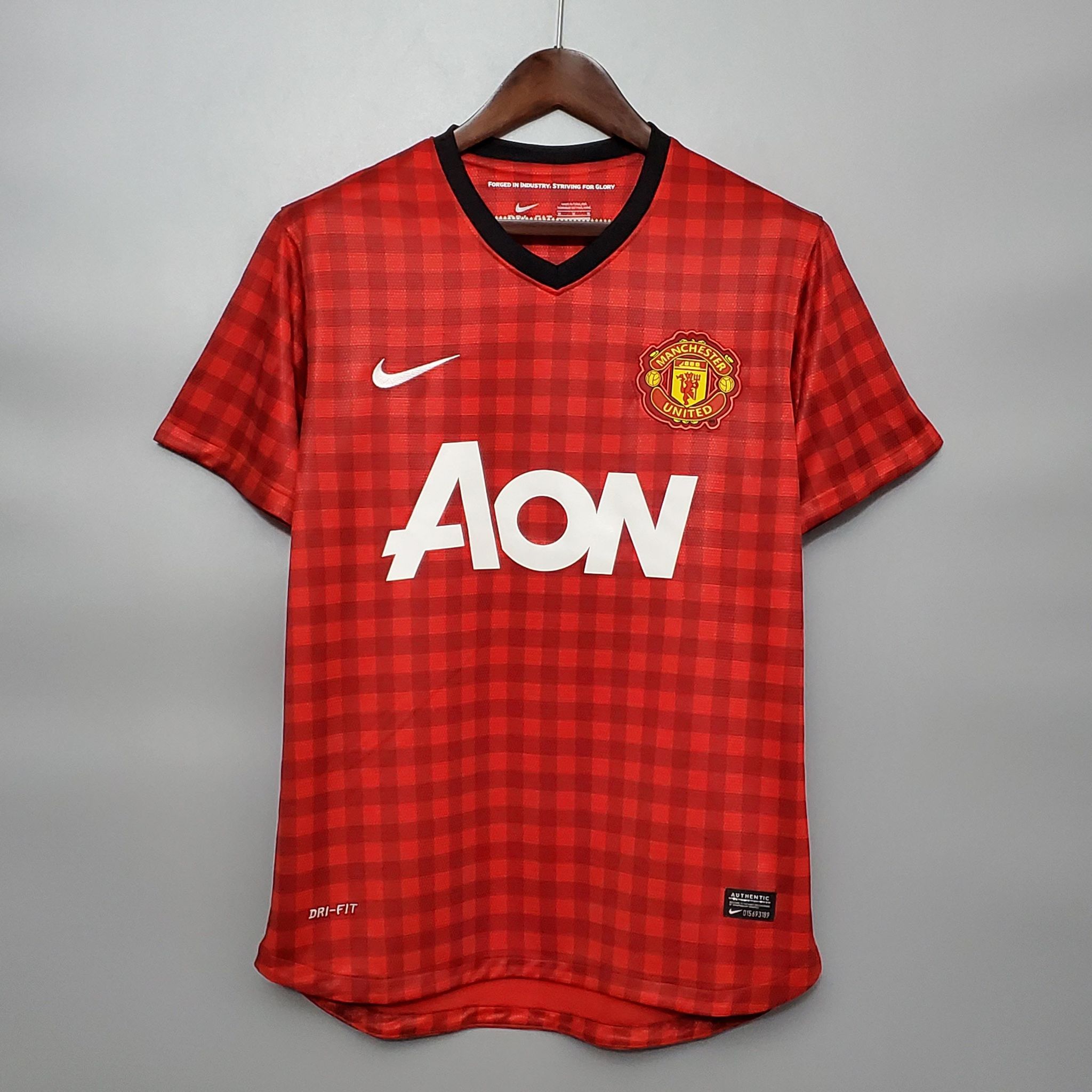
The tablecloth. I found it horrible initially, but I like it now. We have great memories with RVP in this shirt winning us our last league title. It's also unique and looks like no other kit.Thought this one was horrible.
Thought this one was horrible.
The story behind it was that the type of pattern was used in the old industrial days of Manchester with hard working people and steam/smoke everywhere.
Nah man, it's just a fecking table cloth.
The tablecloth. I found it horrible initially, but I like it now. We have great memories with RVP in this shirt winning us our last league title. It's also unique and looks like no other kit.
Your doctor would like to see you for an eye test.
Redstain
Full Member
- Joined
- Feb 2, 2019
- Messages
- 2,004
Disaster of a kit, Adidas taking the biscuit.
Sky1981
Fending off the urge
Wouldnt wear it even for free. But i guess the milenials loved it
RedIan
Full Member
Yep hate it
GMoore23
Full Member
- Joined
- Apr 22, 2014
- Messages
- 3,859
Ah, the table cloth.
was it in Fergie's last season? or the Moyes one?
I seem to remember Januzaj wearing it, maybe also Kagawa?
Edit: 2012/3 indeed.
The Van Persie Kit. How could you forget.
RC89
Full Member
- Joined
- Oct 12, 2010
- Messages
- 3,106
It's a beautiful kit
LilyWhiteSpur
New Member
I think it’s like our 3rd kit, as in its a nice kit but totally not right for the team.
André Dominguez
Full Member
It looks horrendous on TV. Doesn't beat last season's 3rd kit in the horrendous level, though.
Fluctuation0161
Full Member
It's bad.
DWelbz19
Correctly predicted Portugal to win Euro 2016
- Joined
- Oct 31, 2012
- Messages
- 35,484
Yeah, I think this is right. It's an alright kit. Compare it to the god awful zebra kit we had -- that was genuinely atrociousIt not a bad kit but it just looks wrong for Man United.
ScholesyTheWise
Full Member
- Joined
- Feb 1, 2022
- Messages
- 1,246
The Van Persie Kit. How could you forget.
I tons of the stuff we experienced with Fergie tbh. feels like another lifetime.
cafecillos
Full Member
- Joined
- Aug 20, 2014
- Messages
- 1,759
Seriously, those thinking it's not that bad, go have a look at the fan version available in shops and report back to the thread. The enormous green "boxes" for the sponsors are an abomination.
SouthMancRed
Cheimoon's Fault
- Joined
- Aug 14, 2022
- Messages
- 664
That look makes it acceptable. No horrific sleeves with a mess of strips and white shorts to reduce the wall of not particularly nice green. Could live with a playing version of this but not as it is.I hated it when I first saw it, then I saw this picture of Onana looking cool as feck in the tracksuit version and now I love it.

ETA - similar to what cafecillos says above, also do away with the horrific plain box on the back for the name/number. There are ways round that with stripes/hoops while keeping the info legible.
Last edited:
Red Indian Chief Torn Rubber
Thus says Kemo
That doesn't existTell me which has been worse!
Castia
Full Member
- Joined
- Jun 18, 2011
- Messages
- 19,191
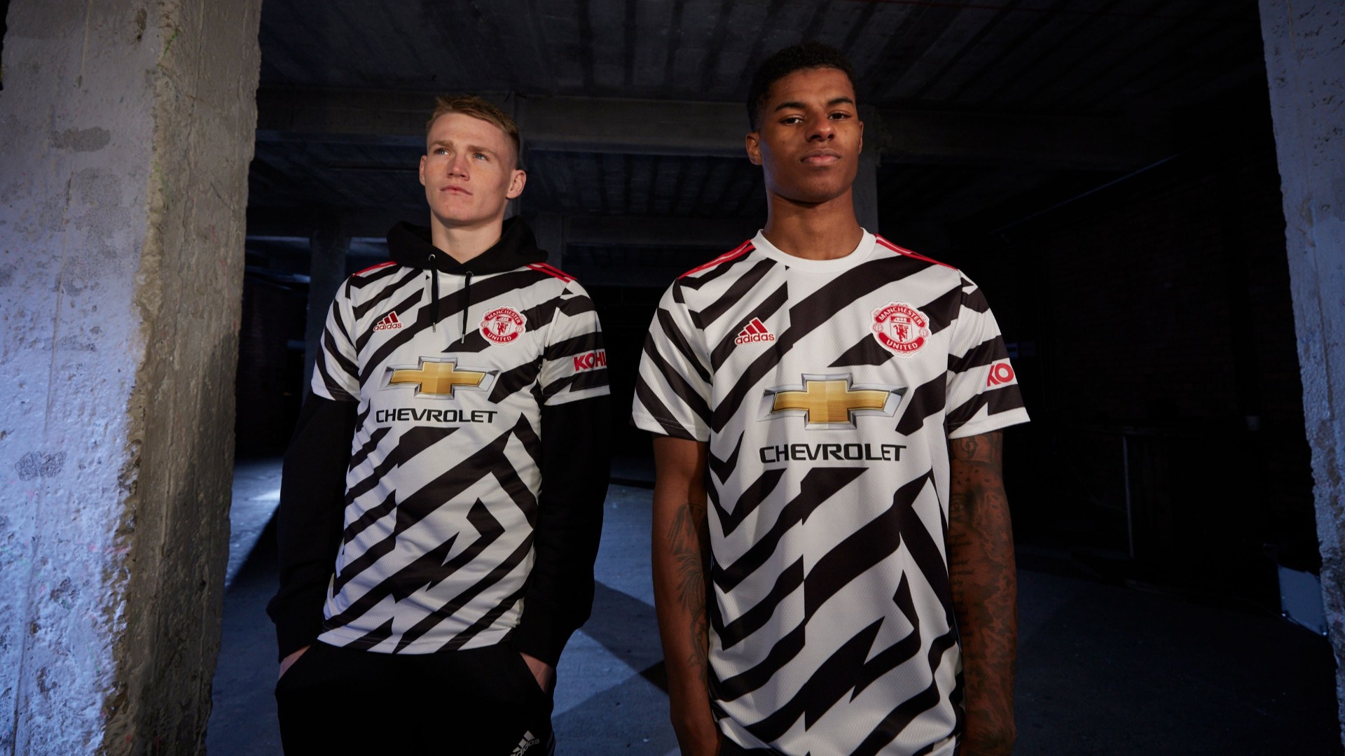
Joint worst with this
Nah I loved the Zebra kit
Still got the shorts that I lounge about it at home

TheRedDevil'sAdvocate
Full Member
It's wonderful, tbf. It helps you forget sometimes that the woeful team on the pitch it's actually the one you love and support.
Red Indian Chief Torn Rubber
Thus says Kemo
We look like prisoners
Wilt
Full Member
- Joined
- May 22, 2017
- Messages
- 7,736
Hope Utd use it when they play at Newcastle, should good for a laugh.
gaffs
Full Member
Love the kit. Just a shame we wont get a win in it anytime soon.
Free us from Glazer control. It's a cry for help!We look like prisoners
- Joined
- Sep 19, 2023
- Messages
- 66
The green one is fire in my opinion, really don't know why people hate it so much.
Compared with the recent AON ones, it's complete luxury.
Compared with the recent AON ones, it's complete luxury.
Red Indian Chief Torn Rubber
Thus says Kemo
HehFree us from Glazer control. It's a cry for help!
MyBloodIsRed
Full Member
the away kit is for sure one of the ugliest we've worn... that is for sure
pocco
loco
I'm always going to associate it with the close up shots of our players looking defeated as they walk back to the halfway line after conceding.
Even if we were winning it would still be hideous though, it just feels worse when you associate it with crap football.
Even if we were winning it would still be hideous though, it just feels worse when you associate it with crap football.
MackRobinson
New Member
The modern version of that would be a good looking kit. The Sharp logo ruins it
The Infamous
MackRobinson
New Member
The designer was either drunk or thought it would be worn on America's Next Top ModelJoint worst with this
Judas
Open to offers
Zebra kit was elite.
lex talionis
Full Member
- Joined
- Jul 25, 2017
- Messages
- 15,905
This green kit is pure shit that I wouldn’t even wish upon Liverpool, but it’s no match for the zebra kit. Hopefully club management can put this one away in cryostasis and have us go in white. I can’t think of any other clubs, now that we’re past Arsenal away where our white or red wouldn’t be suitable. There’s Brentford away, but wouldn’t the green/white away not work for that fixture?
The Firestarter
Full Member
- Joined
- Apr 8, 2010
- Messages
- 30,377
I got 99 problems but the kitch ain't one.
tomaldinho1
Full Member
- Joined
- Nov 26, 2015
- Messages
- 19,479
I really like this kit - up there with my favourite non home tops
mu4c_20le
New Member
- Joined
- Jul 7, 2013
- Messages
- 46,746
I like the colour like most people, but it looks like a retro baseball shirt.
Revaulx
Full Member
From an aesthetic angle I quite like it.
It’s just not “United” though.
It’s just not “United” though.
Dr. Dwayne
Self proclaimed tagline king.
Thought this one was horrible.
This is one of my favourite kits. If you roll the sleeves up there is black trim to match the neckline making it even more striking.
The blue goalkeeper version was great, too.

Stobzilla
Adores babies
Grey kit 95/96 season was the absolute worst. Utterly horrible.
There was a shite navy one at the turn of the millennium as well. Just bland to the point of offensiveness.
I hated the white one we played the 2011 CL final in as well, that was proper bollocks.
The lime green from last year is miles.worse than this one as well.
There was a shite navy one at the turn of the millennium as well. Just bland to the point of offensiveness.
I hated the white one we played the 2011 CL final in as well, that was proper bollocks.
The lime green from last year is miles.worse than this one as well.
Share: