(some of the) problems with polling
http://www.bbc.co.uk/news/uk-politics-35926183
We are used to weary cynicism about British polling. But one novel question that has come up from the EU referendum polling is not the usual "why did they all get it wrong at the last election?" but "why do they all seem to say different things?".
One curiosity is that the phone polls have consistently shown Remain doing better than in the online polls. So who is right?
Happily,
a new piece of research by James Kanagasooriam, an analyst for pollster Populus, and Matt Singh, who runs
Number Cruncher Politics and one of the few polling analysts to predict a Tory win last year, has put forward a fairly compelling thesis about why this is happening.
Populus, which has been working for the Remain campaign, runs both online and phone polls.
Sure enough, when they ran a classic phone poll, they found Remain had an 11-point lead but in a similar online poll, they found Leave had a six-point lead. Their task was to explain that difference.
Their research uses two techniques to work out what has been going on. Firstly, they run several online and phone polls under different conditions and scrutinised the results and secondly, they compare results to the British Election Study. This is the gold standard survey in Britain and is run by academics from across the UK.
Normal polls, in effect, ring people or email them to take a poll. When they have enough answers, they give some respondents' replies more weight than others so they simulate the effect of having asked a cross-section of British society.
If they get, say, half as many Welsh working-class men as there are in the population, answers by poll respondents from that group would be given double weight.
The BES poll is rather different.
In effect, they choose who they would like to answer the poll by randomly selecting addresses and then the people at those addresses and they they repeatedly try to contact that person. That means that their cross-section is much better and, for example, their results for the 2015 election matched the real results.
Explaining the gap
One of the critical issues identified by this research is that the sampling process has been going wrong.
Imagine a world where you constructed a survey which matched the population measured on every demographic and political dimension you can imagine.
You might well find that questions on politics were answered perfectly. But what if, say, you happened to have too many vegetarians?
You might never find out until you polled on, say, animal rights - when you might get a shock.
That, in effect, is what seems to have happened here. When you look beyond some of the normal dimensions - political allegiance and demography - you find that the samples are a bit wrong for online and phone polls.
But because the two styles of poll are put together in different ways, the biases point in different directions for each one.
For example, the BES finds that around 32% of people think racial equality "has not gone far enough". If you ask the same question in a phone poll, 40% of people fall in that category. When you ask the same in an online poll, you get 25%. So the phone polls look too socially liberal and the online polls look too socially conservative.
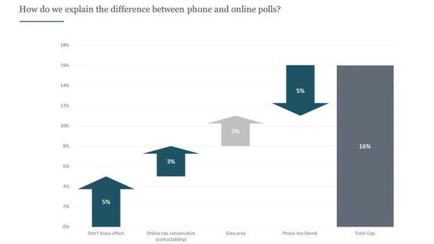
Taking that into consideration, the Populus Number Cruncher research suggests that this sampling error is increasing the lead for Leave by about 3 percentage points for online polls and increasing it for Remain in the phone polls by about 5 percentage points.
Taken together, those two sampling errors explain nearly half of the 16-point gap.
The 'Don't Know' gap
The other critical issue they have shown is that there appears to be a large pool of voters who, if offered the option to say "Don't Know", will pick that. That is typically how the online polls are put together.
But if they're only prompted to answer "Leave" or "Remain", they tend to move to "Remain" and that is typically how phone polls are constructed.
This means, they argue, that there is a pool of people who are semi-engaged and don't want to commit, even to a pollster, but when push comes to shove, their preference is for Remain. That's worth about 5 percentage points of the gap between the polls.
The results, taken together, mean they can explain 13 percentage points of the difference, leaving 3 percentage points unexplained.
But, even so, they suggest that while the phone polls are too kind to Remain, they're probably a better estimate about the current state of opinion.
That is good for Remain - it implies their position is a bit stronger than a crude poll average suggests.
Image copyrightPopulus / Number Cruncher Politics
Image captionHow to explain the 16 percentage point gap between between online and phone polls?
It implies a comfortable lead for Remain - well out of the margin of error - although, of course, the campaign may change minds and this does not adjust for turnout effects. There's everything to play for.
Pity the pollsters
One really helpful thing that this report really brings out is just how hard it is to build good samples.
For example, you might think that it is easy to find out how people voted at the last election if you are polling them. Just ask. But, over time, people's memory of their vote deteriorates.
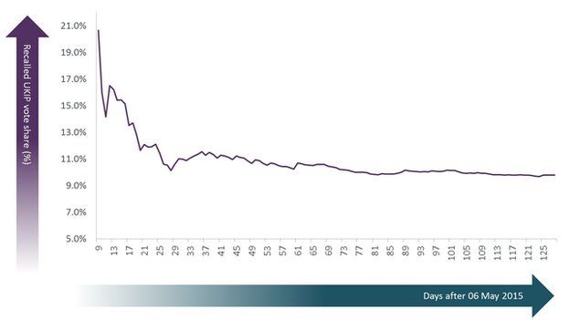
Here is a graph showing how many people said they voted UKIP plotted against the days that have passed since the general election - the numbers have dropped as time elapsed. People tend to misremember voting for small parties and recall voting for major parties - so the recalled UKIP share drops.
Image copyrightPopulus / Number Cruncher Politics
Image captionHow many people remember voting UKIP in the days after an election?
That's fixable with weighting, but there's a second issue that this research highlights, too.
Some people are relatively easy to reach by pollsters, but some are more difficult.
So long as, say, the sort of Conservative voter who answers questions is similar to the sort who doesn't want to bother, that's fine. But that's not the case.
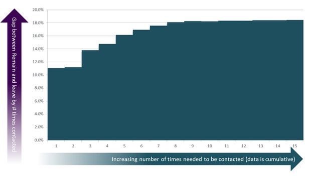
This is a graph showing what the lead for "Remain" is from people surveyed by the British Election Study, against the number of times that researchers had gone around the block to get people to reply.
So the people who responded to their questions immediately were reasonably pro-Leave. That's the column against the number "1". They score a roughly 11 point lead for Remain.
Image copyrightPopulus / Number Cruncher Politics
Image captionHard-to-reach voters are different to easy-to-reach ones
You can see that, as they layer in results from harder-to-reach voters, the numbers move a long way.
By the time that researchers have tried each household eight times, the lead has grown to around 18%.
The easy-to-reach voter appears to have quite different characteristics to the hard-to-reach ones - and that is a major headache for pollsters.
You can see why it is so hard to put a poll together that's both accurate and cheap.


