What was your favourite United shirt sponsor?

Vote


  • Total voters
    227
  • Poll closed .
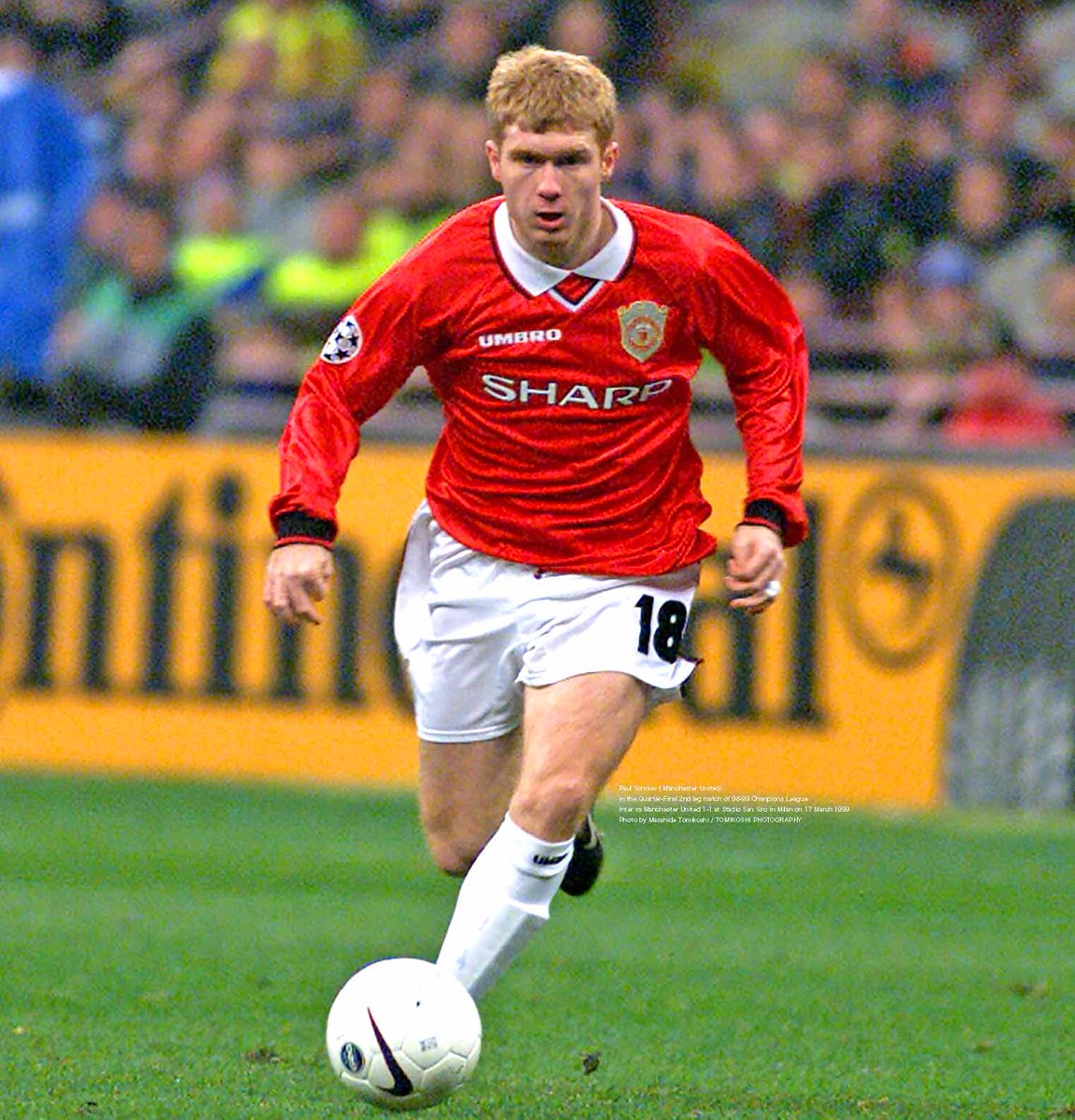
1. Sharp

EKRFHrFUwAADPG9.jpg


2. AIG

2.7243361.jpg


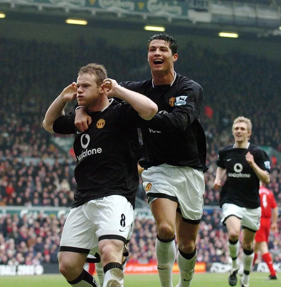
3. Vodafone

EFoY8IGXkAE5ksO.jpg
 
Who are those poor feckers that voted for chevrolet? awful logo and awful era for us dont get it.
 
The sharp 1985 kit with the white flecks at the top has never been bettered.
 
I'm not sure how good a logo the Chevy one was, I'm not sure what the criteria should be when assessing how "good" a logo is, but what I can fairly confidently say is that it looked absolutely horrendous on football kits. If they had gone with a simplified, plain-coloured version it may have sort of worked out depending on the shirt, but nope, they went with the shaded, textured, full-colour gold one. I'm positive millions of United shirts went unsold for years due to how ludicrous the logo looked on them.
 
I'm not sure how good a logo the Chevy one was, I'm not sure what the criteria should be when assessing how "good" a logo is, but what I can fairly confidently say is that it looked absolutely horrendous on football kits. If they had gone with a simplified, plain-coloured version it may have worked depending on the shirt, but nope, they went with the shaded, textured, full-colour gold one. I'm positive millions of United shirts went unsold for years due to how ludicrous the logo looked on them.

The full colour design was what made it beautiful as opposed to boring monotone white. It was so classy.

:lol:
 
Sharp, Vodafone, AIG, Aon or Chevrolet?

Many kits were quite amazing. The one that I connected with the most was the all-black kit of the 1993-94 season (and the picture that I have of this is when Lee Sharpe had that brace in a 2-1 victory against Aston Villa at Villa Park).
 
This is all mostly down to age I think, but to me Sharp still feels like what a United shirt is supposed to have on it. Aon and AIG was okay, Chevy looked misplaced with the gold color, vodafone looked a bit cheap.

I actually like the Team-viewer logo, simple and clean and fits the shirt. Especially the 21-22 one, which I thought was great.
 
I am torn between Sharp and Vodafone. Although one of my favorite kits is the AIG one with the white stripe on the back from 07/08 I think.

So basically, give me all of them - and also the last Chevrolet kit with the club logo on the black patch.
 
The Sharp black away kit is the only answer here. Best kit we ever had.
 
Skinheads Against Racial Prejudice

All day long, every day. Coolest sponsor of all time.

Worst being the Chevrolet one, which for me, just summed up the soulless, Americanised, plastic, hollow shell that Utd has become under the Glazers.
 
Skinheads Against Racial Prejudice

All day long, every day. Coolest sponsor of all time.

Worst being the Chevrolet one, which for me, just summed up the soulless, Americanised, plastic, hollow shell that Utd has become under the Glazers.

Chevrolet was bad, but the massive Team Viewer we're getting this year has to be the ugliest.
 
Thought to myself before entering the thread, "it's got to be sharp hasn't it?" :lol: I love that shirt like no other. Black and gold. Interesting story, actually got this shirt from a young hooker I was doing the rounds with on a weekly basis.
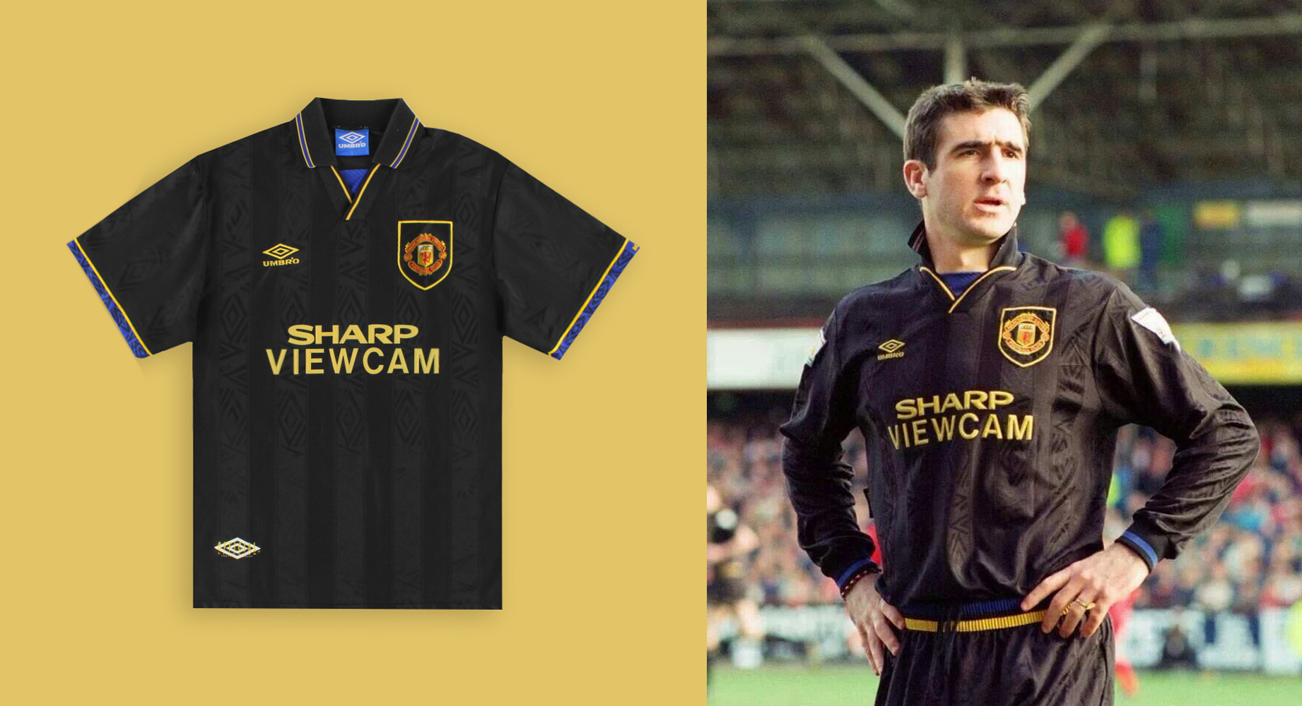
 
Yeah, the answer is obviously Sharp (even though they're very likely responsible for numerous horrible acts over the years, I'm too scared to look it up).

But I do remember editing some of the old PES editions to make United ("Man Red" or whatever is was) sport "SHARP" as their sponsor: that was easy to do, just letters (and you could add shading to the font too).
 
Thought to myself before entering the thread, "it's got to be sharp hasn't it?" :lol: I love that shirt like no other. Black and gold. Interesting story, actually got this shirt from a young hooker I was doing the rounds with on a weekly basis.

Was this some kind of loyalty program?
 
I just remembered seeing this a while ago.

Sharp Electronics in white and black, weird looking combo.

d09c192a1d3409995af6c02a65f9fd9f.jpg
 
I'd feel a bit strange wearing a United kit from a time when I wasn't supporting United, so 06/07 (red) and 07/08 (black with red stripe) are my favorites.
 
Sharp and Vodafone. Never AIG or AON. Always struggle explaining why, though. Kind of felt they were too short, lacking a few letters maybe? Should love them because of the success we had with those but I just can't.
 
For me:

Sharp
Vodaphone
AIG (that 07:08 kit)
AON (I actually loved the 2021/2013 kit)
Team Viewer
Chevrolet
 
Vodafone
Sharp
Aon
Team Viewer
AIG (great kits, awful logo - would've looked fine with their current logo, but the old one with the serif font just didn't look "clean")
Chevrolet