Utd Kits 22/23

Like the look of their new home kit

milan-22-23-home-kit-1.jpg
If it didn't have a sponsor or could be ordered without it I'd totally get me one of those. It's a shame so few clubs offer the option to remove the sponsors from the shirt.
 
Away kit looks fantastic. Really like the home kit too. 3rd kit is weird being yellow? But i like the design of the kits. Simple, clean. 3rd kit would've been perfect if it was black.
 
Away looks decent, other two are pretty shite to be honest
 
The white away kit is mint. Probably the best kit Adidas has created for us. Not a fan of the yellow as I think it looks like a goalkeeper top.
 
Only the white away kit is nice. The collar of the home kit is hideous and the radioactive green third kit makes my eyes bleed.
 
Looks shit, the pentagon back drop is all wrong should have copied the way nike used to do it.
 
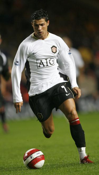
It’s a Derby county shirt with a Utd badge superimposed on it. I had high hopes for a white away kit but it might just be a bit meh.
Probably get the home kit for the collar!
Can you explain how a white away shirt can not look like a Derby County home shirt?
 
Can you explain how a white away shirt can not look like a Derby County home shirt?
Needs more red detail to balance the monochrome effect, or all white.
It’s to do with team colours - Derby are white and black, we are red, white and black.
Google our 1998 away kit (won’t let me add pics) you wouldn’t mistake that as a Derby kit. It’s an iconic Utd shirt. Our 2012 shirt is another wonderful kit. Just that touch of red makes it.
Fair enough. More red makes it for you. I tend to agree, although for a while we didn't put any red on there at all. For me that 98 away kit nailed it too, but I also liked the early 80s Adidas ones where the red elements were small enough to be invisible from a distance. If it were up to me, our kits would be red with white and black elements, white with black and red, and black with red and white. And the occasional royal blue third kit to break up the monotony.
 
Fair enough. More red makes it for you. I tend to agree, although for a while we didn't put any red on there at all. For me that 98 away kit nailed it too, but I also liked the early 80s Adidas ones where the red elements were small enough to be invisible from a distance. If it were up to me, our kits would be red with white and black elements, white with black and red, and black with red and white. And the occasional royal blue third kit to break up the monotony.
Sounds good to me! Looking again if the adidas 3 stripes are red and black, it just needs a red sponsor logo rather than black to be quite close to the 98 kit. This one could be a slow grower, obvs need clearer images.
 
Turn the addi stripes and logo red make the socks white and it could work.