United Kits 2024/25

If all three of the alleged official kits are accurate, then that is immediately the best kit lineup Adidas have given us so far.

I'm, like, shocked that after so many bad kits, especially as far as away and third go, they could have actually nailed all 3 kits for a season like this.

Home kit is 9/10
Away kit is 9/10
Third kit is a fire 10/10
 
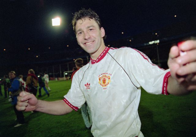
Not for me, old United more like.

Van-Persie.jpg


Yeah that's proper old skool United.


Now that’s a beaut

It really is. We are about to change ownership which means new era for the fans. Why not make a brilliant kit and earn dozens of millions? I really wonder how come all these big companies like Adidas, Nike, Puma, Under Armour etc. who are supposed to invest millions in designing shirts, end up making ugly products. A random fan twitter seems to have much better taste than the so called professionals.
 
Home and 3rd kits look really good, just obviously slightly ruined by a changed Teamviewer logo. Sadly the away kit is shite but 2/3 is still a very good result for us.


That’s lovely and the smaller sponsor logo suit the shirt much better, though it’s a shame they haven’t used the retro Adidas originals logo too. Just being picky :angel:


Looks like a Liverpool kit to me. No club crest is sacrilege.
 
Hope they switch the away and the 3rd - I want to see more of the white kit in action and less of the dark green one.
 
I'm surprised the white kit isn't the away and the striped third.
 
No crest on the shirt. Won't somebody think of the children.
 
It really is. We are about to change ownership which means new era for the fans. Why not make a brilliant kit and earn dozens of millions? I really wonder how come all these big companies like Adidas, Nike, Puma, Under Armour etc. who are supposed to invest millions in designing shirts, end up making ugly products. A random fan twitter seems to have much better taste than the so called professionals.
It's so weird isn't it. These multi-billion dollar corporations just don't get us, the fans!
 
If them three are the kits, I'm not sure how I feel.

Away kit just looks like a Newcastle kit
Third kit screams Liverpool to me, although it looks really good, best of the 3
 
If them three are the kits, I'm not sure how I feel.

Away kit just looks like a Newcastle kit
Third kit screams Liverpool to me, although it looks really good, best of the 3
I keep thinking that the devil looks like their liver seagull from a distance but other than that it looks like a standard white kit we would usually have.
 
Really like the look of our home kit next season, despite the bigger logo. At least we no longer have Chevrolet!

Unfortunately, our away kit is looking like a joke. At least the third looks far more traditional even without the club crest.
 
I’ve seen some better pictures of the kits and the away shirt actually has thin red stripes within the white stripes.

I actually really like the home shirt. The flowers pattern looks very cool.


That’s lovely and the smaller sponsor logo suit the shirt much better, though it’s a shame they haven’t used the retro Adidas originals logo too. Just being picky :angel:

As I say annually now - Adidas have not used the old logo on a football shirt for over 30 years now. I can't see them bringing it back just for us any time soon.
 
I like them all. Just for being different. About time we modified the badge.
 
When will we start to wear the cream and burgundy strips? Just like Newcastle did with their Saudi kit.
 
Have you worked in design then? Because this is probably verbatim what happens every season.

No, I'm a film producer, director and editor. Creative industry is like this, your client doesn't know shite but they are the decision makers.