daveskimufc
Full Member
- Joined
- Feb 27, 2014
- Messages
- 1,482
Makes such a difference. WOW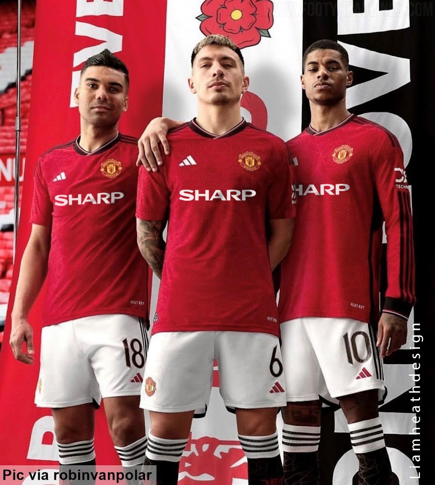
A decent sponsor logo does so much for a kit
(Editied as it initially sounded sarcastic. NOT sarcastic!)

Makes such a difference. WOW
A decent sponsor logo does so much for a kit
It doesn’t count because of the really small almost unnoticeable black line on the collar
This was also a few years back. Don't recognise the initials, but I am shite with names.Guess it's changed then. He left a few years ago. My mate is a United fan but the guy running the team at the time was a Liverpool fan. Unless its my mate you met. Initials NB.
Have they revealed any insights about what goes into designing kits?A very old friend of mine, Floor Wesseling (so you can Google..) is one of the World’s premier kit designers and I can ensure you most posters in this thread don’t know there arses from their elbows when it comes to kit designs. Quite laughable actually..
Would look much better with black shorts.
To be fair Sharp just has good memories. It’s just a brand like any other.
A decent sponsor logo does so much for a kit
Here’s a mock-up that’s actually based on that “leaked” image.
It’s a great simple logo though. Very clean, aesthetically.To be fair Sharp just has good memories. It’s just a brand like any other.
Have they revealed any insights about what goes into designing kits?
A very old friend of mine, Floor Wesseling (so you can Google..) is one of the World’s premier kit designers and I can ensure you most posters in this thread don’t know there arses from their elbows when it comes to kit designs. Quite laughable actually..
Green and White till the club ain’t shite!
 “ Green and white, yeah that’s right, big whoop - wanna fight?! “ - Paddy Tanager, the caddy manager.
Since they’ve been posted now already…

Even the third kit is giving me Jamie Redknapp vibes.this isn’t going to help beat those “it’s a liverpool kit” accusations!
That beigey colour is very Spice Boy era… (I also think the lack of our badge/its colours is the main thing, since ’Pool streamlined the Liverbird)
this isn’t going to help beat those “it’s a liverpool kit” accusations!
That beigey colour is very Spice Boy era… (I also think the lack of our badge/its colours is the main thing, since ’Pool streamlined the Liverbird)