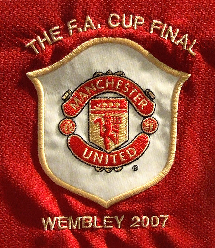
The Club Crest

decorativeed

Full Member
Joined
Oct 19, 2009
Messages
13,011
Location
Tameside
In the early days of football it was rare for clubs to wear crests on their shirts. Usually the only times they were worn were in cup finals. In United's first FA Cup final, they wore an embroidered Lancashire red rose on their jerseys:
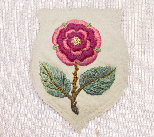
13830885513_d7725190df.jpg


It was almost 40 years until United appeared at another final and this time they wore the Manchester coat of arms:
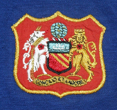


The same crest was worn in the 1957 Cup final against Aston Villa:
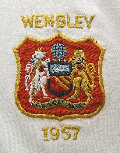


In the wake of the Munich disater in 1958, United managed to reach the final again and wore this crest on their jerseys (the first time they had worn their red home shirts in a final):
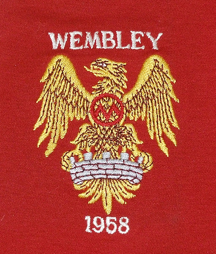


Contrary to popular belief, it does not depict a phoenix rising from the ashes, but is a short-lived badge featured in a new Manchester coat of arms introduced several months earlier. The golden bird is actually an
eagle and is the same that is featured on City's current crest. For more information, see this link

By the time of the 1963 cup final, United had reverted back to the old Manchester coat of arms:
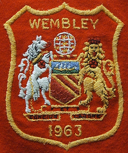


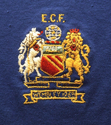
It was used again in the 1968 European Cup Final:


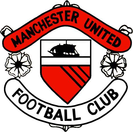
This version of the club crest appeared on official club documents in the 1960s:
4238903372_af60abecfa_o.jpg


The three bands are often said to represent the city's three rivers, the Medlock, the Irwell and the Irk. Actually, they are the ancient arms of the Grelley family (the first Barons of Manchester) and should be coloured gold (referered to as "or" in heraldry) on red ("gules"). Above that is a ship in full sail, a symbol of trade and enterprise (not of the ship canal as often thought).

Interestingly, this badge features roses instead of footballs. Presumably they are representitive of the red roses of Lancashire (which Manchester was still a part of at the time), but for some reason they have not been coloured like other parts have and could therefore be confused with Yorkshire's white roses.

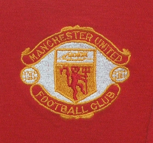
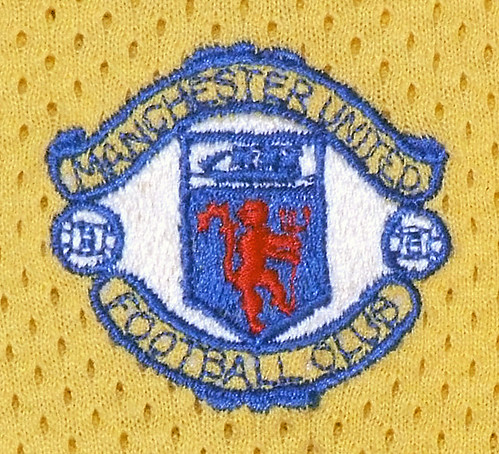
It was redesigned in 1970 but it was not until the following year that it was worn on the players shirts:


Last edited:
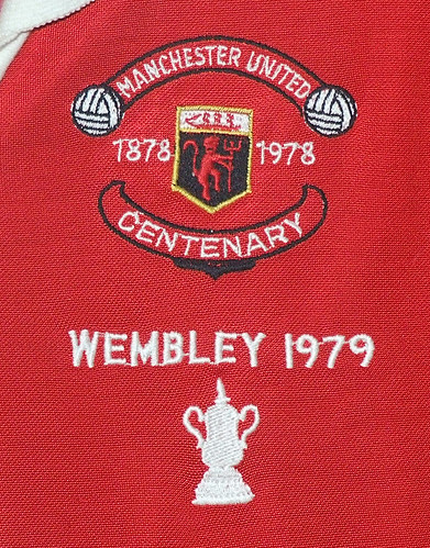
When Admiral took over from Umbro as kit suppliers they changed the colour of the ship to red but otherwise it stayed basically the same (although it appeared in a variety of colours on away shirts) until the club's centenary season 1978/79:


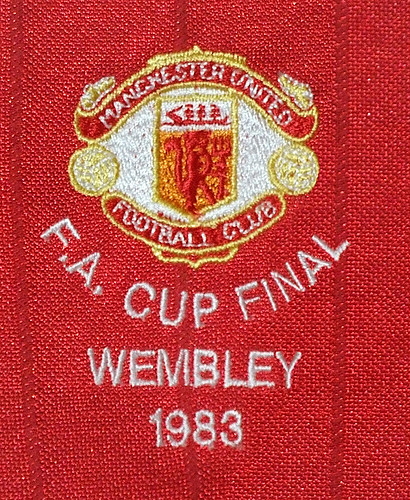
The following season it reverted back to the earlier version and changed slightly when adidas took over the kit contract from Admiral in 1980:


In 1984, adidas added a pair of three-stripe boots to the top ribbon of the crest - a feature that remained until 1992:


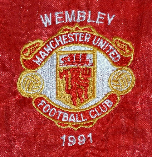
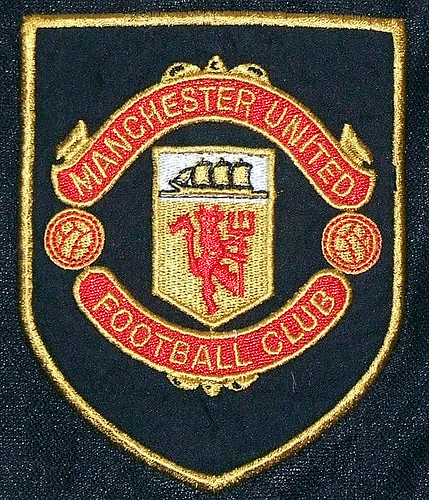
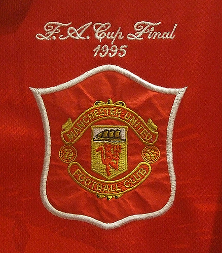
At the start of the Premier League era, United's contract with adidas ended and Umbro took over. The crest was again redesigned - the boots were removed along with the solid white background:


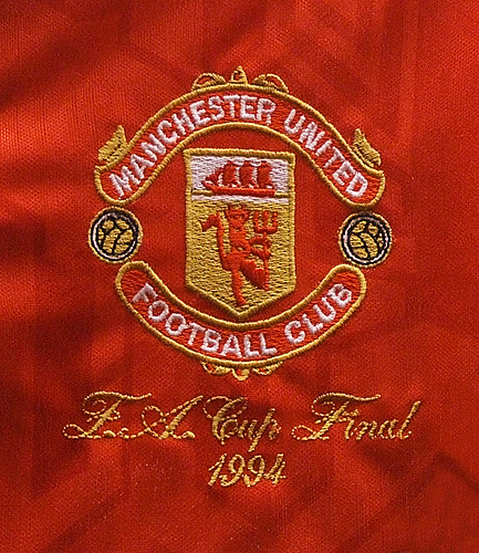
In 1993, again there was a minor change - the white lettering was replaced by gold, as was the red ship:


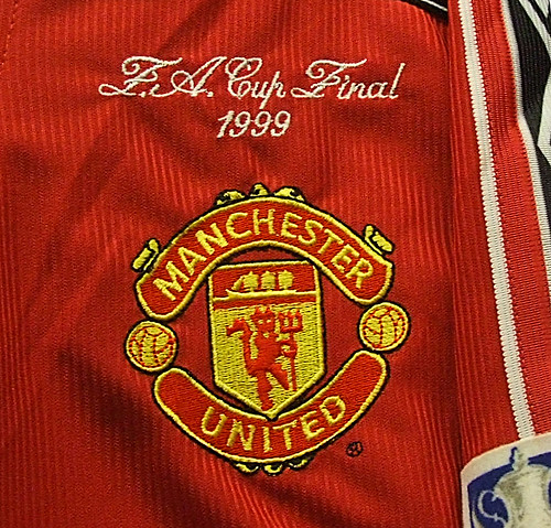
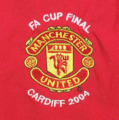
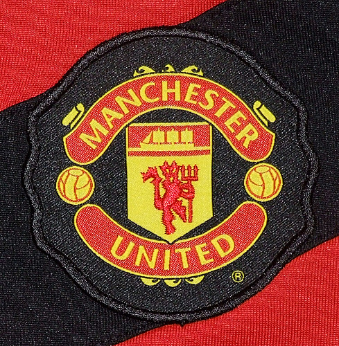
The major and most controversial change to the crest came in 1998 (although the new design was registered a year earlier). The words "football club" were removed and the colours were altered. The badge was also squashed horizontally and a black outline was added:


Most of these photos are clickable for high res versions. All are taken of the actual player's shirts rather than replicas.
 
It doesn't - it's a photoshop job created after the fact. It's just the 1990s badge with the devil obscured. The only club badge to have used the three stripes rather than the red devil is the one I posted above.
 
It doesn't - it's a photoshop job created after the fact. It's just the 1990s badge with the devil obscured. The only club badge to have used the three stripes rather than the red devil is the one I posted above.

It's a shame that. I prefer it to the Red Devil to be honest.

I'd love to see the words 'football club' reintroduced. The day we lost those was the day United became more of a business than a football club.
 
Terrific post! I always love a little history lesson about this little football club of ours :)

For me the one that was introduced in '92 (incidentally back when I first started identifying with United and got my first pieces of merchandise from my dad) look best by far. Not sure why, but I prefer white text over gold.

I wouldn't go as far as to say it looks bad after they removed the Football Club part, but I certainly think the squished version that the club uses today is less of an eye candy (looks cheaper) than the old badge with the FC.
 
Great stuff decorativered, I was talking to a friend about the 1958 badge the other day - will have to go and correct myself now ;)
 
Interesting to see how the badge has evolved over the years - this should be added to the blog
 
3795419898_201352622a.jpg

This one's my favourite. I hate how they've got that stupid foam crap on the raised stitched on crest with only the devil embroidered. The knock-offs I buy still embroider the whole badge though.
 
I'd love to see the words 'football club' reintroduced. The day we lost those was the day United became more of a business than a football club.

No, it's just the day when you started realising this fact, probably.

Great post, very interesting and nice to see them all in one place.
 
Great thread, Thanks Decorativeed. I'd always assumed the ship was a reference to the canal.
 
I hate the new badge, it's childish....it looks like it's been made for a children's cartoon lunchbox and should be whizzing out at us some how... The black outline is completely unneeded too, I don't like that for some reason, makes it look like a comic book panel... and the man that removed Football Club should be castrated with a pitch fork...

"We just felt that the words 'football club' were exclusive, and alienated people who didn't like football"

90s one was by far the best.... and I hope someone puts the FC back at some point.

That's a great quote, who said that?

If people don't like football then what interest would they have in a football club crest? :lol:
 
Terrific post! I always love a little history lesson about this little football club of ours :)

For me the one that was introduced in '92 (incidentally back when I first started identifying with United and got my first pieces of merchandise from my dad) look best by far. Not sure why, but I prefer white text over gold.

I wouldn't go as far as to say it looks bad after they removed the Football Club part, but I certainly think the squished version that the club uses today is less of an eye candy (looks cheaper) than the old badge with the FC.

Totally agree with that. The older badge was far more classy looking.

Fanstasic read. but when and why the devil was added to the crest?

In 1970. Not sure why (other than being a visual representation of the club's nickname) but it was a move that meant they had something unique that they were able to copyright. That would come in handy years later when most clubs had to change their crests in order to do the same.

That's the best IMO. It was slowly improved and made to look more professional and clearer up until that point, then started looking amatuerish and cheap.

Again, I agree, although I don't like the use of black in that particular crest.

This one's my favourite. I hate how they've got that stupid foam crap on the raised stitched on crest with only the devil embroidered. The knock-offs I buy still embroider the whole badge though.

That's true but (unlike when Umbro did similar with their replicas) the crests on the players shirts are just as cheaply made too.

I hate the new badge, it's childish....it looks like it's been made for a children's cartoon lunchbox and should be whizzing out at us some how... The black outline is completely unneeded too, I don't like that for some reason, makes it look like a comic book panel... and the man that removed Football Club should be castrated with a pitch fork...

"We just felt that the words 'football club' were exclusive, and alienated people who didn't like football"

90s one was by far the best.... and I hope someone puts the FC back at some point.

I couldn't have put that better. The black outline is what makes the current crest so bloody ugly, but the loss of "football club" means I really cannot relate to it as a club crest any more, instead I identify it as a corporate logo.
 
By the way, I found this in an old thread:

untitled10kv.jpg


Anyone any idea where the image originally came from or that has a larger version?

There are a few more photos of crests on my Flickr page by the way.

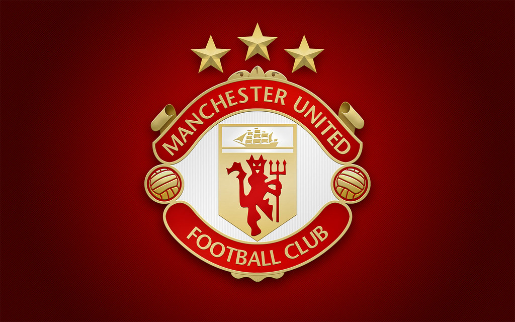
Also, I tried my hand at designing a new version of the crest with Illustrator (and Photoshop) the other day as I'm trying to learn to use that program (click for full size 1680x1050 wallpaper):


If anyone wants to use it for anything else, I could upload just the crest as a png.
 
That's a great quote, who said that?

If people don't like football then what interest would they have in a football club crest? :lol:

:lol:...it's not real, I just made it up.

But it seems like the reasoning behind it.

That top picture is sex decorativeed....:drool:
 
I've just had a look at my hits on Flickr and am really surprised at what the most popular photo in this thread is. With 10x as many views as any of the rare, historically important old shirt badges is...the current home shirt one - something you could look at in any branch of JJB sports. Bizarre.
 
i enjoyed this thread a lot, great to see them all in one place
 
It's a shame that. I prefer it to the Red Devil to be honest.

I'd love to see the words 'football club' reintroduced. The day we lost those was the day United became more of a business than a football club.

Forgive me but I think United were run like a business certainly under Martin and Louis Edwards.

I understand what you mean though.
 
The three stripe boot crest is the one I grew up with. . .imagine if Nike slapped a tick on the current badge?!
 
Ha! There'd be bloody outrage!

I've got a programme somewhere from the 25th anniversary of Munich match. Massive Sharp logo on the front of it!

Incidentally, does anyone prefer the badge with the white background?
 
The last season's crest was fully embroidered and it looked very sharp. The current one only seems partially embroidered(the devil).


manubadge.jpg
 
Ha! There'd be bloody outrage!

I've got a programme somewhere from the 25th anniversary of Munich match. Massive Sharp logo on the front of it!

Incidentally, does anyone prefer the badge with the white background?

Yes! for me it should always have a white background.
 
Excellent to have the evolution of our own club crest splayed out in front of you this way. Cheers :D
 
They'd look better in gold than that awful yellow we use now though.

I must admit, I prefer the white background on the crest too. Looks more striking - especially from a distance.

As for the cheapo new crests, they were used on last season's away and third kits too.

Anyway, what do you reckon of this version then (click for 1680x1050 version):