- Joined
- Oct 20, 2020
- Messages
- 121
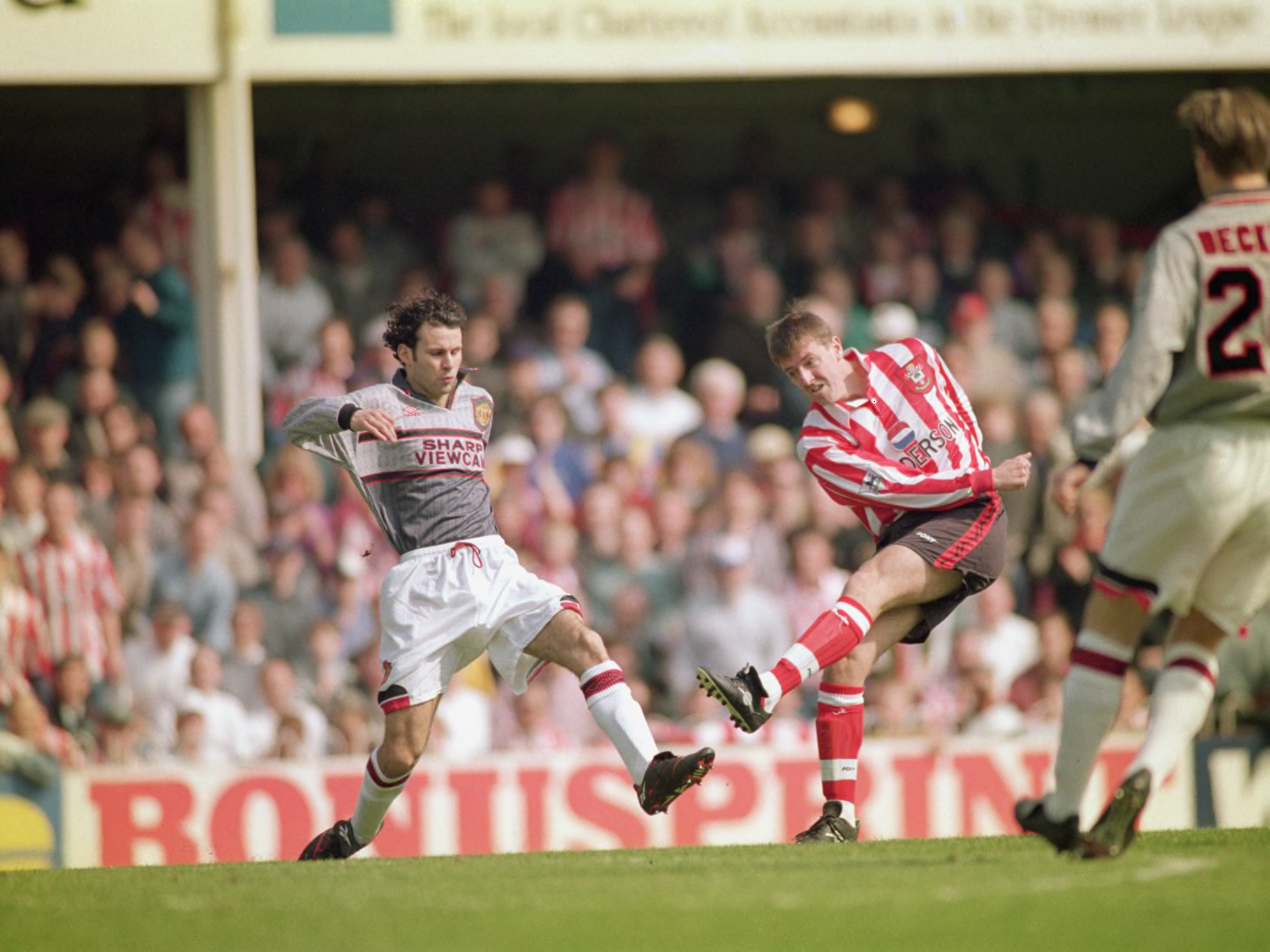
Us? That’s just a picture of Matt Le Tisier.
You must be younger than meYellow and blue has to be the worst combination. The pics of Ronaldo in an Al Nassr kit makes me want to gouge my eyes out. Torquay United can do one as well.

A shite kit, family man and yet Le Tissier is the worst thing in that picture
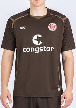
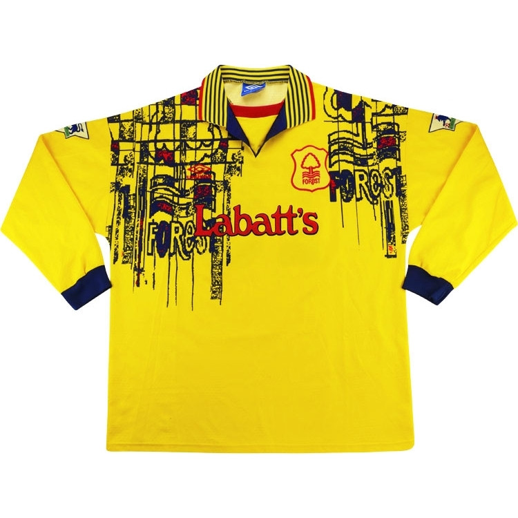
Anyone who plays in brown. Especially in a farmers league where the pitch matches the shirt.
Dark red isn't red? Genuinely fascinated to learn how youve come to this conclusion if you're being serious.Not red then. Cool.

Have you seen Scunthorpe this season?!Claret and Blue just signifies hoofball and misery for me.
How do I know that the blue I see is the same as the blue you see?
It would be nice if teams started matching their crest with the rest of the kit. This Napoli shirt (OK the kiss ad or whatever it is, makes it bad) but the crest is also so out of place with the rest of the colors.

Well you can't see Giggs according to FergieUs? That’s just a picture of Matt Le Tisier.