Silverman
Full Member
- Joined
- Oct 8, 2013
- Messages
- 6,614
I'm sick of all the kits. One kit for two seasons was brilliant and it means they are running out of ideas cos they need a new one each year.

I agree. 3 new kits and 2 new goalie kits is mental. Should be 1 new kit every season and rotate between the home and away (2 years for each kit).I'm sick of all the kits. One kit for two seasons was brilliant and it means they are running out of ideas cos they need a new one each year.
We're you alive in 1997, 2003, 2005 or 2013?Home kit is god-awful.. probably the worst I can recall in my lifetime.
Home kit is god-awful.. probably the worst I can recall in my lifetime.
Yeah, 97 kit was a complete nightmare of design. Countless things wrong with it, as you say. Then you touch it and it actually gets worse!Nah, the chevron one was worse.
Though I actually think this one looks worse on the players. Which is usually the saving grace of a poor kit.
I maintain it's all down to the sleeve stripes.
Edit: and yeah, as @decorativeed says, the 97 one with the weird tartan sleeves, floppy grey collar and huge central badge was significantly shitter. I quite liked the white away version though.
I'm sick of all the kits. One kit for two seasons was brilliant and it means they are running out of ideas cos they need a new one each year.
Nah, the chevron one was worse.
Though I actually think this one looks worse on the players. Which is usually the saving grace of a poor kit.
I maintain it's all down to the sleeve stripes.
Edit: and yeah, as @decorativeed says, the 97 one with the weird tartan sleeves, floppy grey collar and huge central badge was significantly shitter. I quite liked the white away version though.
We're you alive in 1997, 2003, 2005 or 2013?
This kit is blandly inoffensive at worst in comparison to those.


Chevron one saved by the 4-3 derby for me in terms of memories associated with but in design terms horrible.
Problem with new kit apparently.
https://www.socceronsunday.com/article/adidas-apologise-for-penis-pattern-in-utd-kit/
This is the problem with assessing kits. People automatically associate good memories with good kits. Everyone loves the '99 domestic kit for example, which I thought was a terrible cluster feck of shit ideas at the time. I mean, what was the stupid plastic zip about? And why was it all weirdly ribbed in places!? And the Umbrospasm all down the sleeves was just plain ugly. I still downloaded and play with it on Pro Evo though, cos, hey, it's classic.
Now the European version, that was a kit. Good memories or no.
Problem with new kit apparently.
https://www.socceronsunday.com/article/adidas-apologise-for-penis-pattern-in-utd-kit/

Problem with new kit apparently.
https://www.socceronsunday.com/article/adidas-apologise-for-penis-pattern-in-utd-kit/


No way.. 97 was iconic in its own way. This doesn't come close.

2003/2004?
Is this the wrong one..

That is indeed a bad kit, but even so I would say the current one edges it due to the sleeves. Only one that comes close.

I liked the 2005 one and it is million times better than the current one.

2013? incredibly bland kit and I hate the black collars, but again a far superior kit to the current edition.
Only one that comes close is 2003. This has shit collars, shit colours, shit sleeves and is a bad fit. Only a moron would be seen dead in it.


 Manchester United
 There's black on the shorts and black socks with a white band. It only looks odd when you forget about the rest of the kit besides the shirt, but it's a repeated element on the whole thing.The problem with this kit for me is the black bit on the cuffs comes out from nowhere. You've got the white Adidas stripes on the shoulders, so the white bit is sorted. Then boom. Random black bit when there's no sign of it elsewhere on the kit. Weird design.
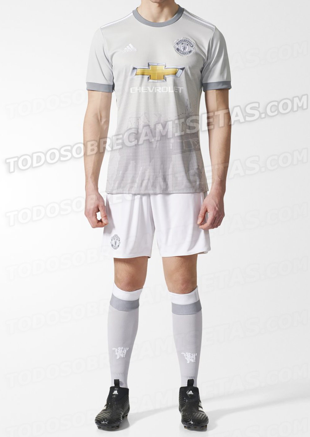
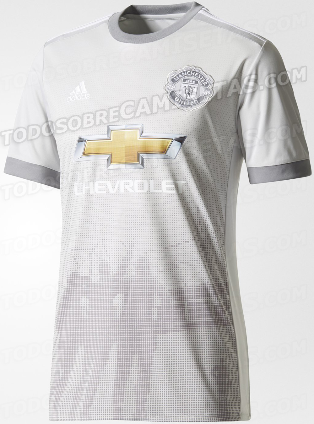
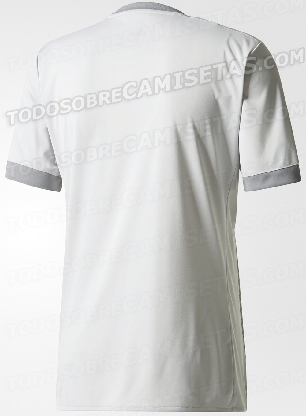
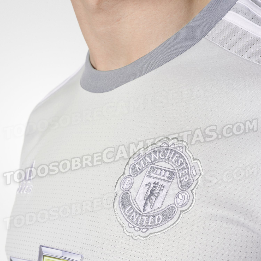
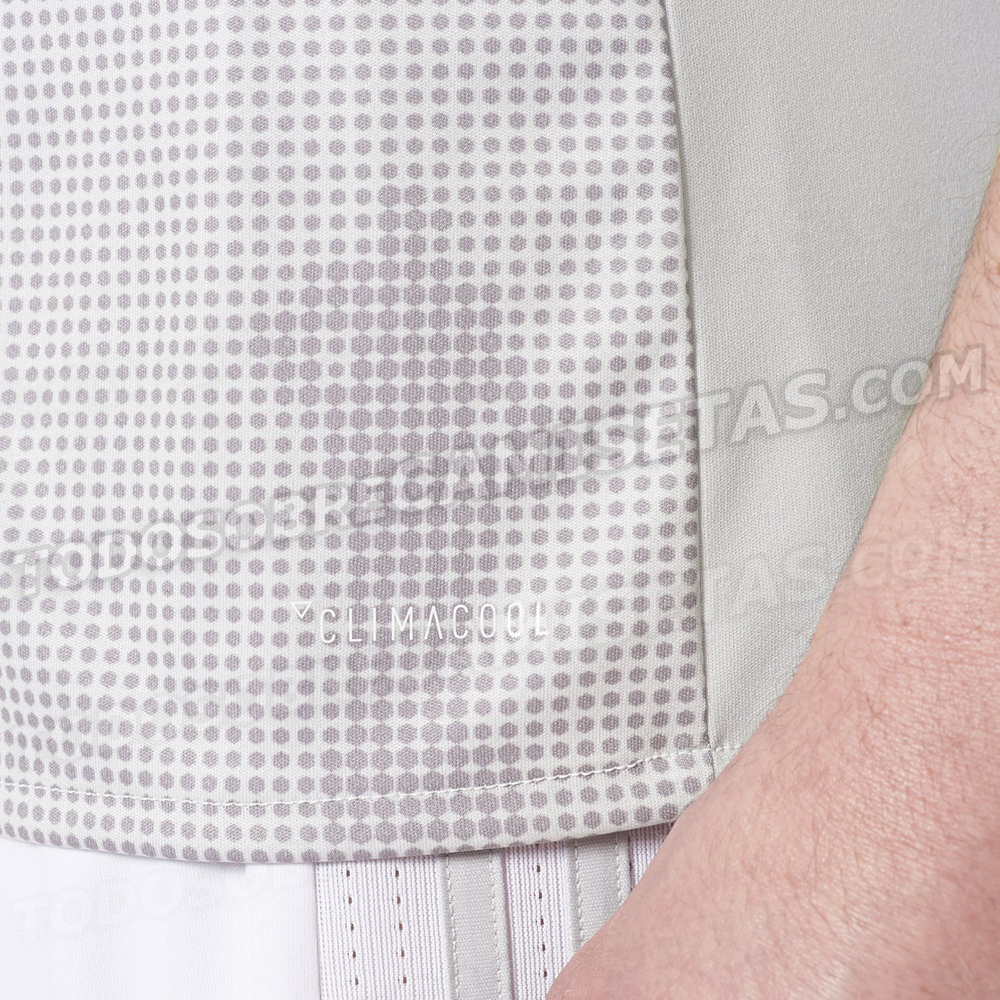
New pictures of the third kit. It looks much lighter in colour than previous pictures and is not as shiny. Shorts are also white, and not grey as I had previously written. Quite a mess in my opinion.


WTF ? That's awful, I thought we relied on shirt sales, who on earth would wear that ?New pictures of the third kit. It looks much lighter in colour than previous pictures and is not as shiny. Shorts are also white, and not grey as I had previously written. Quite a mess in my opinion.


These losersWTF ? That's awful, I thought we relied on shirt sales, who on earth would wear that ?

