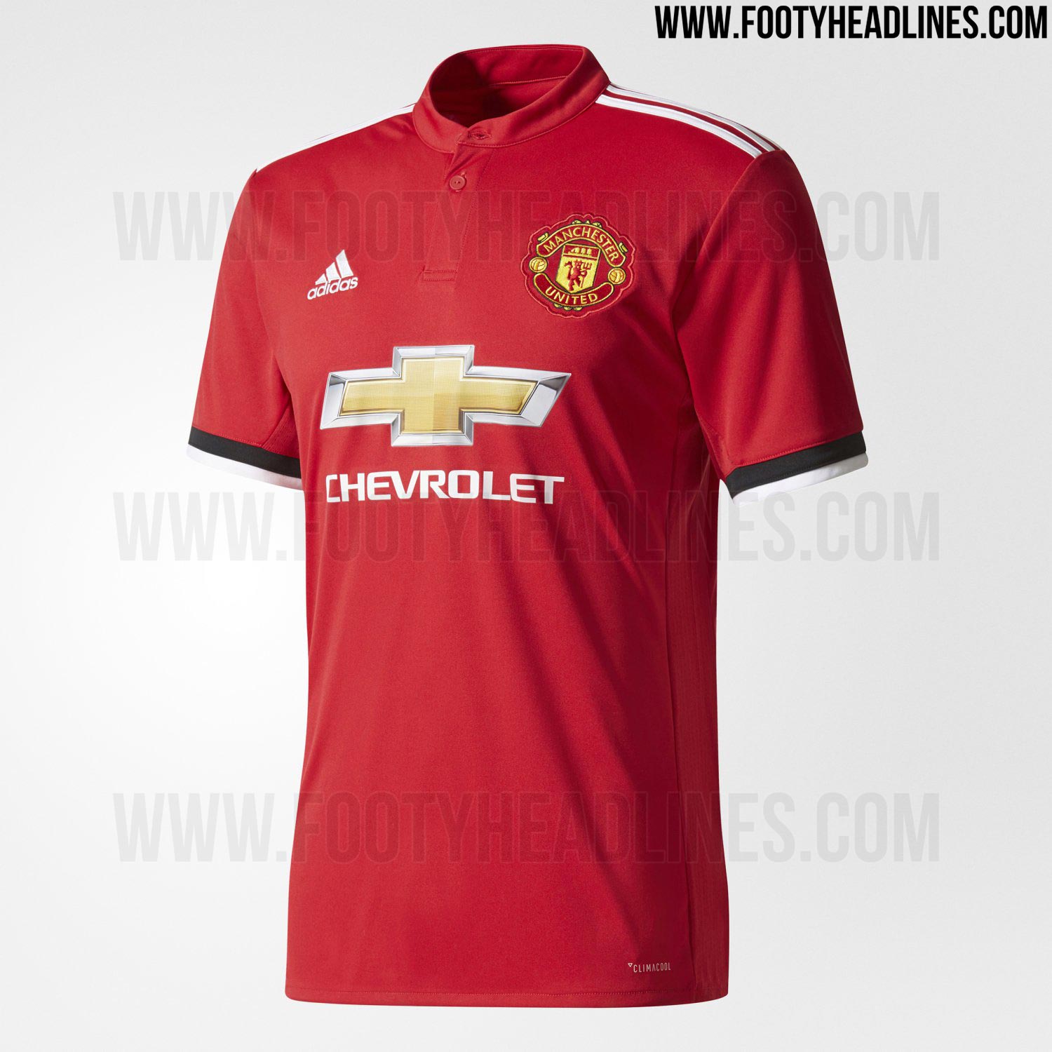
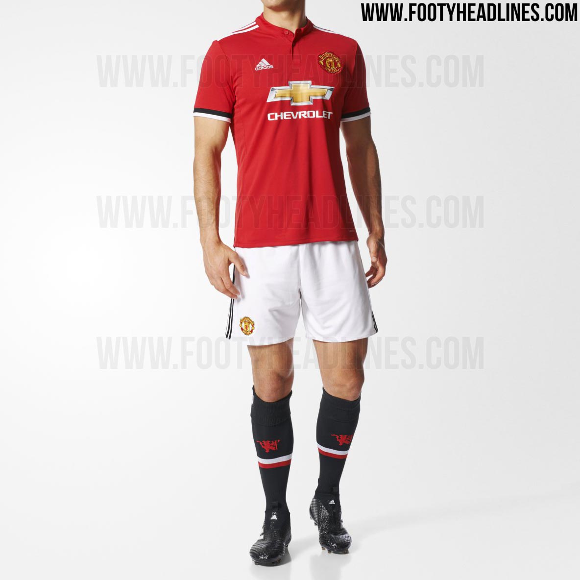
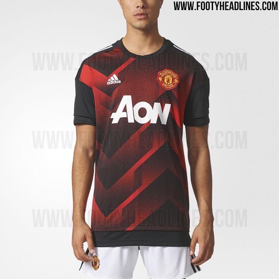
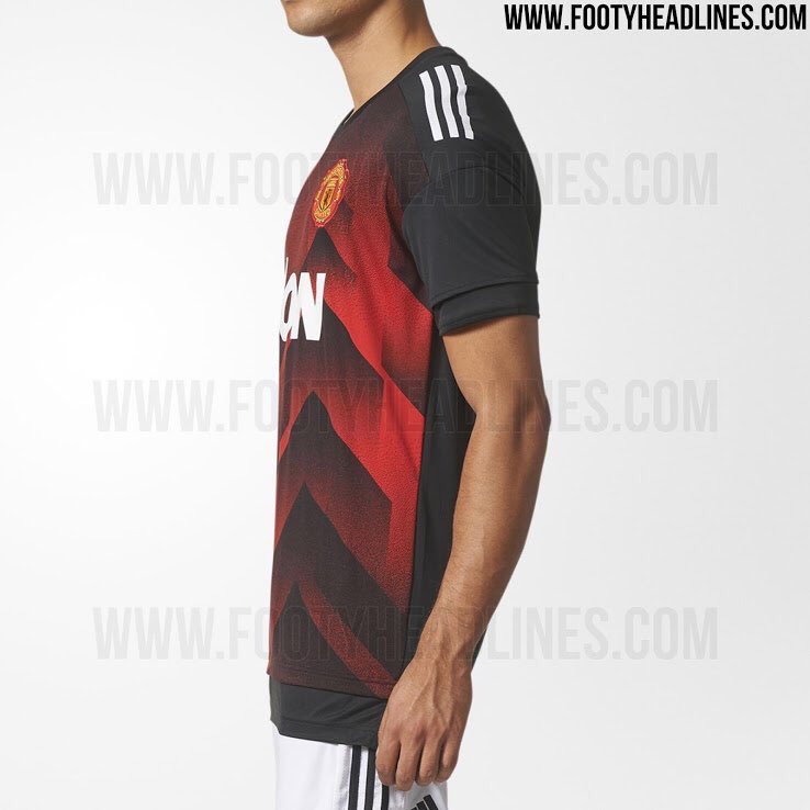
Manchester United Kits 2017/18

My post was an attempt to parody the point of view that every new kit is crap apart from the fake ones.

Good info though, how do you know they're from an official source?

Ups, my bad. :nervous:

Some guy on reddit also datamined them.
 
Ups, my bad. :nervous:

Some guy on reddit also datamined them.

Not at all, I rarely know what's real and what's fake so am glad to get some credible information. I also find the polarised discussions in this thread both interesting and amusing. Truly one person's shirt is another person's shit.
 
Agreed. But i have come to realise that once the kit that comes out isnt an exact replica of the 07/08 kit then people will moan.

Even when that came out, I remember people moaned that the stripe on the back looked lit was going into the players arse.
 
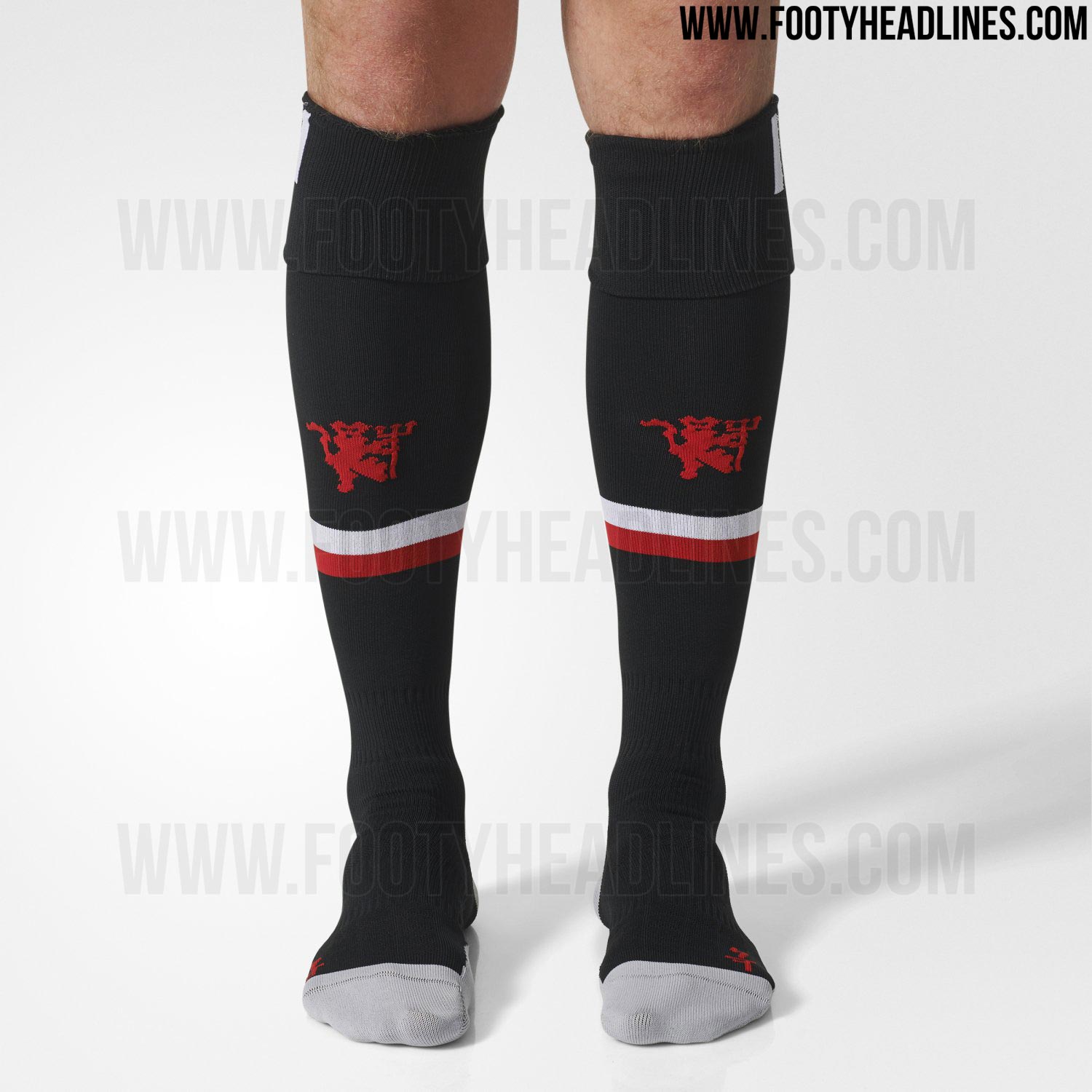
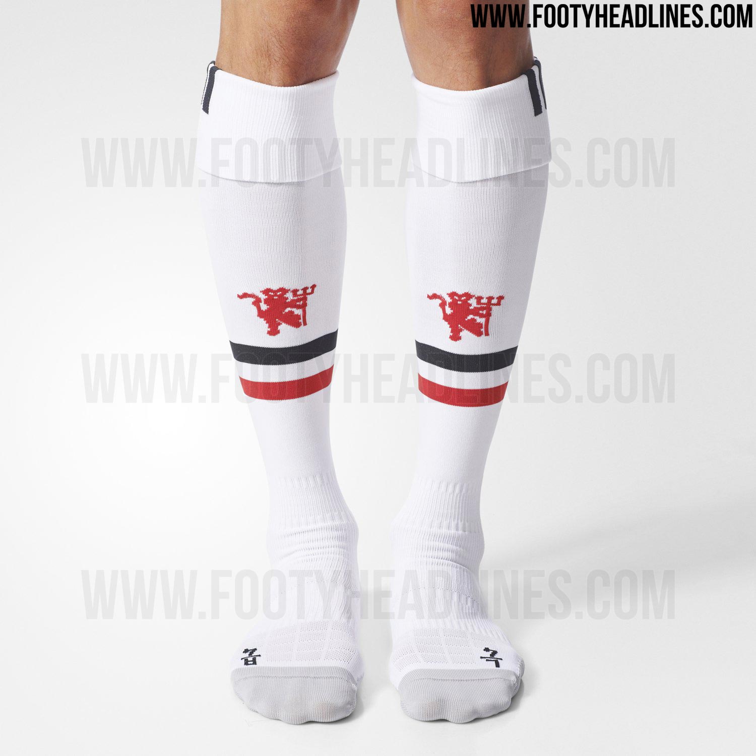
Here's some official pictures from Adidas on the entire home kit

manchester-united-17-18-home-kit-2.jpg

manchester-united-17-18-home-kit-3.jpg

manchester-united-17-18-home-kit-4.jpg

manchester-united-17-18-home-kit-5.jpg

manchester-united-17-18-home-kit-7.jpg

manchester-united-17-18-home-kit-8.jpg


Out next monday, July 3rd.
 
It's a decent kit, that. Would have liked to see what it might have looked like with a contrasting collar, but otherwise happy with it.
 
Not a fan it has to be said. Looks cheap and that collar is just ugly. Much preferred our previous efforts in the last two seasons.
 
The stripes need to go down the entire sleeve. Not a fan of the stripes just being on the shoulder.
Adidas haven't put stripes down the entire sleeve for a decade or more - they can't due to rules on competition patches.
 
Not sure what I make of it, definitely do not hate it but don't love it either. Wish we could have a real classy kit with a proper collar. This seems a little underwhelming.
 
:angel: Cool kit.

Assuming it'll be, love that black-white at the sleeve, the one vivid red color, and the neat design at the neck with buttons slightly going downwards. Adidas's three white strips at the shoulder is a nice touch. Center of the shirt with all three logos are neatly arranged in a plain yet clear presentation.

"The Manchester United 2017-18 home shirt is anything but bold, combining the traditional three colors of the club - red, white and black. However, whereas last season's jersey was inspired by the very first, green and yellow half-and-half design of the club and therefore featured two different shades of red, the new Manchester United 2017-18 jersey uses just one shade of red (Real Red) in an overall very clean look."
 
Doesn't look like a kit that champions would wear I have to say. Very uninspired and uninspiring.
 
Doesn't look like a kit that champions would wear I have to say. Very uninspired and uninspiring.

Remember that Nike kit a few years back with that Chevron? That was pretty odd and imo gash. But we won the league and got to the CL finally in it.
 
I ended up getting the black away kit in the authentic version... The home kit looks a bit plain tho
 
Our new kit for me somehow looks like Liverpools, 11/12 kit to be specific, and weirdly enough their new one looks like ours.
 
Our new kit for me somehow looks like Liverpools, 11/12 kit to be specific, and weirdly enough their new one looks like ours.
Which kit, cause the one I looked at for 11/12 looks feck all like it.
lfc_homeshirt_201012-432x500.jpg
 
I have a good feeling about next season's shirts. Got that title look. :drool:
 
Which kit, cause the one I looked at for 11/12 looks feck all like it.
lfc_homeshirt_201012-432x500.jpg

It's not actually look-a-like obviously, but that's what I generally felt when I saw our red kit with round red collar and three white stripes on shoulders
 
Remember that Nike kit a few years back with that Chevron? That was pretty odd and imo gash. But we won the league and got to the CL finally in it.
No we didn't. We finished second, a point behind Chelsea and went out in the quarters of the CL that season.
 
Haha they did look like table cloths but I didn't think they were that bad!


Right on. Was thinking of the season after because our black away shirts still had the chevron but our home kits didn't.
Yeah the black one because our third kit.
 
The new home kit looks blatantly like the one few years ago while we were still under Nike and van Gaal, there was a button on the front collar as well
 
I like it. Will look a lot better though when we actually see them wearing it.
 
Those socks look nice.

Kit's okay, but the black bit on the cuff annoys me for some reason. There's nothing else that's back on the rest of the kit and suddenly, this black bit is on the sleeve. Just my opinion though